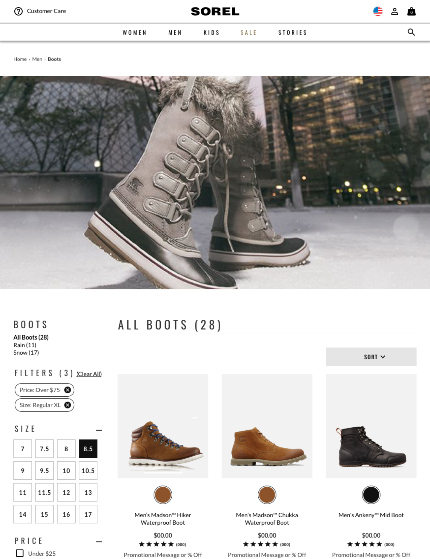
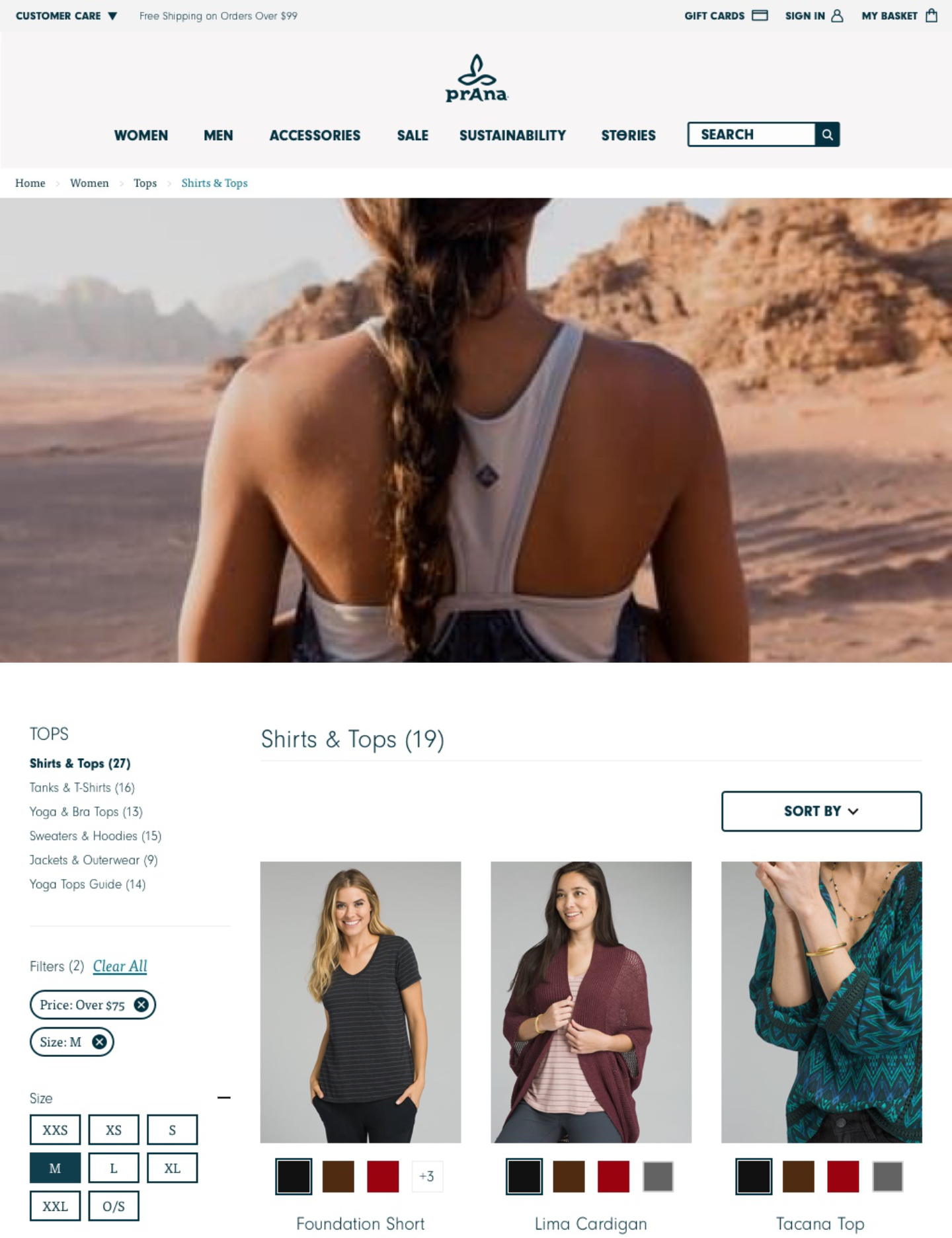
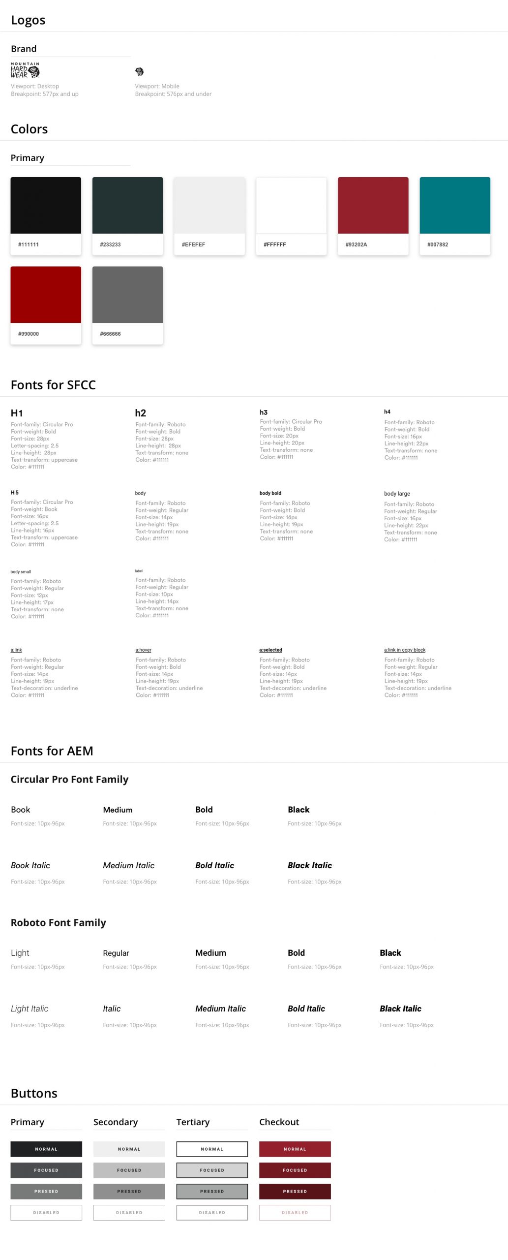
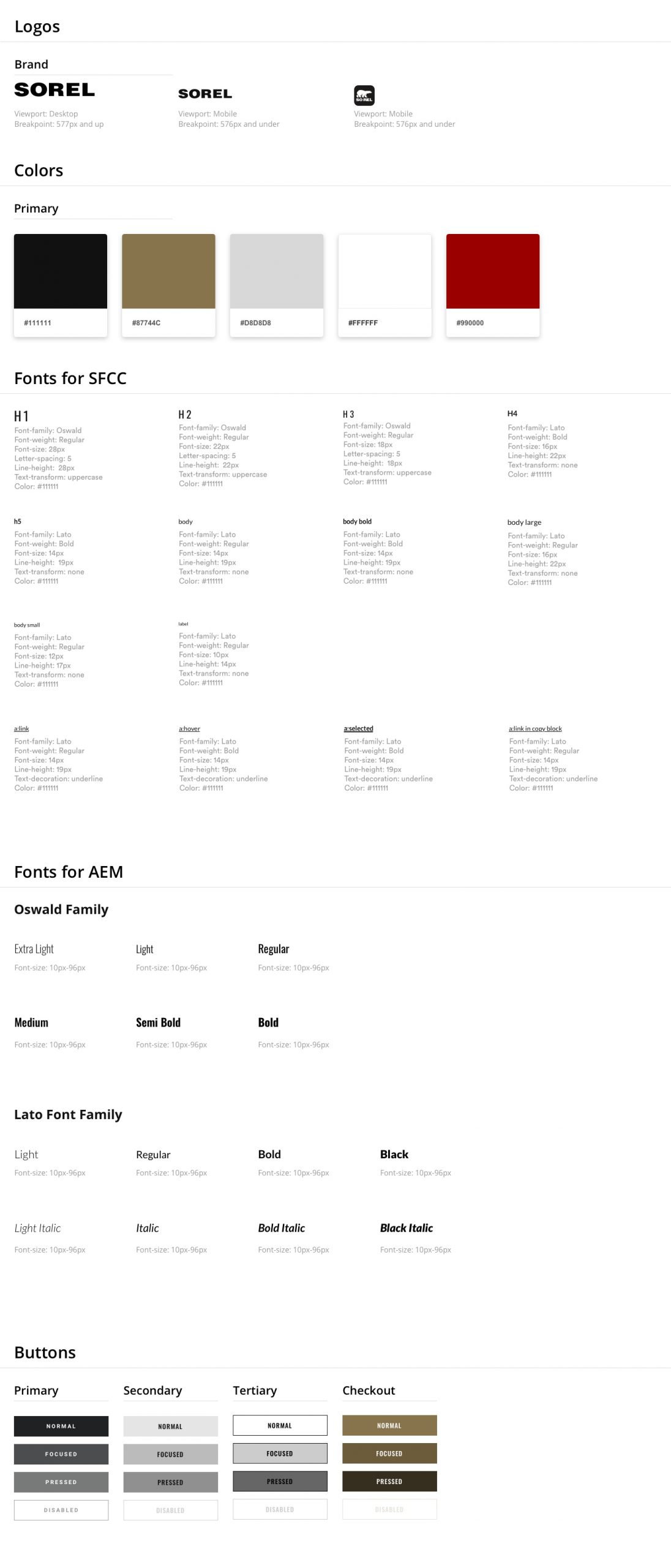
Redesign Columbia, Sorel, Mountain Hardwear, and prAna e-commerce websites with a mobile-first POV.
Requirements
Columbia Sportswear and its four leading e-commerce brands were stuck with an antiquated design. As traffic over the last few years has moved to leaning mobile, the company needed to address the lack of usability on devices other than desktops. In addition, the user experience was not up to par in ant viewport, and a refresh was necessary. I was hired on a contract to help create a system that could be skinned with each brand and help smooth out the UX for customers.
Findings/Research
The UX Research team at Columbia conducted studies identifying key areas that needed improvement. Using best practices from Baymard Institute as a reality check, they provided documentation on friction points and improved user flows. At the same time, the design team was identifying UI issues, including; clumsy type, lack of information chunking, unhelpful input fields, and inconsistent branding and controls. As expected, the experience was broken on mobile, with some elements not working.
Design
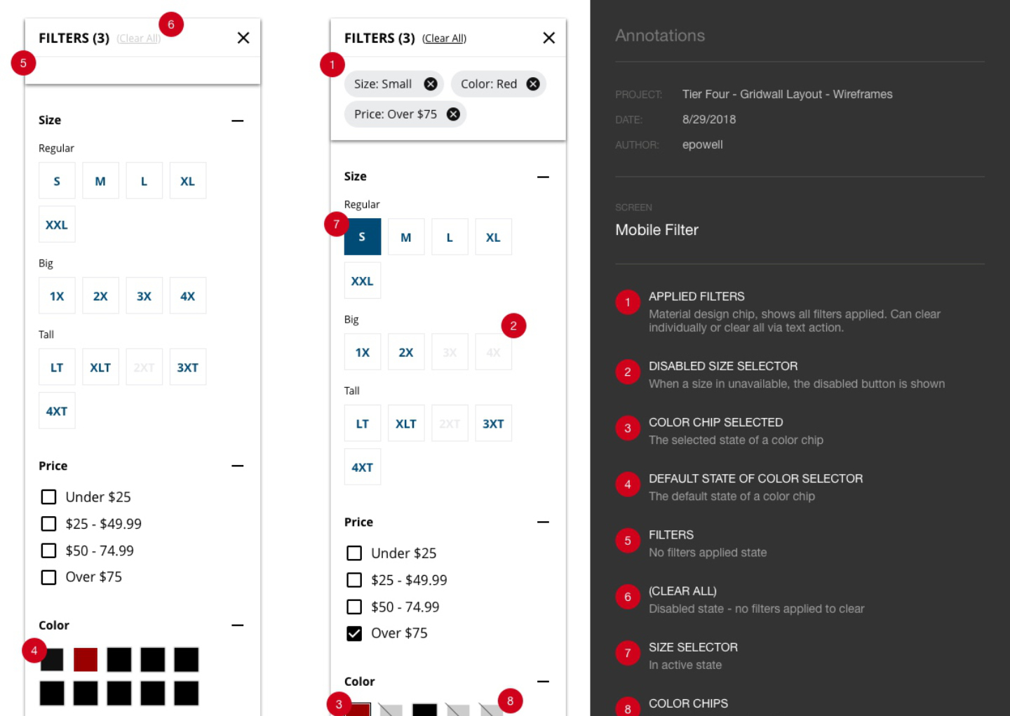
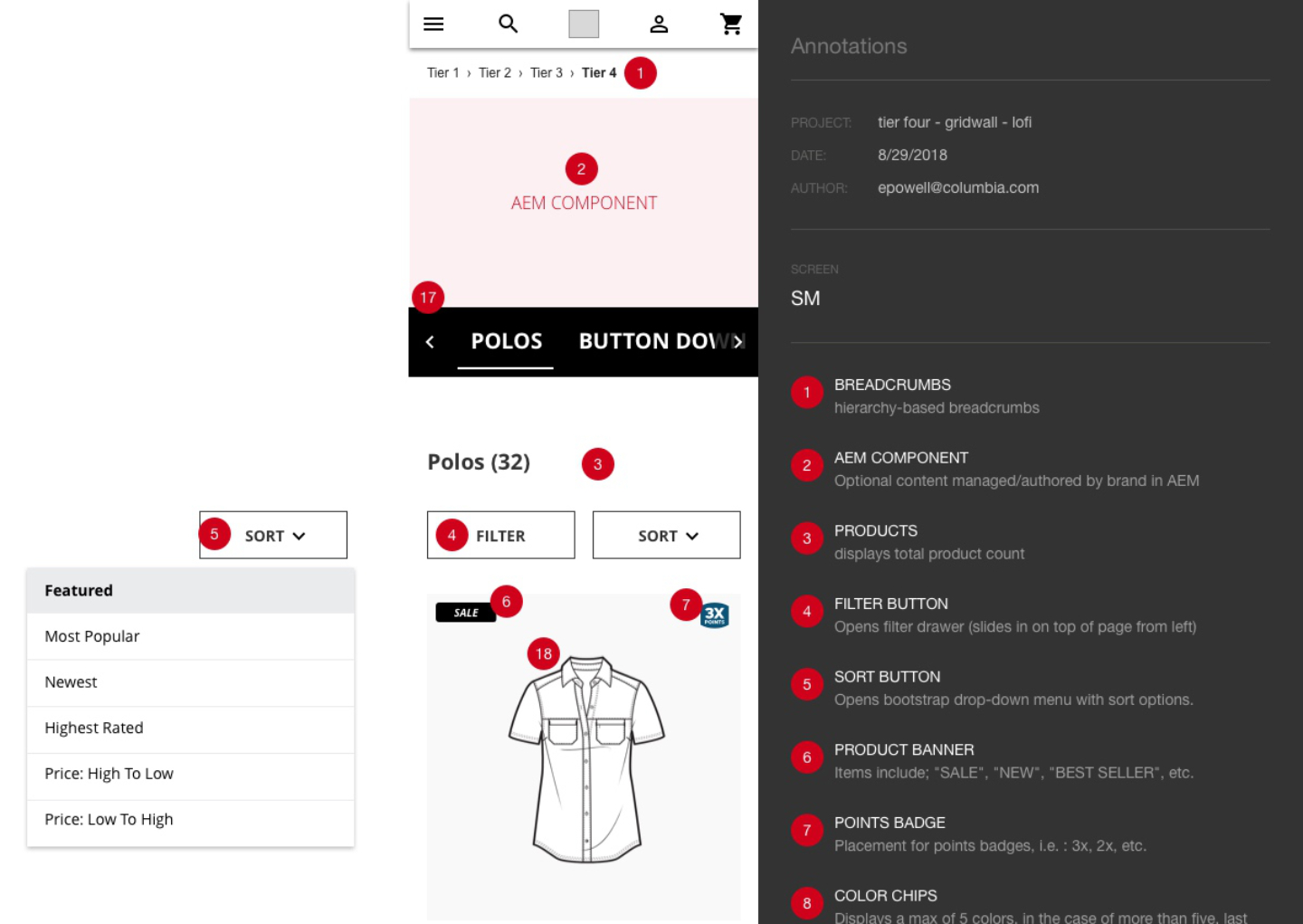
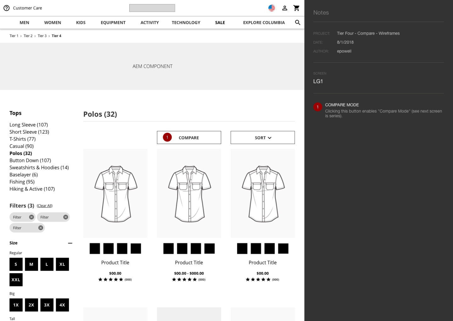
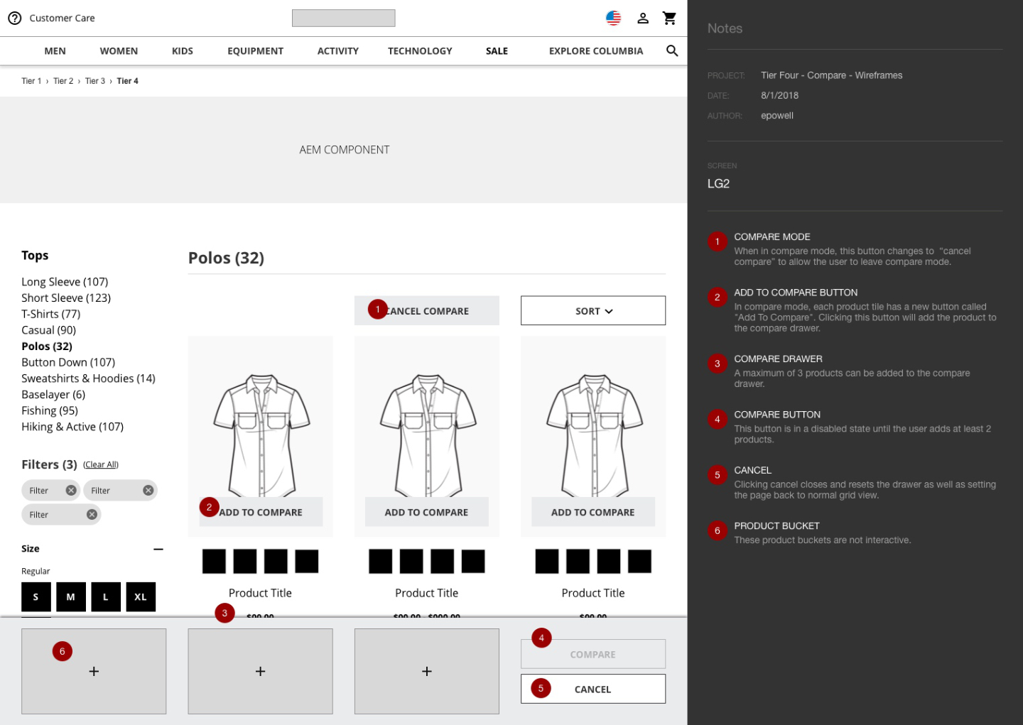
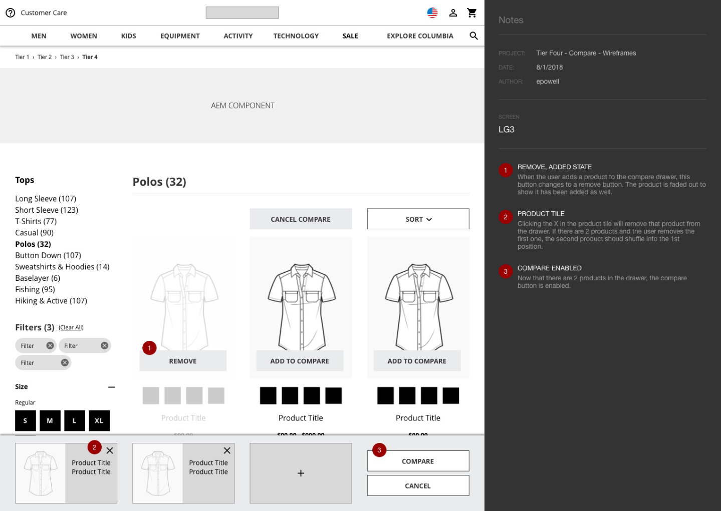
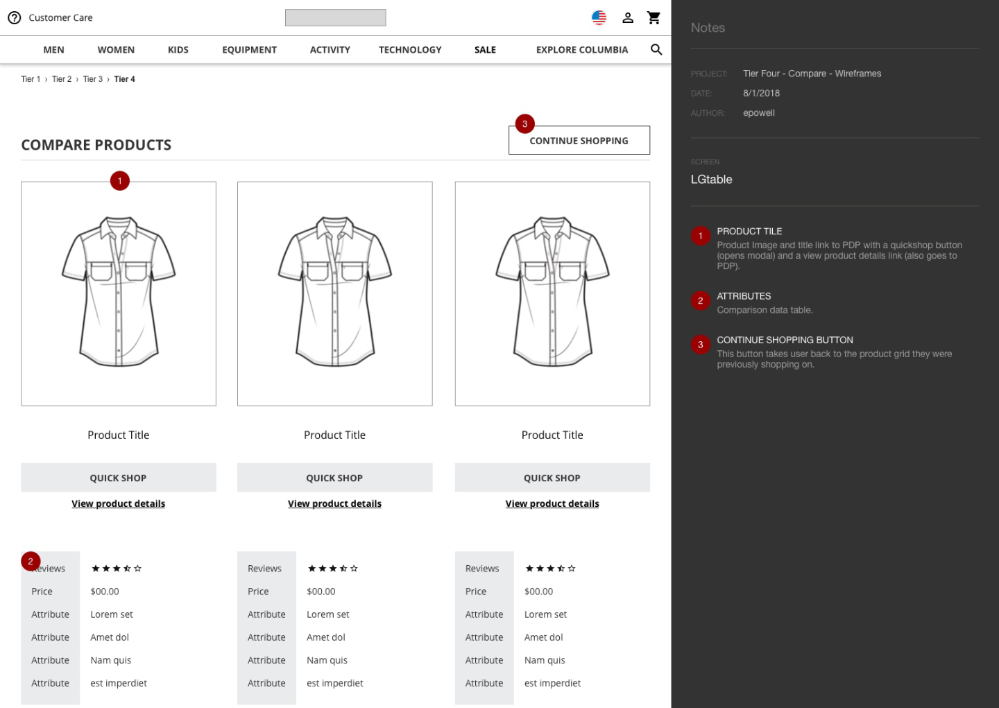
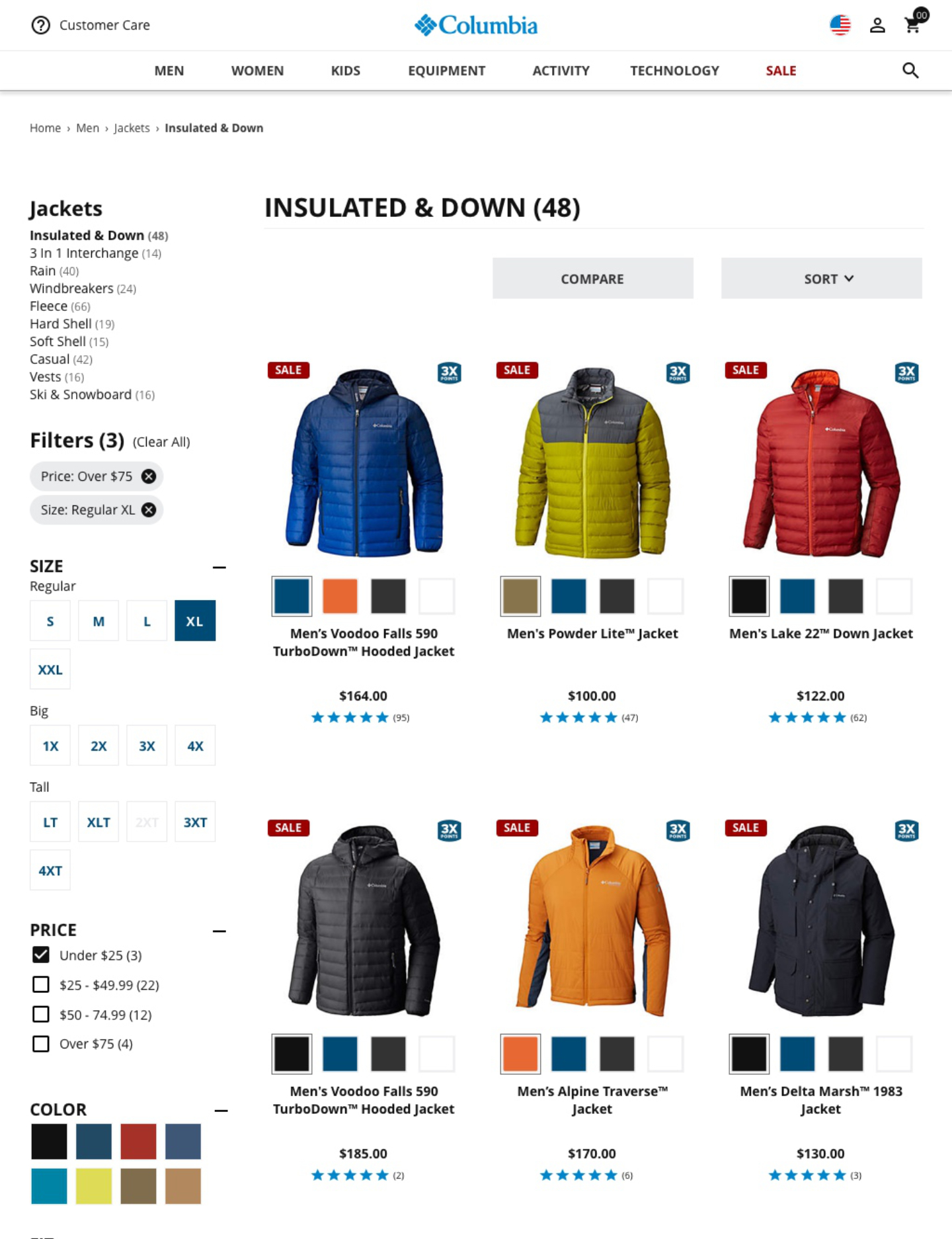
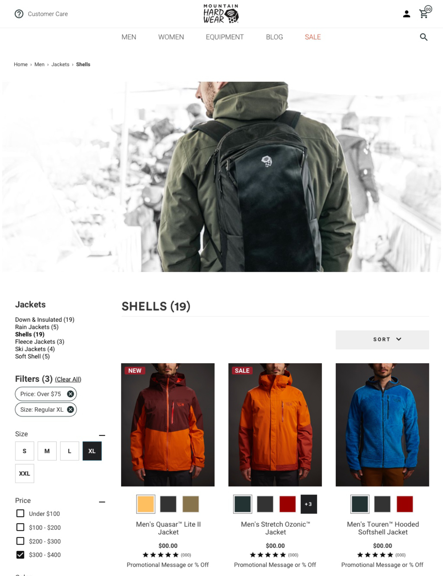
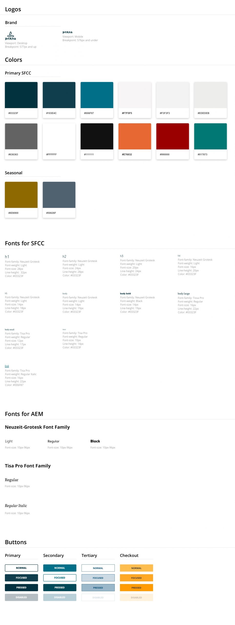
Armed with outstanding research, Icreatede a design system for the templates, components, and modules minus the brand look and feel to make layouts and screen designs more efficient. The team and I started delivering fully annotated documents to engineering to build out the templated designs and establish common elements. As these elements were perfected and approved, style overrides were applied in sketch for each brand.
- Date: July 30, 2020
- Company Columbia Sportswear
- Role Sr. UX/UI Designer
- Platform iOS, Android, Web


