
Nike Sport Research Lab, Form
Elite running science, made simple for athletes* and effortless for the team delivering it.
*Nike refers to its consumers as "athletes," in keeping with Nike's brand language. That terminology carries through this case study.

Overview
Context
NSRL Form is a face-to-face running consultation built by the Nike Sport Research Lab, a research group with 40+ years of sport science history. A runner does a 2-minute treadmill run while six cameras collect 150+ data points across their body, reduced to six core movement metrics, then walked through with the runner in a roughly 15-minute consultation covering what to work on, which exercises help, and what footwear fits their movement pattern.
I started as contract lead designer on the athlete-facing consultation screens. That relationship grew into more than two years of continuous ownership: iterating each operational tool, and supporting international rollouts to Belgium, Germany, China, the UK, and Japan. Over that time, the tools running the service, appointments, check-in, run capture, consult, camera calibration, and settings, evolved separately from each other. Eventually, that separation became the challenge: multiple fragmented tools, each needing its own separate update and testing cycle every time something changed, with very little shared athlete context between them.
That was the problem we set out to solve with Form System Control App, a single iPad-based tool that handled the entire service in one place: checking athletes in, capturing the run, running the consultation itself, and calibrating the camera system. It became one app, structured around the steps of the service rather than the old tool boundaries.
A direction for Form System Control App already existed before I took it on: requirements, jobs-to-be-done, even a working prototype. Rather than build to that spec as-is, I set most of it aside and designed a new structure, workflow, and visual system from the ground up, working closely with Nike's Podium design system to make it feel premium. That wasn't something I was specifically asked to do, it came from the trust the team and I had already built together over the previous couple of years.
My Role
What I designed
The consult experience, used after a run is completed and captured, both operator-facing and athlete-facing
Athlete-facing take-away run reports and follow-up communications
Appointment booking experiences
Form System Control App
What I led
Sole design ownership across a continuous 2+ year engagement, from original concept through iteration
The decision to restructure Form System Control App around the actual service flow (Check-In → Capture → Consult), with Calibration and Settings as separate utilities rather than steps in the core flow, instead of the multiple legacy tools it replaced, a different direction than the original product management concept
Design support for international rollouts across multiple markets
NSRL had no shortage of data. The challenge was moving from data to insight
Nike's NSRL Form running consultation, and the operational tools running it, evolved separately over more than two years. By the time I was deep into the relationship, four disconnected apps, Consult, Camera Control, Calibration, meant operators had no shared context, and appointments and check-in had become the most visible failure point in the whole service.
My contribution went beyond the interface. I was invited to work a Form event myself, and what I saw in appointments and check-in that day became the evidence behind the app's entire architecture, not just one feature. A direction already existed before I took this on, requirements, a jobs-to-be-done document (product's write-up of what the tool needed to accomplish and for whom), even a working prototype, but I set most of it aside and rebuilt the structure myself. Nobody asked me to go that far, it came from trust already built with the team over two years. I also used this project to bring AI into my real production workflow for the first time, prototyping directly in Cursor rather than handing off specs to be built.
The original consult experience already has proof behind it: an NPS of +82, in a range most consumer products never get close to. Operator and product feedback on the new app has been positive from the people who'll actually run it.
Keep reading below for the full story, the field research, the design decisions, and the design screens.
Design Problems
A sport science team ready for design
NSRL Form's early experience came out of a sport science research team deeply skilled in biomechanics and running science, and by the time I joined, they'd recognized it was time to bring in dedicated design support. The underlying science was already strong, the opportunity was to bring that same level of care to how it felt to use.
Intense data, meant for someone with no science background
A runner's consult surfaced complex biomechanical data, six metrics, drill recommendations, footwear guidance, and most athletes had zero background in sport science. The challenge was translating that complexity into something that felt personal and motivating instead of clinical.
It needed to feel like Nike, and like NSRL, at the same time
The consult experience, take-away reports, and follow-up communications needed Nike brand polish, clean and premium. NSRL itself is something special too, direct access to Nike's own sport science lab is exclusive, and the experience needed its own distinct identity within the Nike system rather than standard Nike branding applied uniformly.
The operational side was fragmented
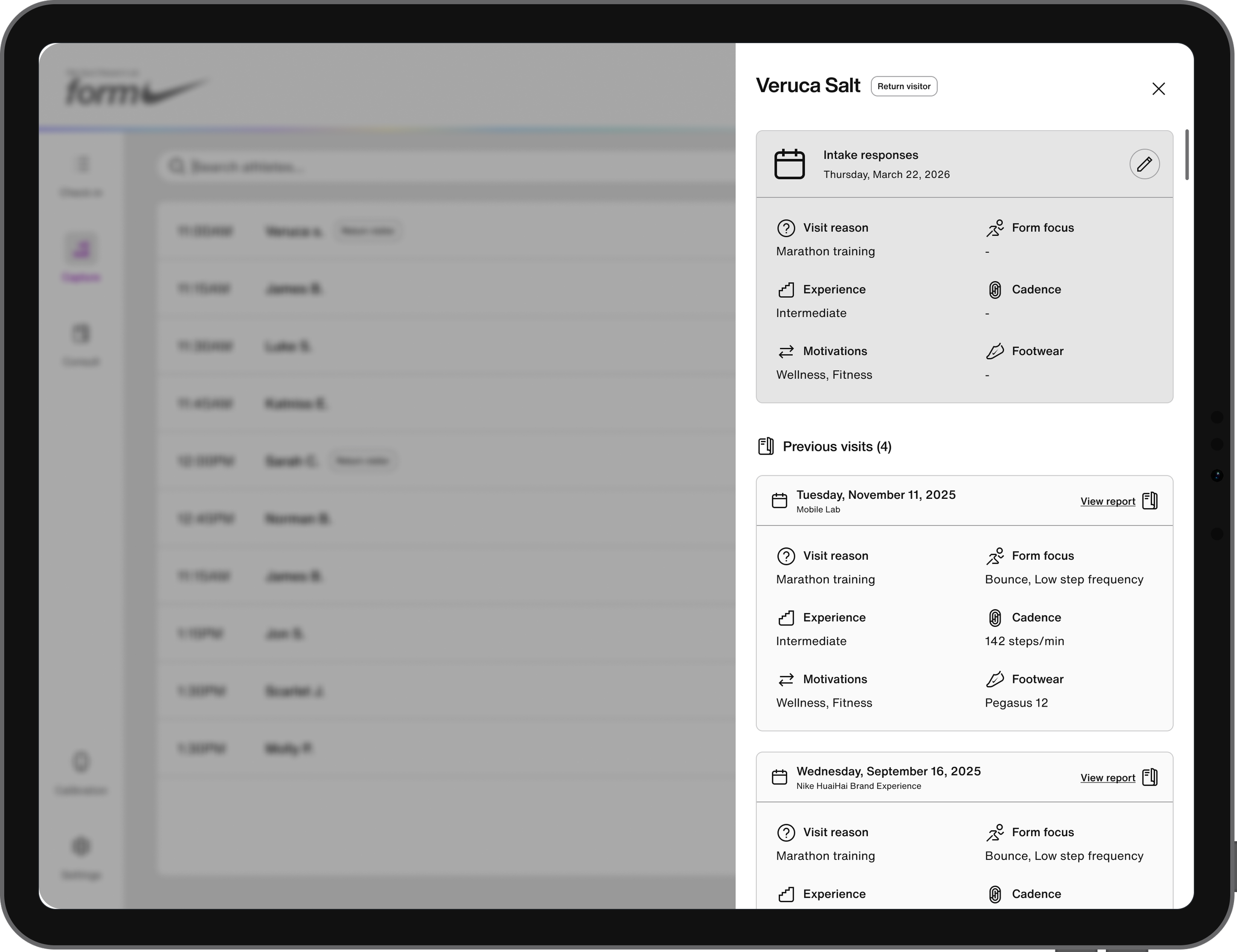
Operators ran the actual service, appointments, check-in, run capture, consult, and camera calibration, across multiple separate tools: consult, camera control, and Waitwhile. Each app deployed independently. The consult app was always built to show a runner their results, but it was never built to surface an athlete's profile context: their running experience, motivations, or why they'd come in that day. Operators had the data from the run itself, but no sense of who they were serving beyond that.
I saw this fragmentation firsthand
I was invited to work a Form mobile lab event, spending time in the check-in area and also observing runs and consults throughout the day, taking notes as I went. About half the people I helped struggled just to scan a QR code and sign in. What was meant to be a simple two-step check-in often turned into several rounds of hands-on help before someone made it through, and I could see the relief on their faces once they finally did. Behind the scenes, the queue itself was being tracked by hand, nothing told it when a run or consult had actually wrapped up, so the wait-time texts people got were often just wrong.
Challenges
Honoring the science without overwhelming the athlete
Form's data collection is rigorous, every metric, every recommendation backed by research. That creates a tension: the people who did that work want it represented fully, but an athlete standing in front of a screen after a 2-minute run can only absorb so much before something valuable turns into noise. Every screen was a negotiation between honoring that depth of work and keeping the experience simple enough to motivate someone to change how they run.
One visual language, multiple surfaces
The same design had to hold up on a handheld iPad a few inches from someone's face, on a large-format TV across a room, and eventually in languages that didn't exist yet when the first screens were designed. It meant building something with enough clarity and hierarchy to survive translation, scale, and distance without losing what makes it feel considered.
Simplicity as the actual design challenge, not a given
The original direction for Form System Control App leaned toward more settings, more options, more configurability, reasonable asks from product, each one on its own. My job was less about answering those requests one by one, and more about constantly checking whether more control for the system meant less clarity for the person using it mid-service. Simple isn't the absence of effort, it's usually the harder design decision to defend.
Designing for one person, and for more than ten
Some Form locations run with a single operator managing every step alone, check-in, capture, consult, calibration. Others run with ten or more, each handling a piece of the flow. The same app needed to feel simple and empowering either way, whether it was one person juggling everything or a larger team dividing the work. I'd already seen what happens when that balance is off: at a field event, one person trying to run registration and check-in alone became a bottleneck fast, and I suggested splitting that role across two people to help.
First version run consult screens
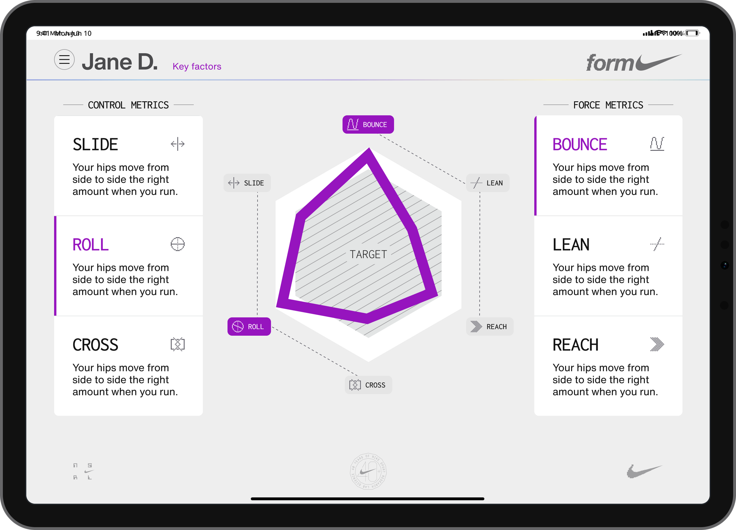
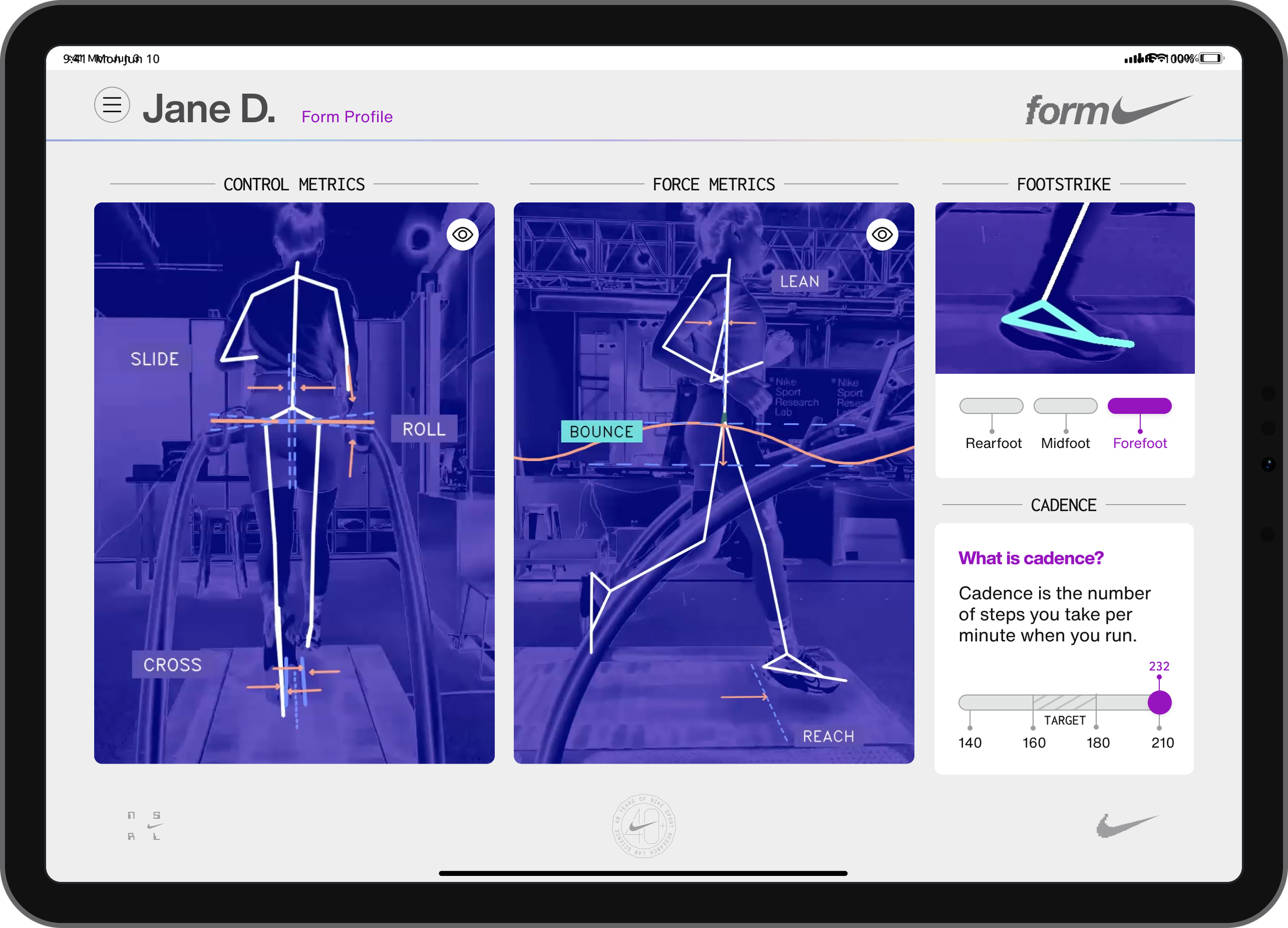
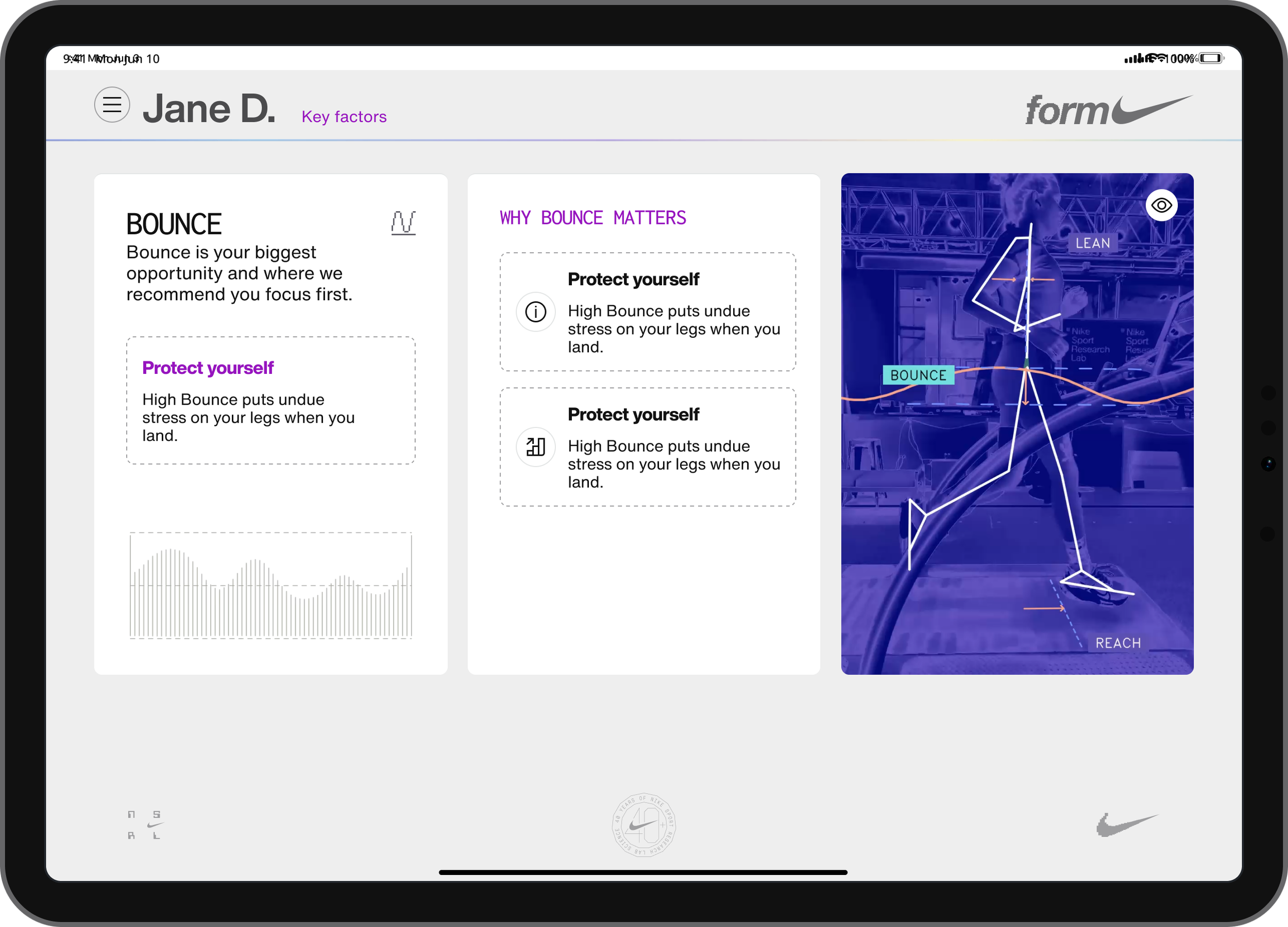
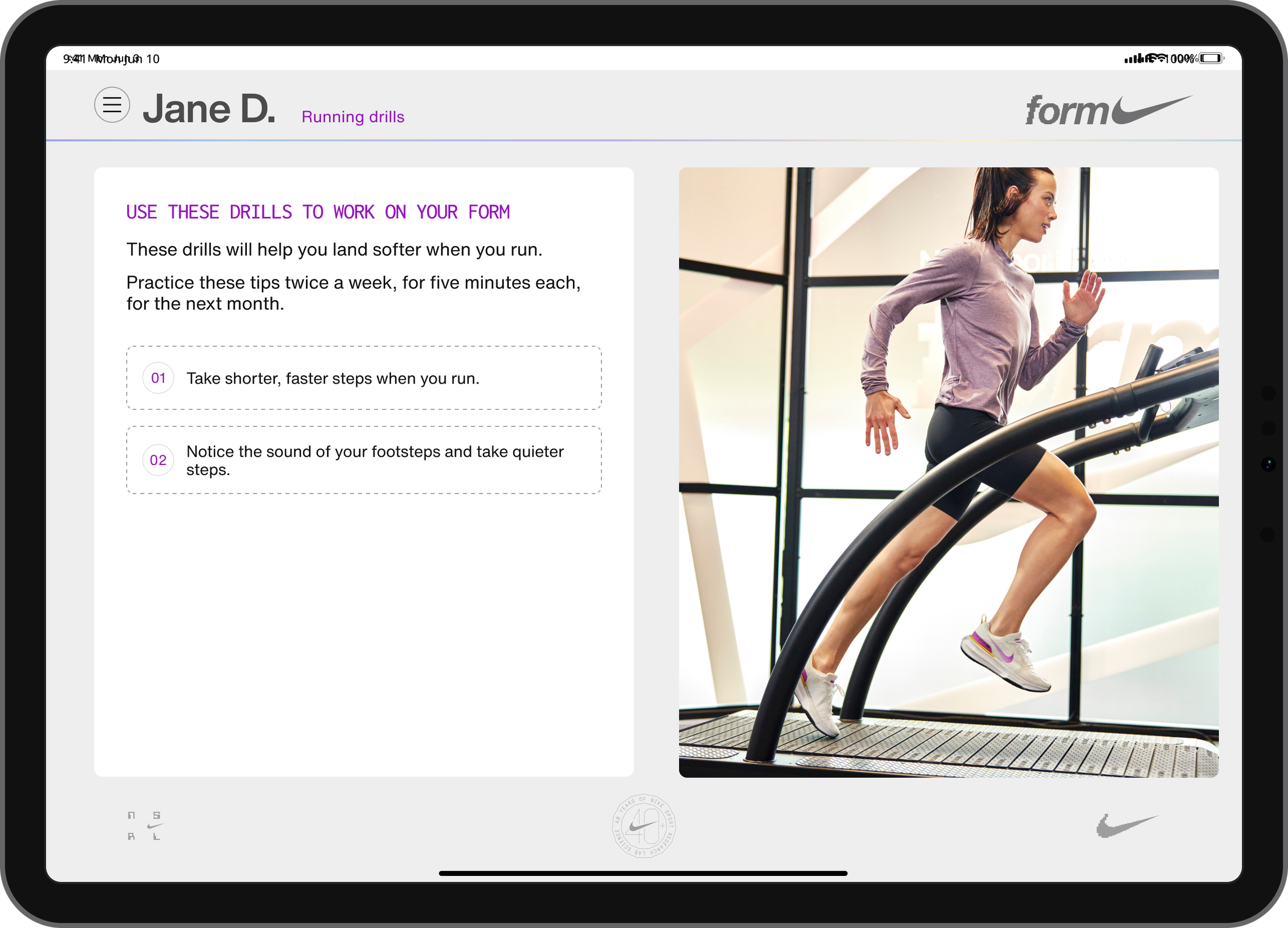
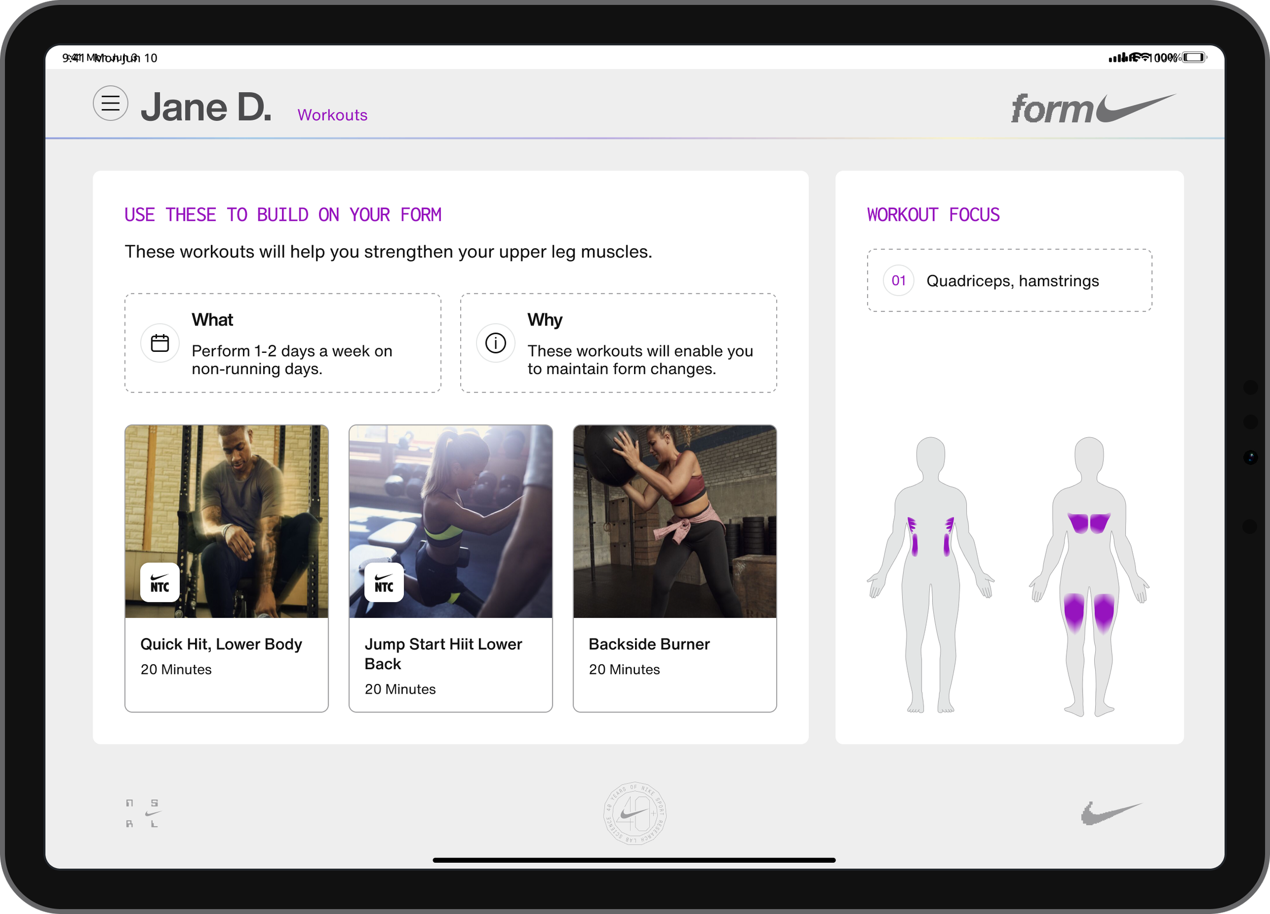
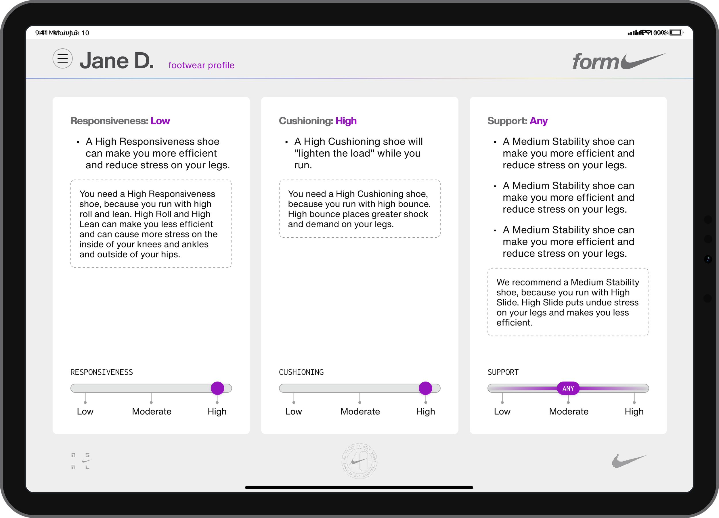
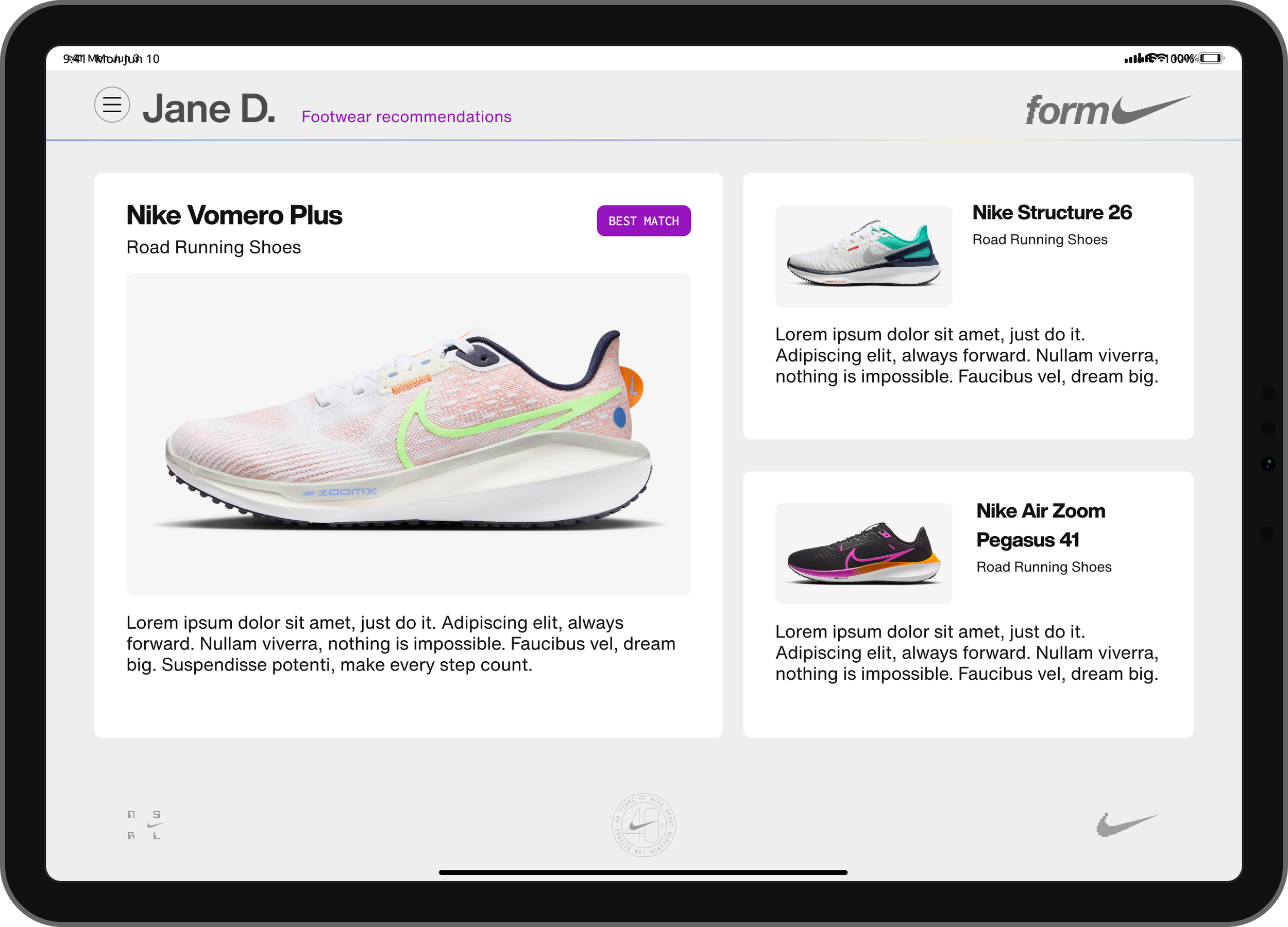
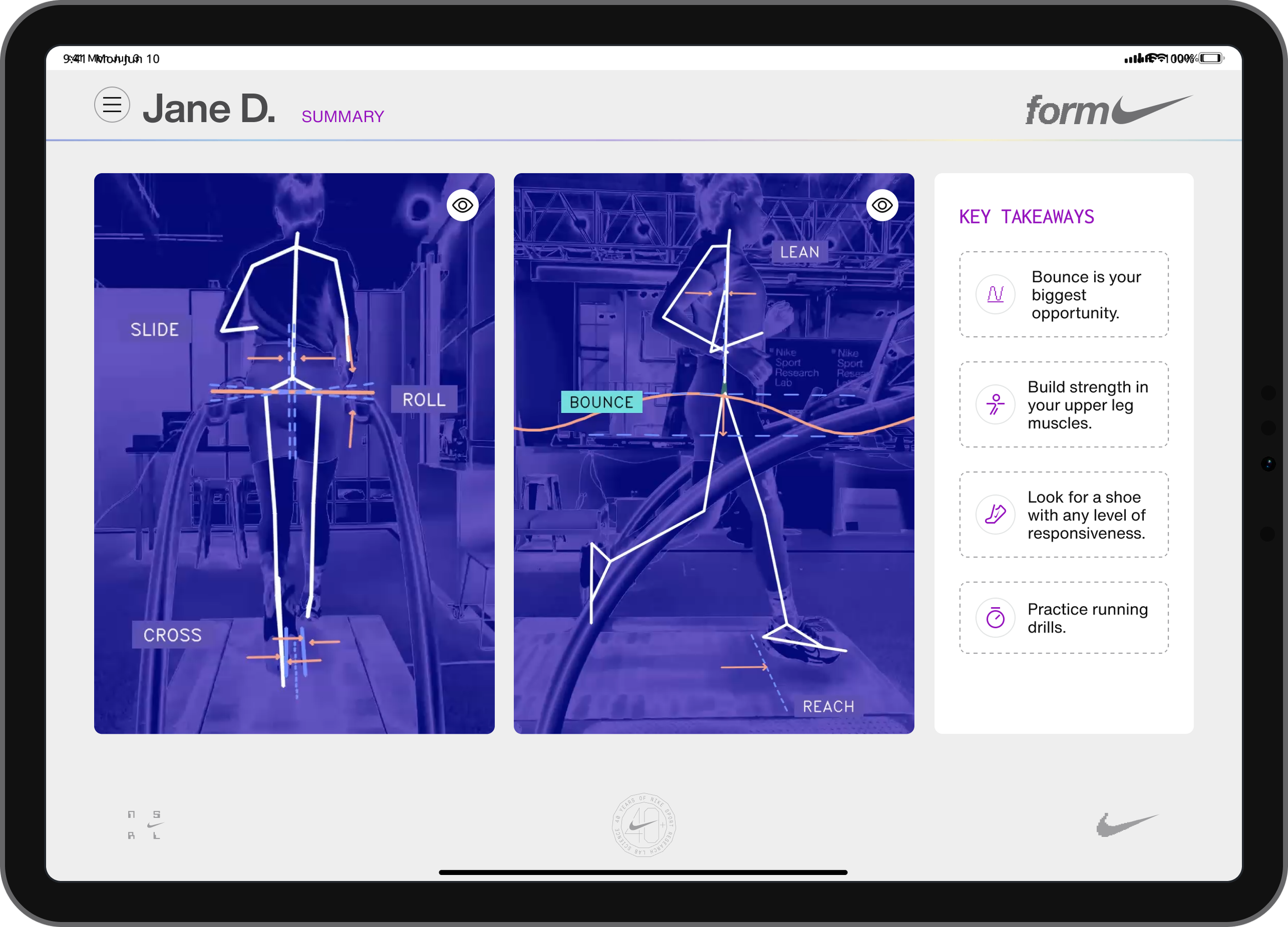
Presented to athletes after their run capture via an iPad, mirrored to a large-format TV so the athlete and operator can review results together. The six core metrics appear as a radar chart, walked through step by step with drill recommendations and footwear guidance tailored to the athlete's profile.
Solutions
A consult that reveals itself in steps, not all at once
Instead of one dense screen carrying all six metrics and every recommendation, the consult experience is sequenced: what happened during the run, what it means, what to work on, what shoes fit. Each step comes before the next, rather than all at once. The hexagon visualization gives the six metrics one shape to look at instead of six separate numbers.
A visual identity that's Nike, and distinctly NSRL
The consult experience, take-away reports, and follow-up communications carry Nike's brand polish, but with a look reserved for NSRL specifically, distinct from the rest of Nike's retail touchpoints.
Take-away reports and follow-up communications, built to be revisited
Post-service survey feedback made the gap obvious: people wanted to see their results again after they'd left, a video clip, a printout, something to hold onto. The take-away report and follow-up communications were designed for that specifically, giving an athlete a way to keep what they learned instead of only hearing it once in the room.
An appointment booking experience that matches the rest of Form
Booking was its own design surface, not an afterthought bolted onto the consult experience, built with the same care and consistency as everything else an athlete touches.
Three principles carried the original Form design work: simplicity, scalability, and openness
Those principles shaped everything from the consult experience down to how take-away reports and communications were structured, a consistent design language rather than one-off decisions per screen. Design didn't stop at handoff, either. I worked directly with development teams through implementation to make sure the detail held up in the built product, not just in the mockups.
Designing inside a product I could actually use
I used Cursor, an AI coding tool, as part of my workflow, working in natural language prompts, pulling context from source documents and from existing screens through the Figma MCP, a plugin that connects Cursor directly to a live Figma file so it can read the actual designs instead of a description of them, and generating sitemaps and user flows through a similar FigJam integration, along with running documentation, status updates, and a changelog as the work progressed. The value wasn't just speed. Being able to use the product while I was still designing it exposed assumptions I would have otherwise carried for weeks, and let ideas move immediately instead of waiting on engineering to build something testable first.
AI amplifies skill, it doesn't replace it
Anyone can generate a screen with AI, get from a blank page to something tangible fast. What determines whether that output is actually good is the design judgment directing it, the kind built over years across different projects and circumstances. AI didn't replace that skill. It just gave it a faster way to show up.
Form System Control App, structured around the actual service
Check-In, Capture, and Consult became the app's core, mirroring how the service actually happens, with Calibration and Settings living as utilities alongside it rather than steps in the flow. That structure traces directly back to time spent working a Form event myself, invited by the team specifically to observe the service flow and bring back thoughts on it. I watched all of it, check-in, run capture, and consult, but the clearest gap was in appointments and check-in, and that's what shaped the architecture most directly. Built on Nike's Podium design system, a deliberate shift from the more NSRL-specific branding of earlier consult releases, since an internal operator tool benefits more from alignment with other Nike retail properties than from its own distinct identity. With a reference and refresher onboarding flow that works whether or not someone's been through formal in-person training recently, and modern UI patterns like side panels that keep an operator oriented without leaving the screen they're on.
An app that tracks itself, so operators don't have to
The Check-In screen carries this furthest: checking an athlete in, completing their run, and finishing their consult each automatically advances their status through the queue, and an undo action returns an entry to its exact origin list using stamped metadata instead of a generic "go back." It came directly from watching an event where a manually tracked queue produced wrong wait-time notifications and a chaotic check-in experience. The fix was designed to make that failure structurally impossible.
Onboarding
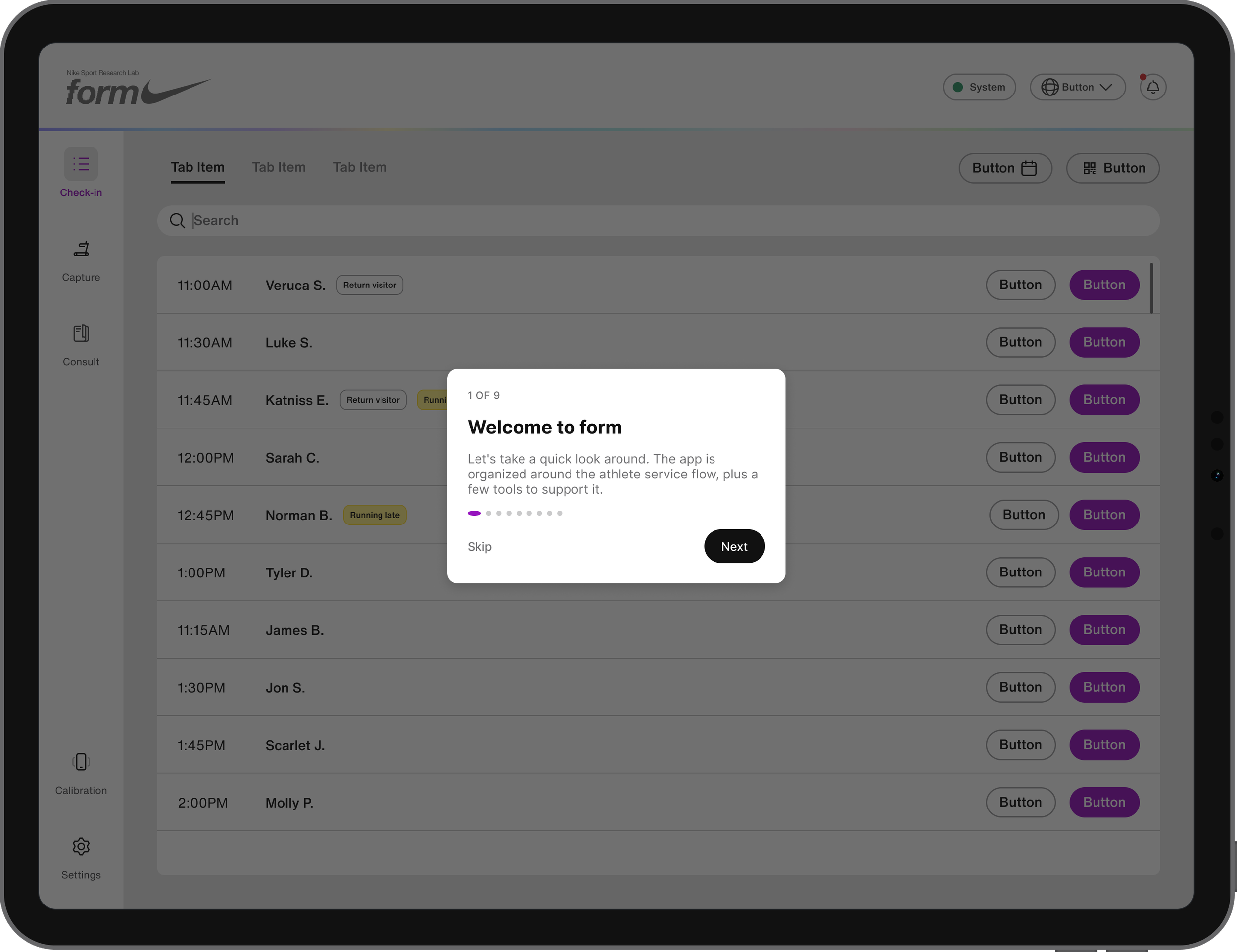
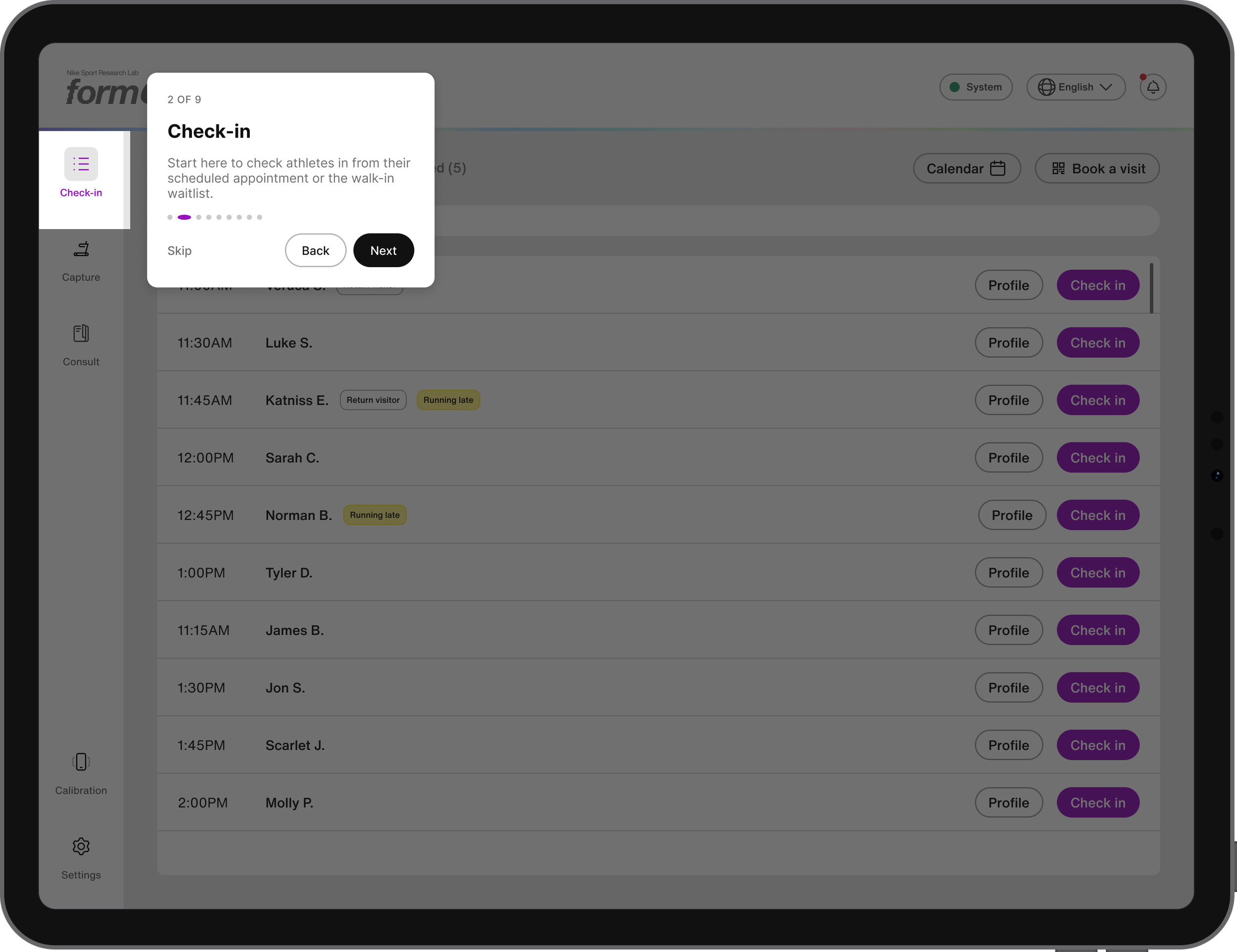
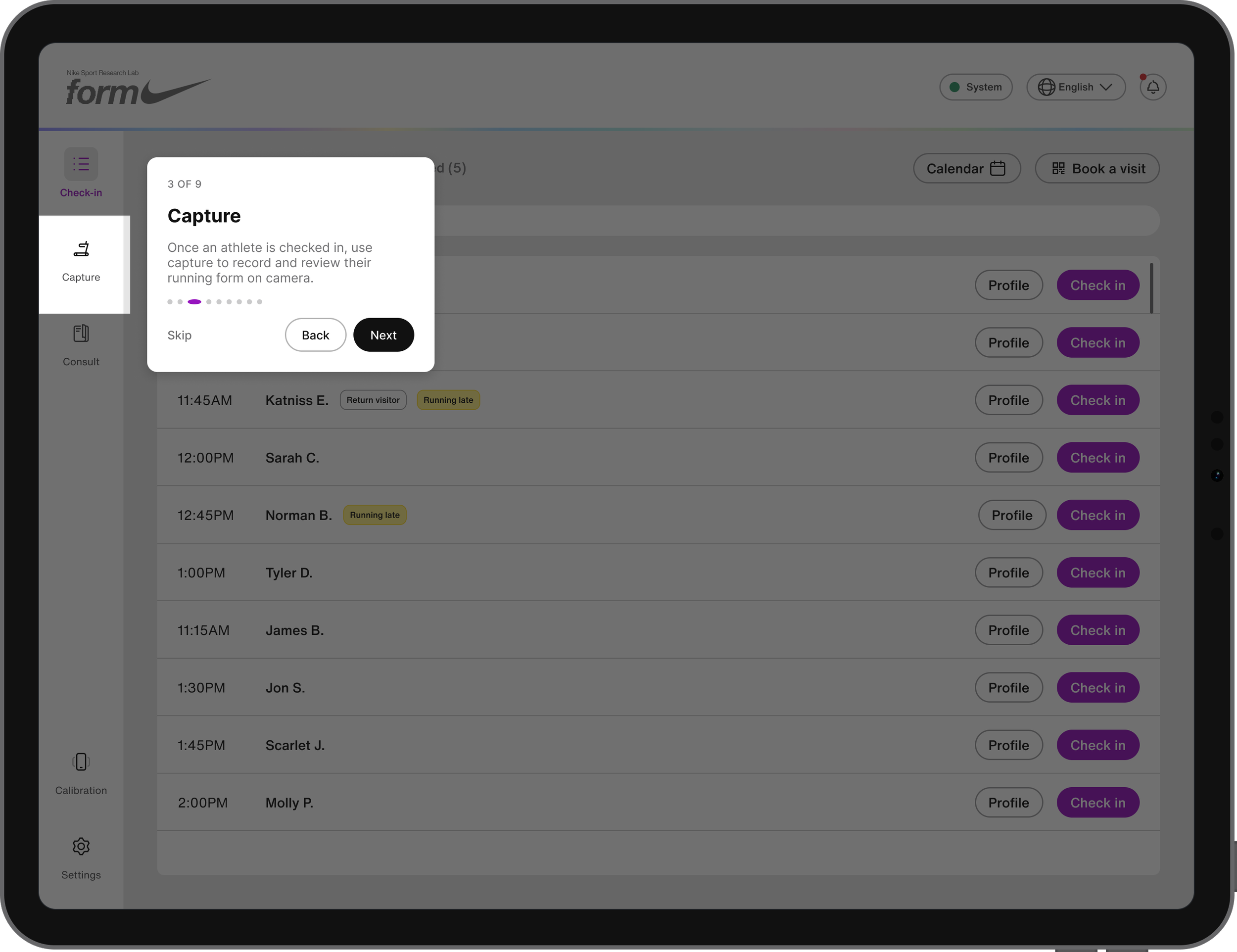
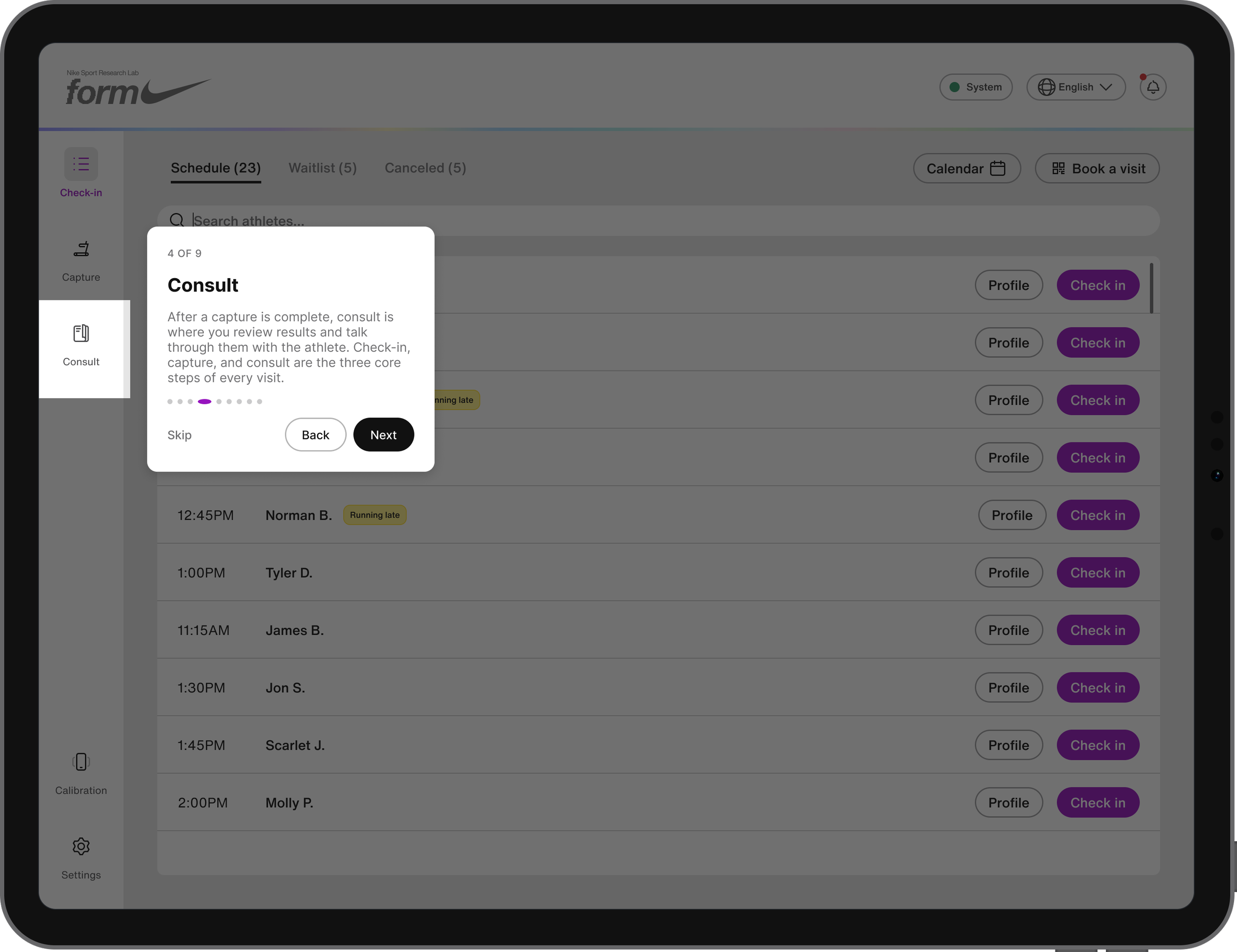
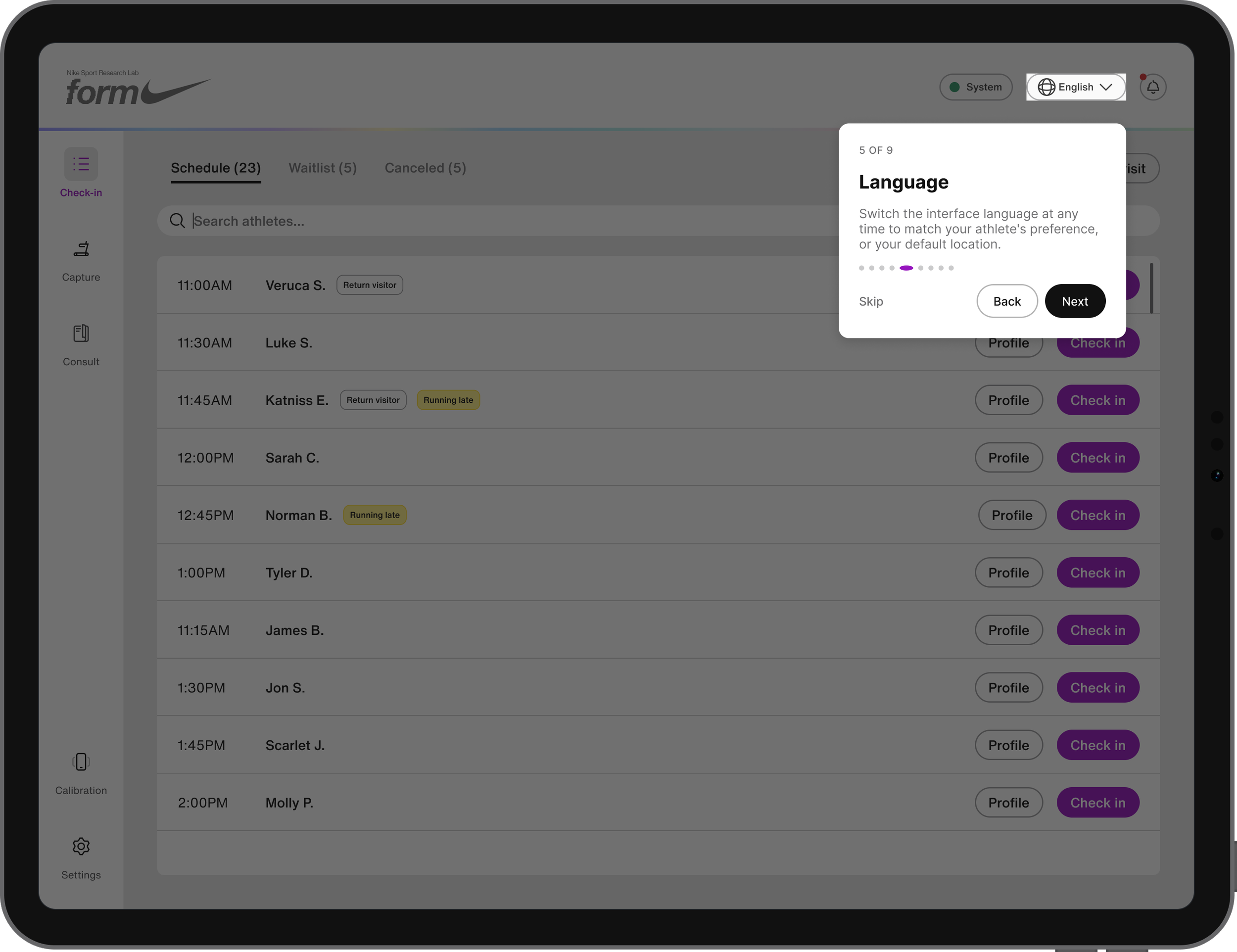
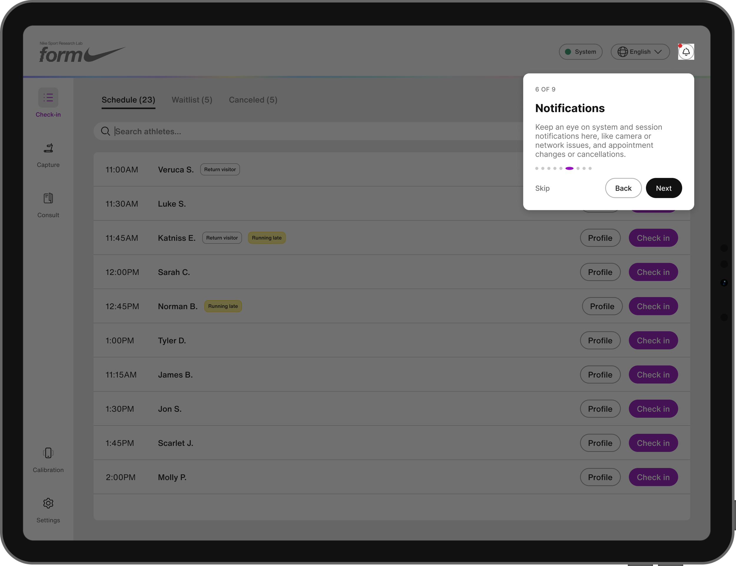
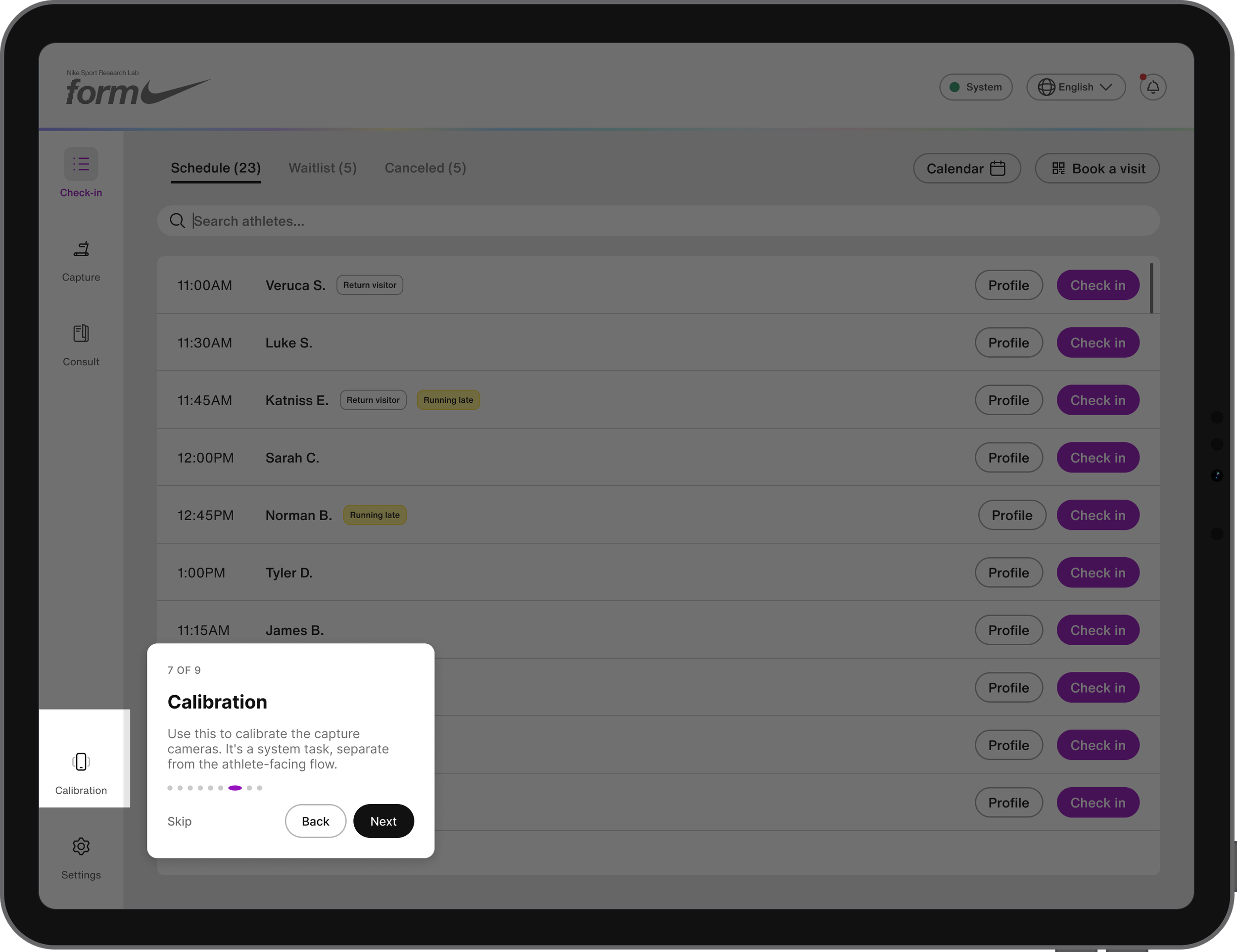
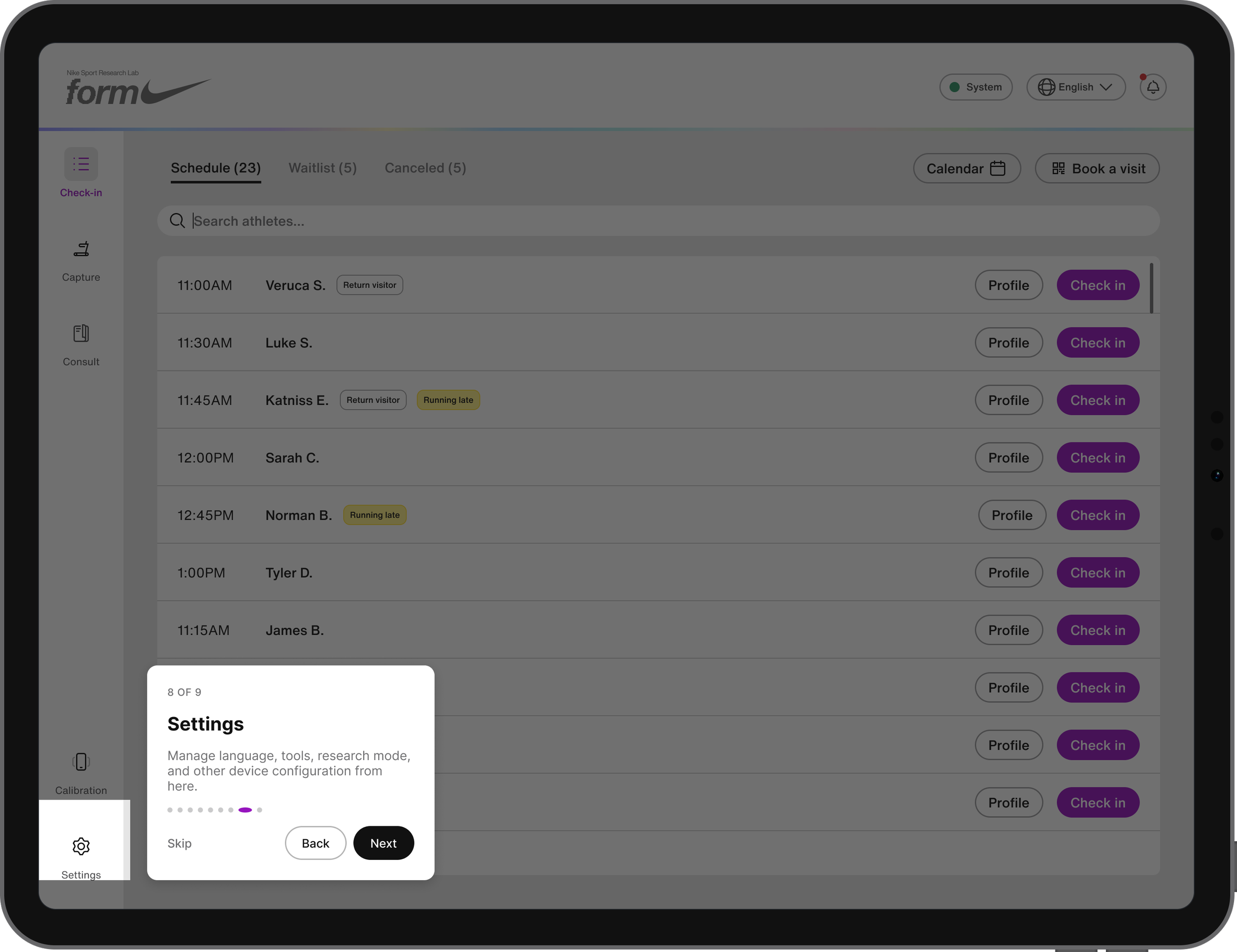
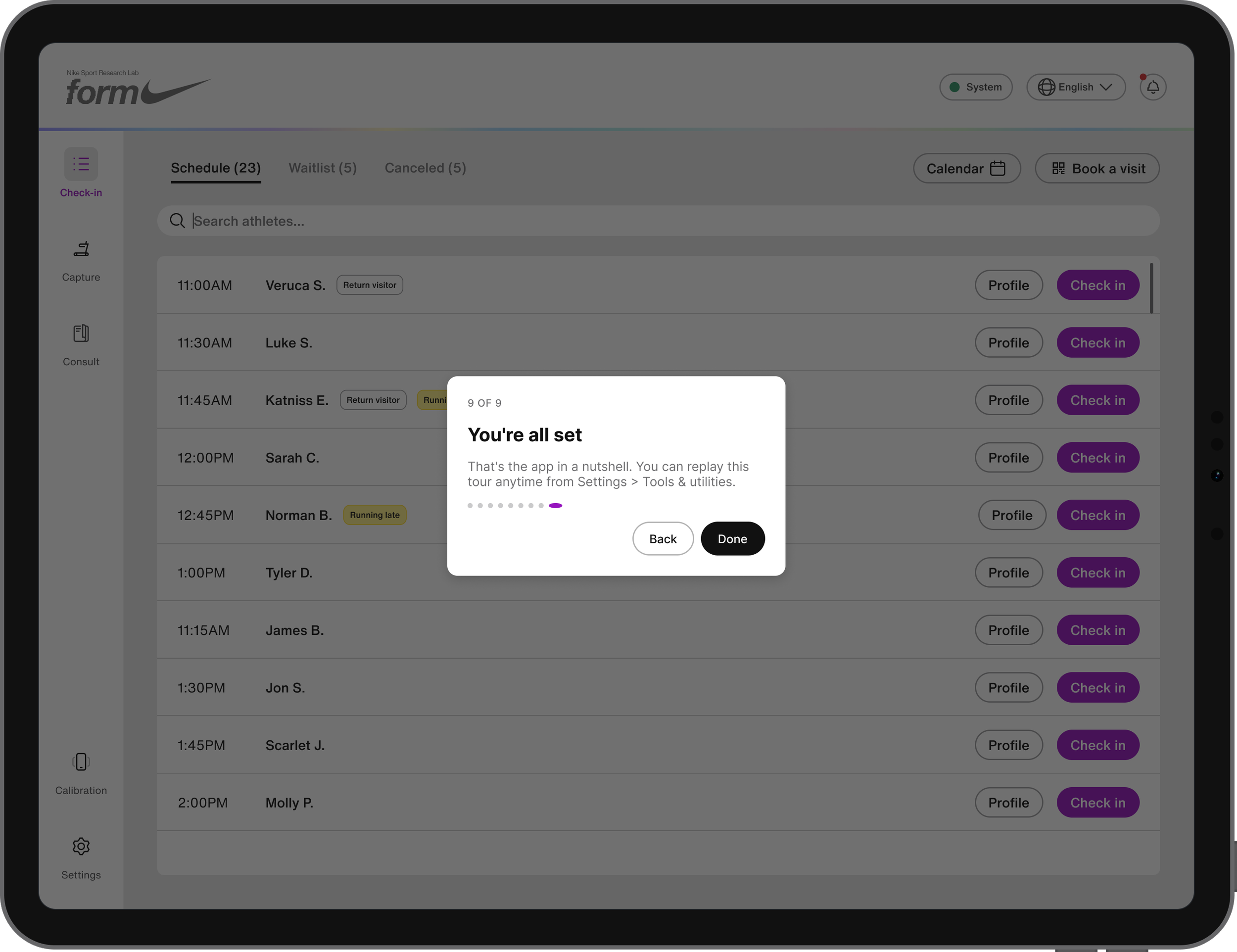
The app loading screen features an animated Form run shape, while the lower-left corner provides live visual feedback showing network, API, camera, and other connection statuses as the system comes online. In-app onboarding then walks new operators through the app shell, Check-In, Capture, Consult, calibration, notifications, and settings, for high-level orientation before their first shift. The tour runs automatically the first time, can be replayed anytime from Settings, and can be turned off entirely once operators are comfortable with the app.
Check-in
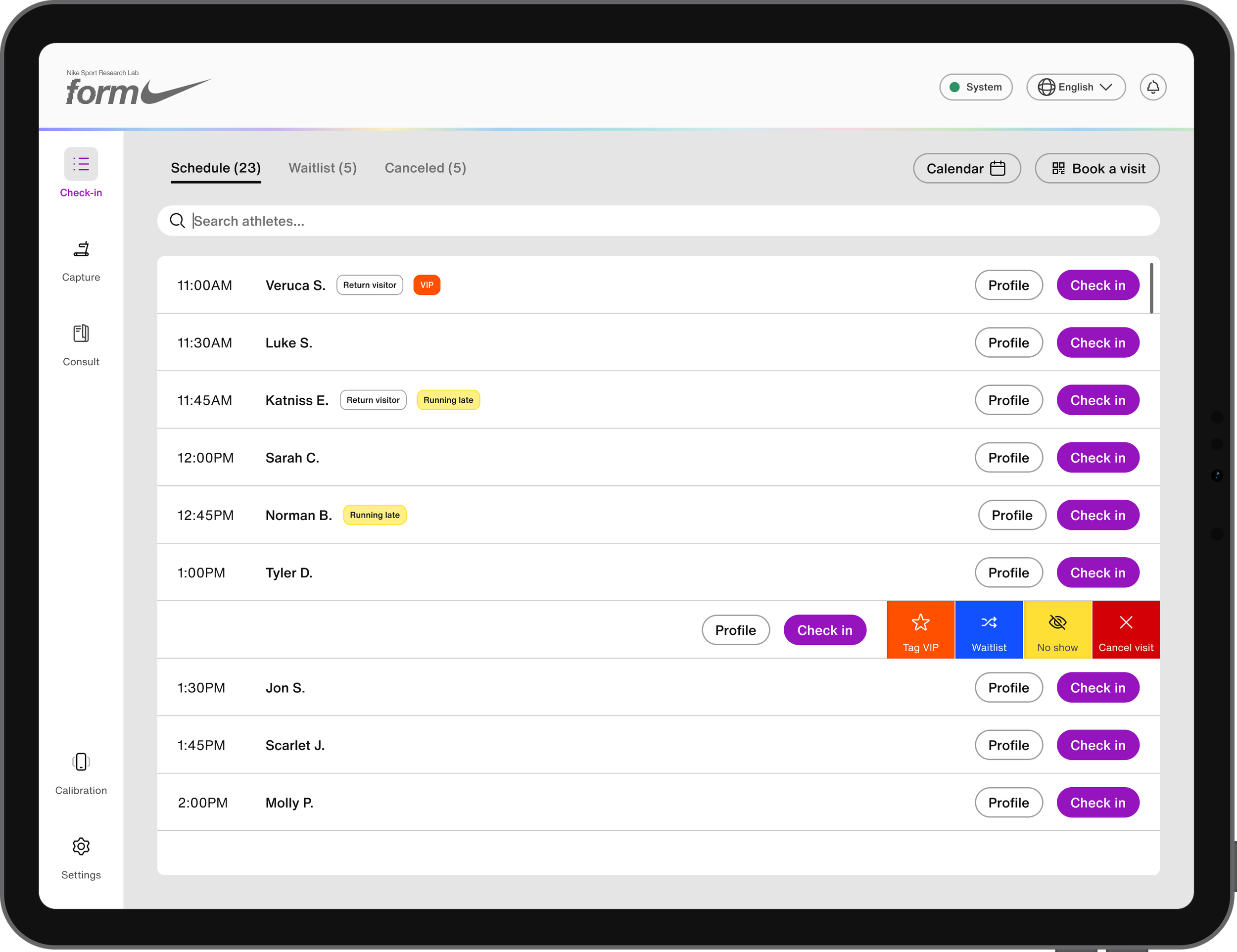
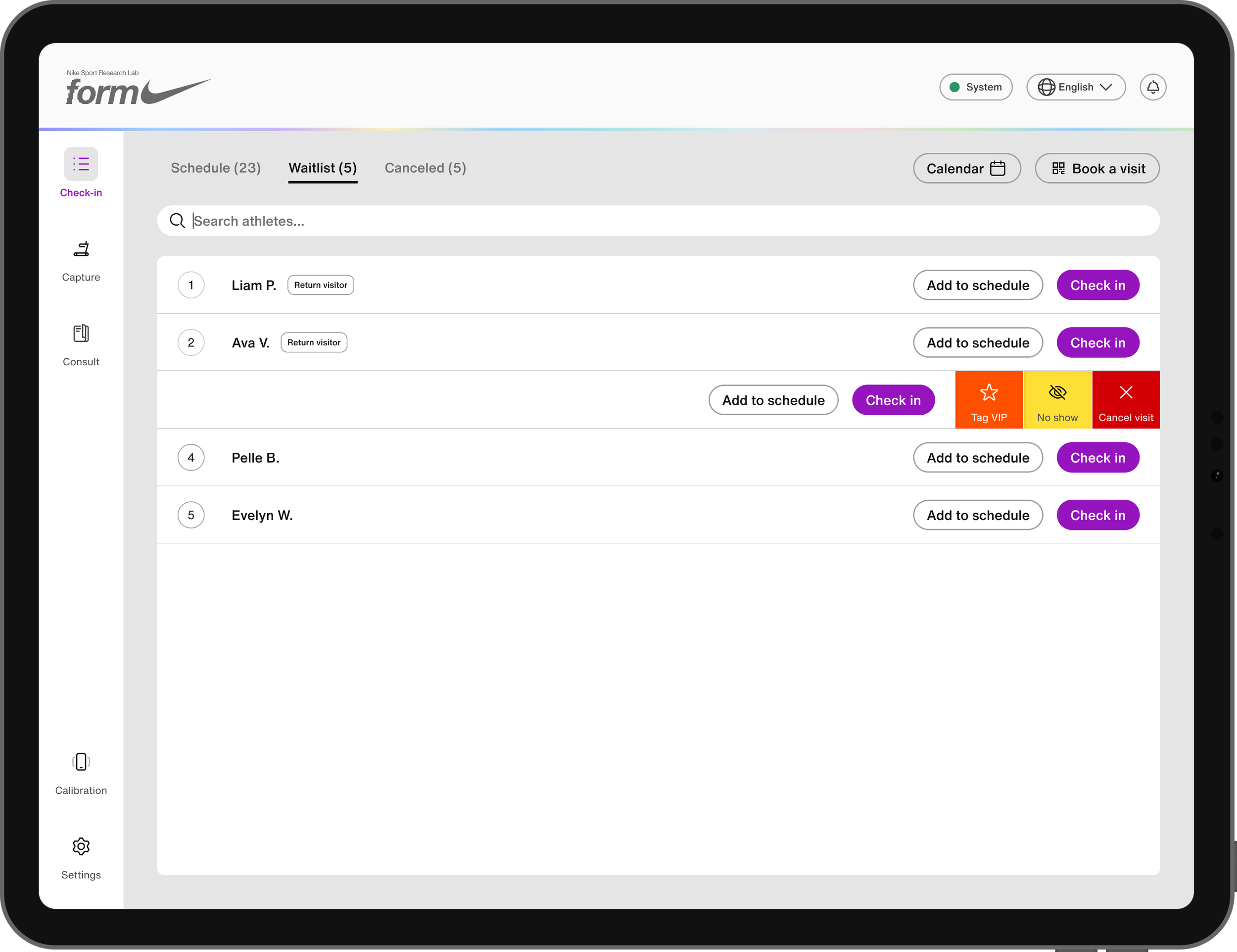
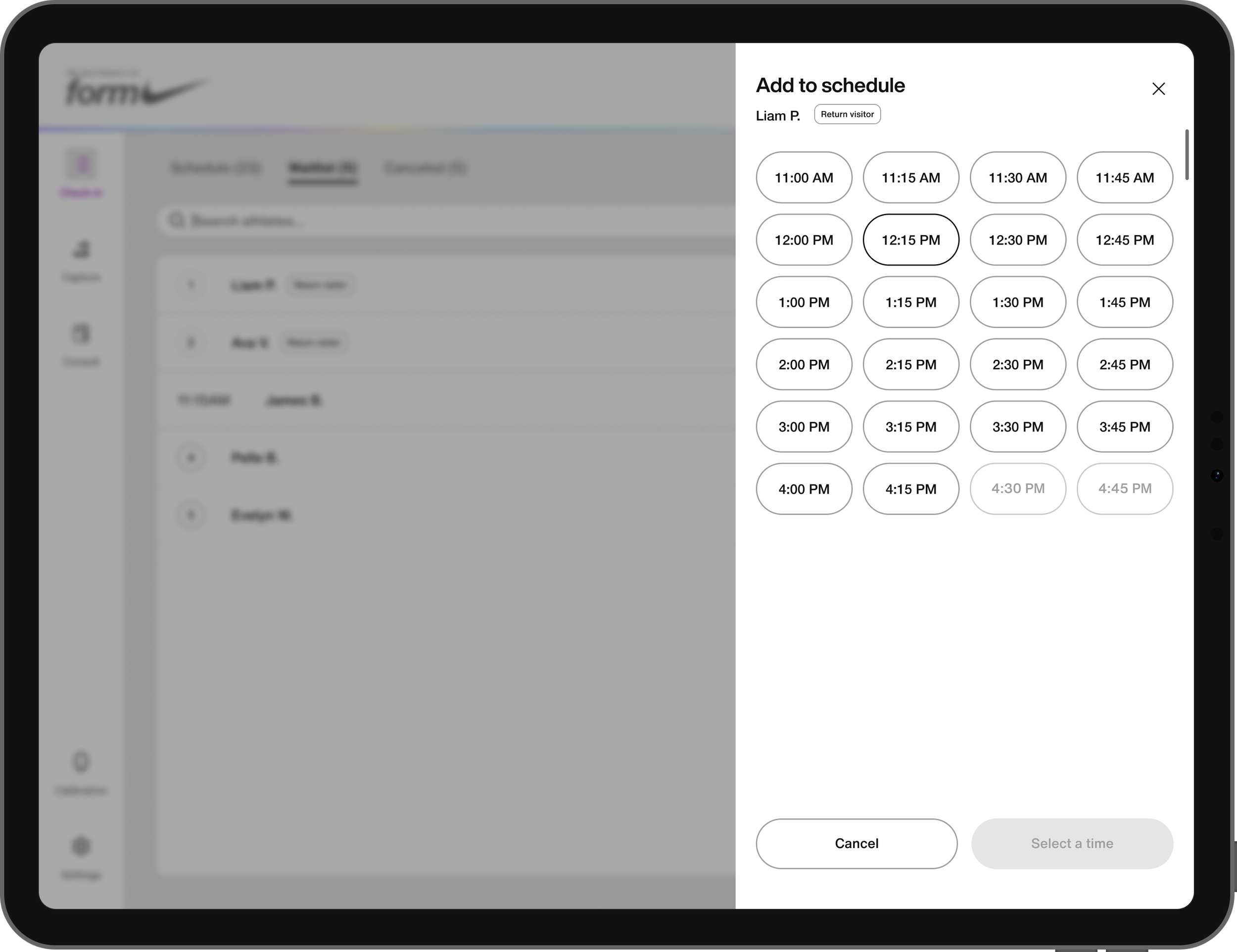
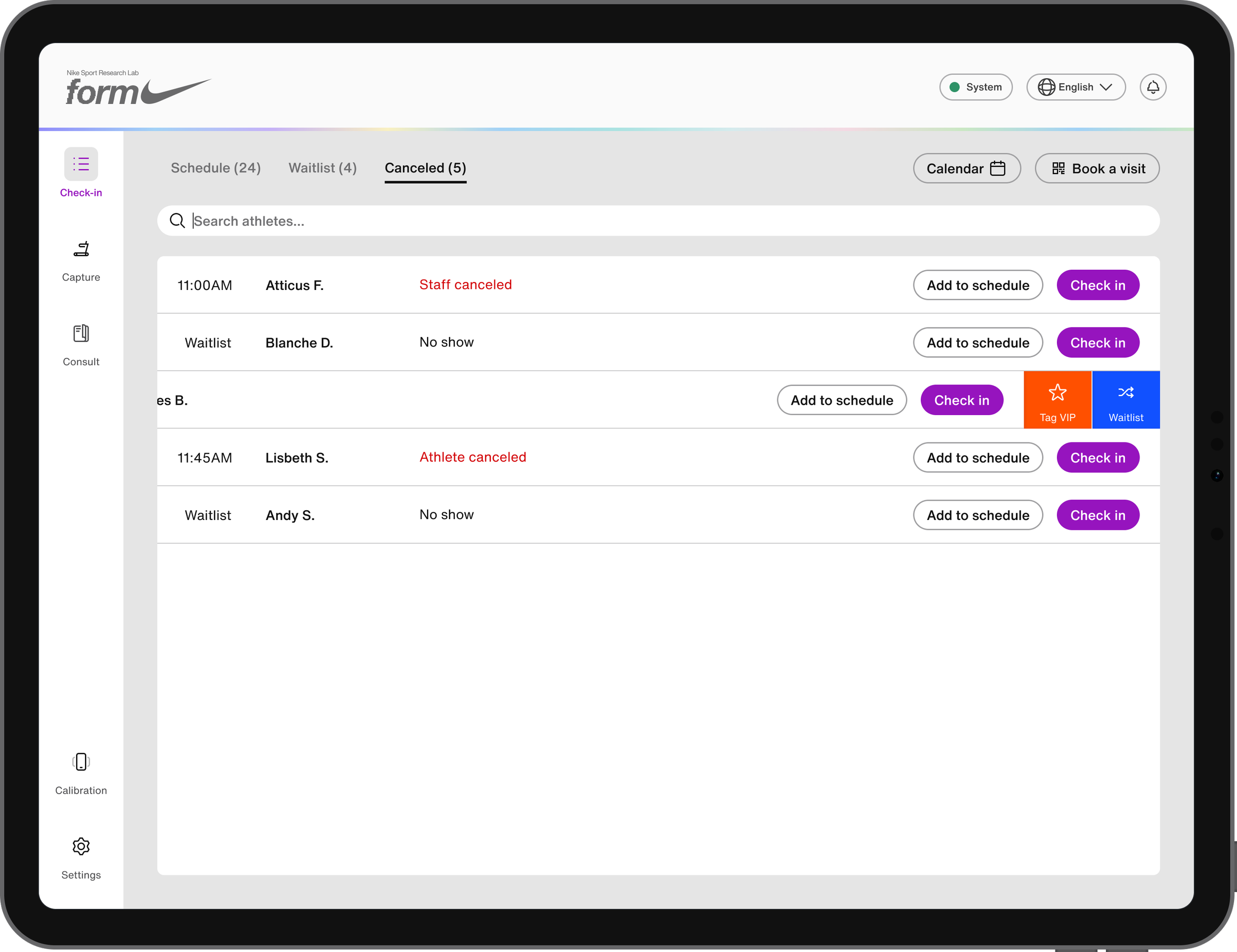
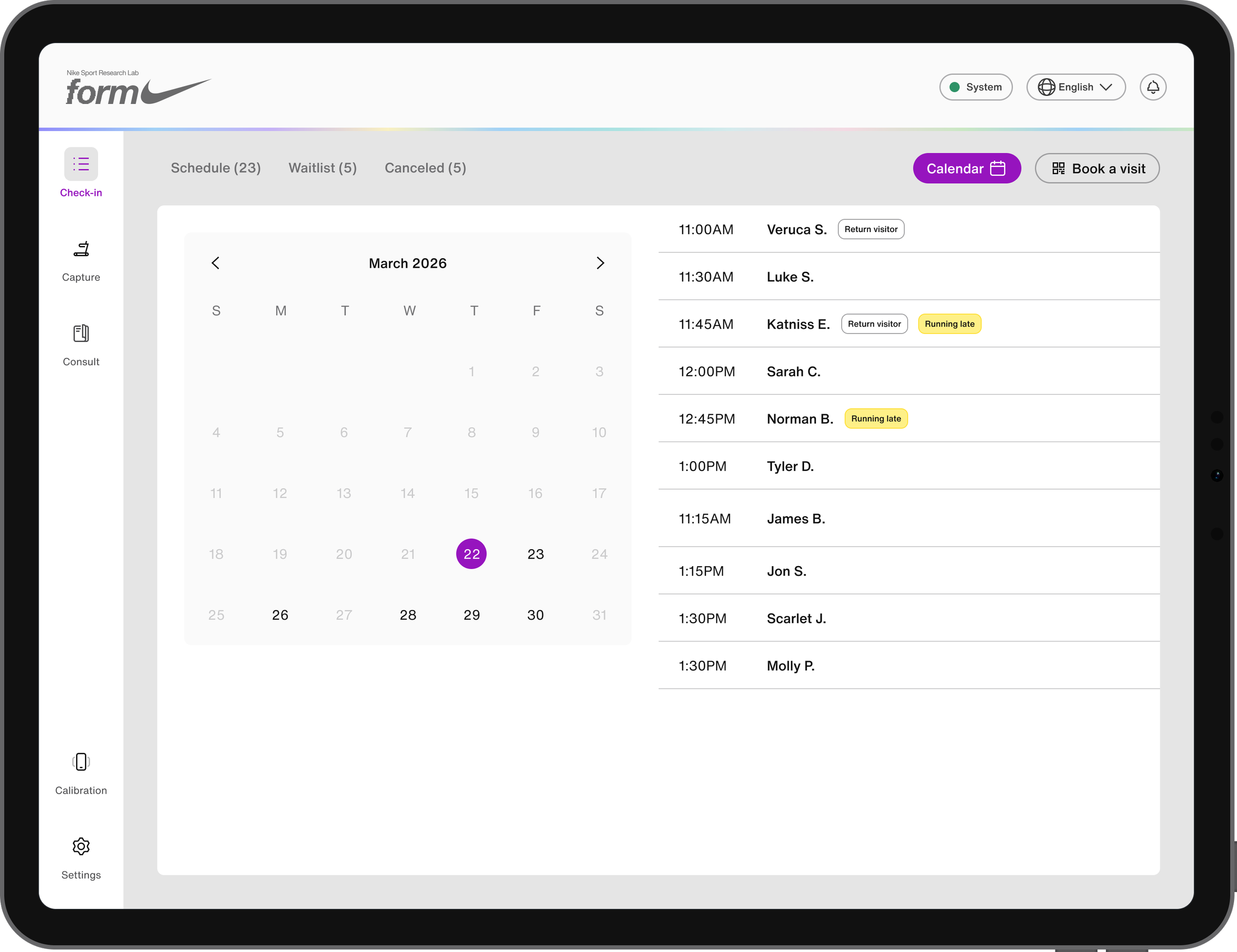
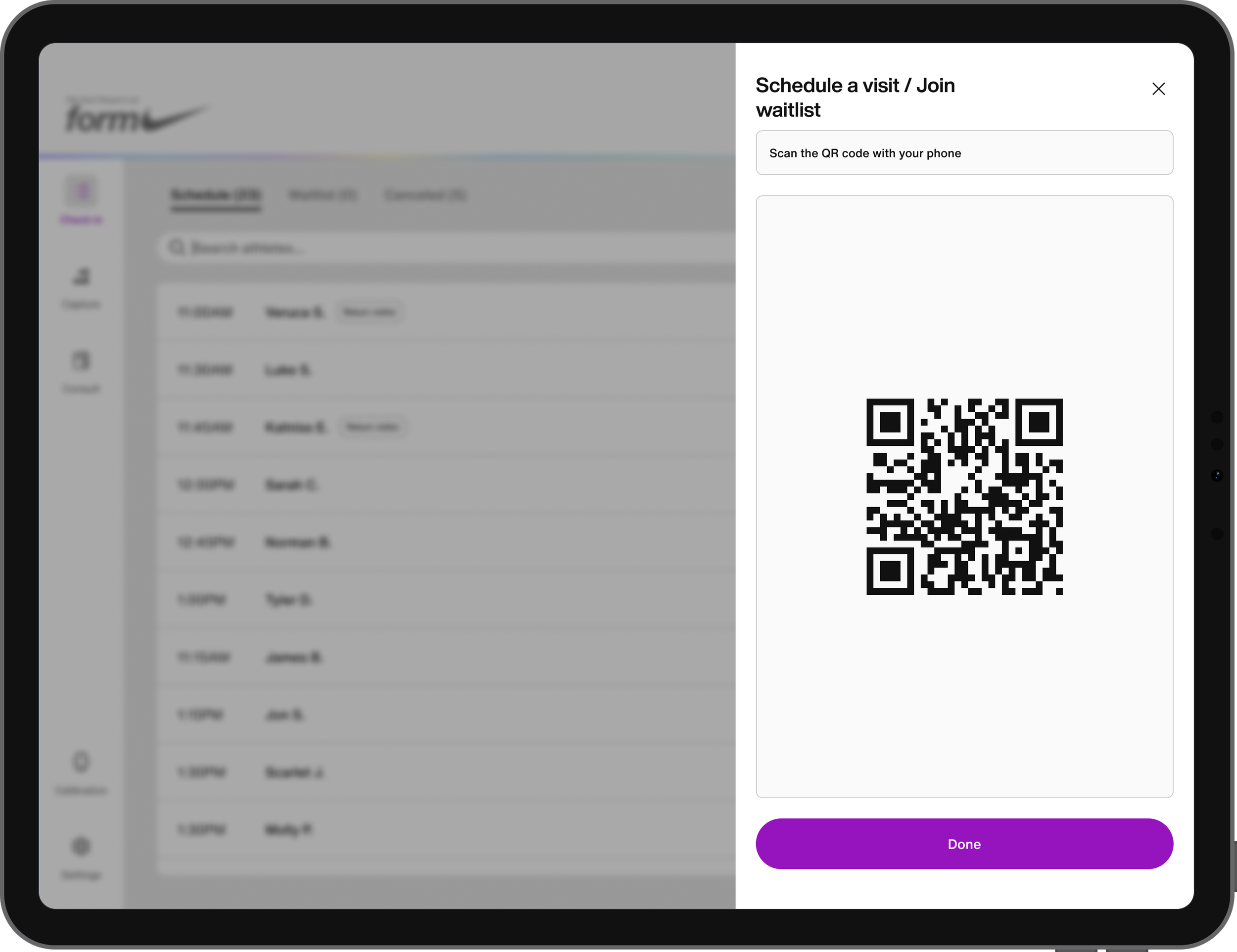
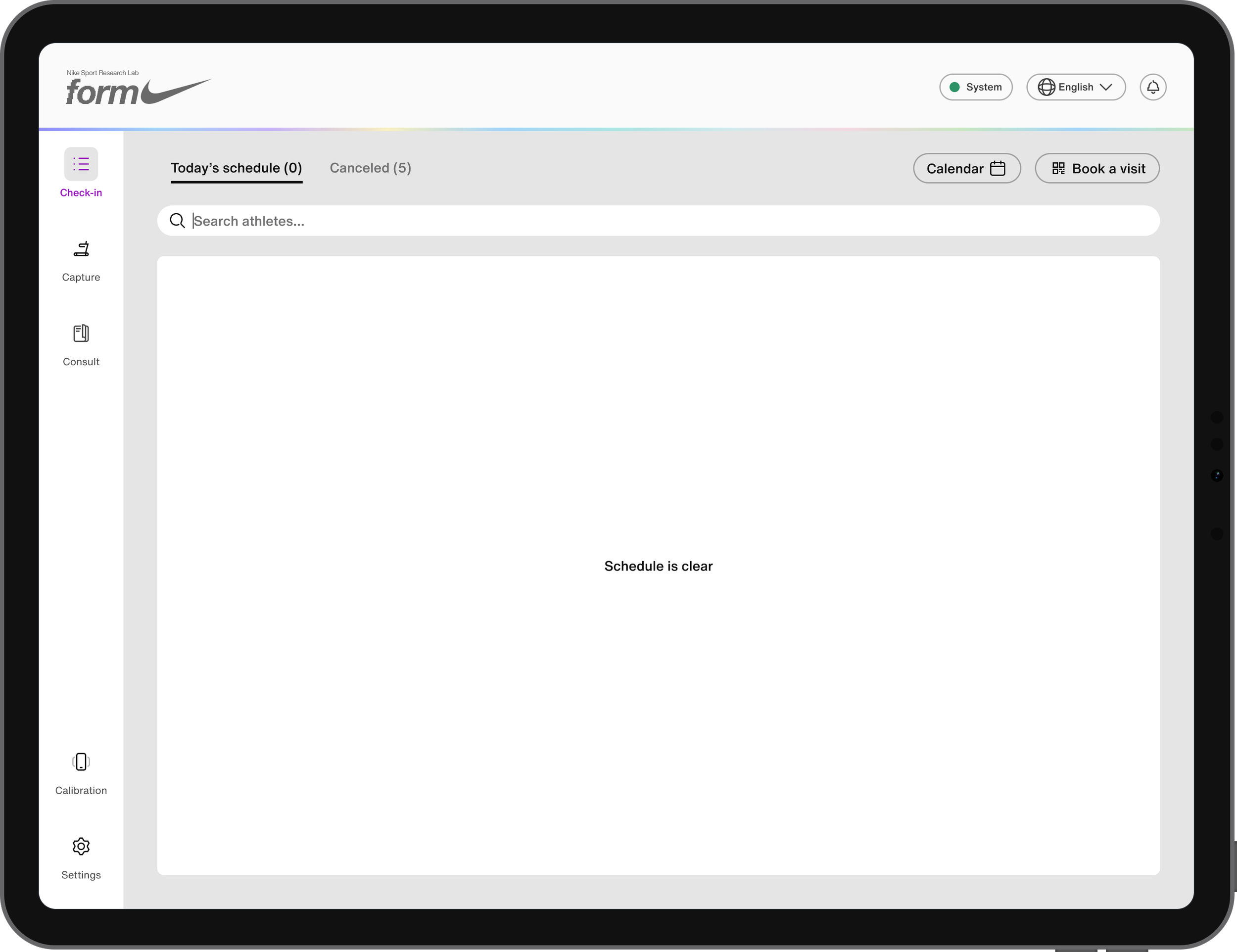
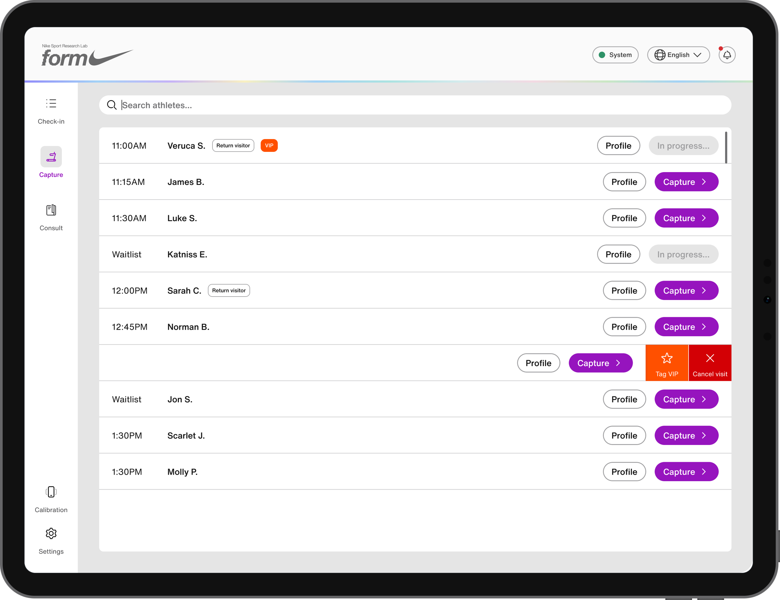
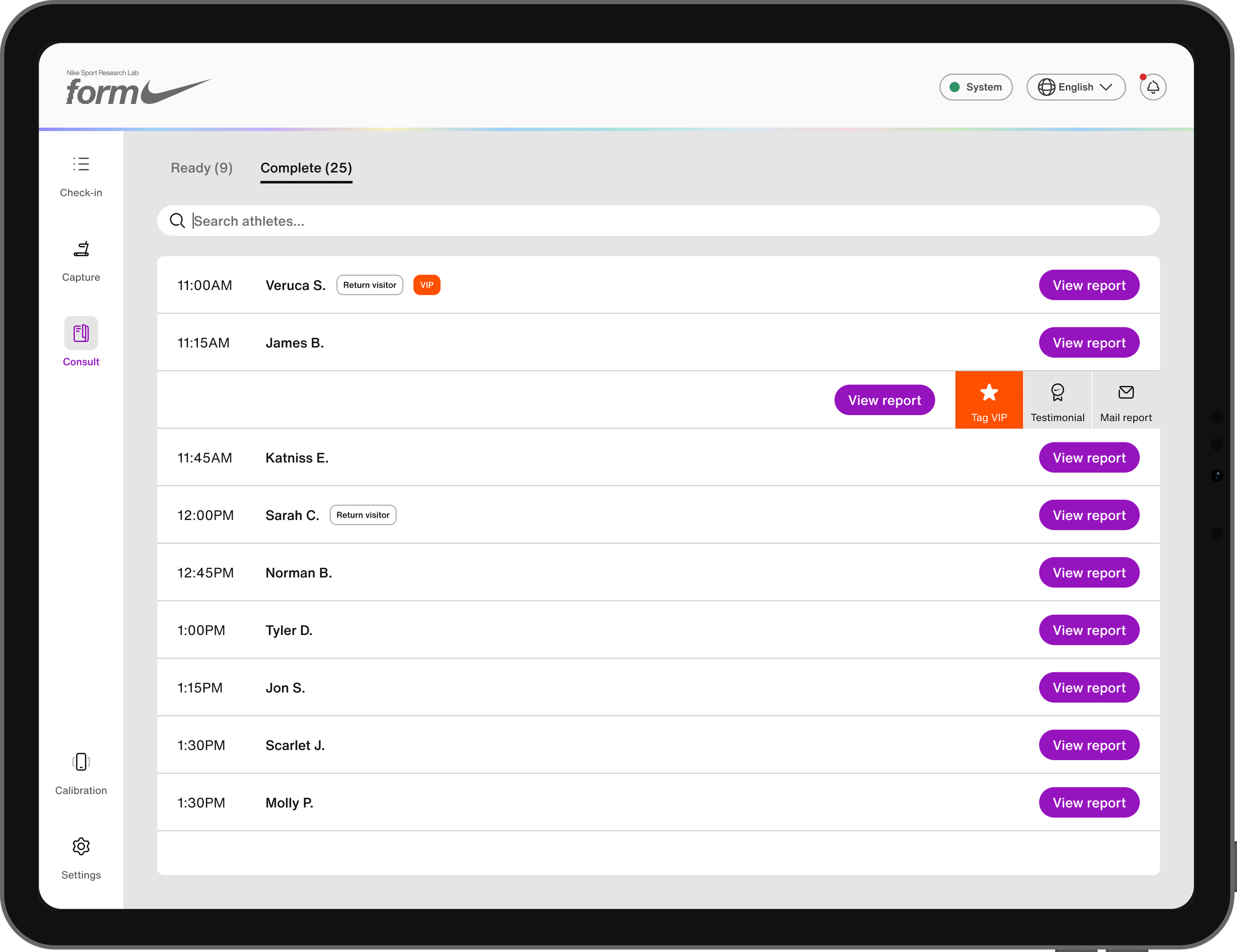
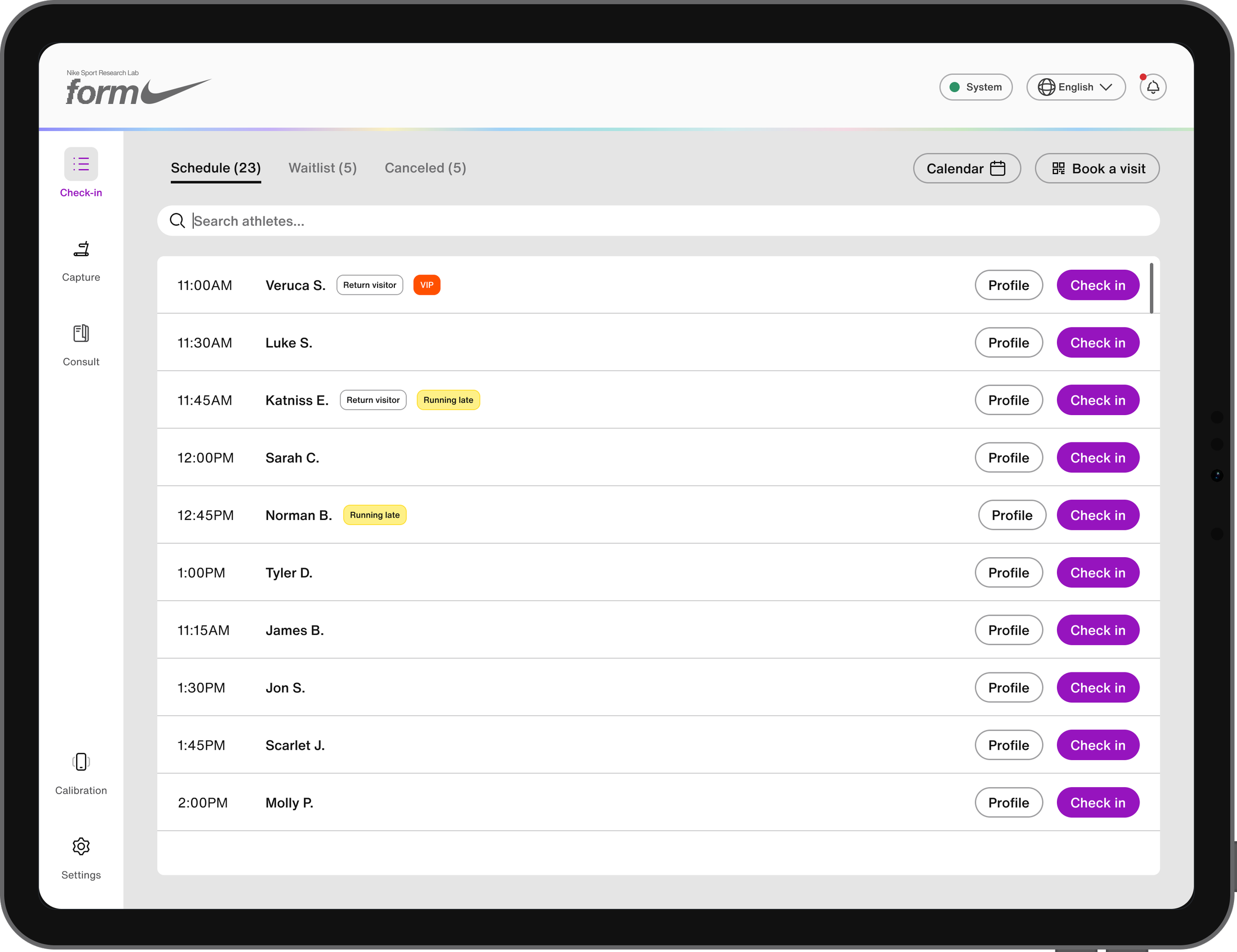
Check-in is the operator's first stop. It houses the day's appointments, waitlist, and cancellations across three tabs, plus a calendar view for browsing and booking future visits. Each row holds relevant athlete data, arrival time, visit tags like VIP or Return visitor, and swipe or tap actions to move an athlete between lists, check them in, or cancel/restore a visit as needed.
Capture
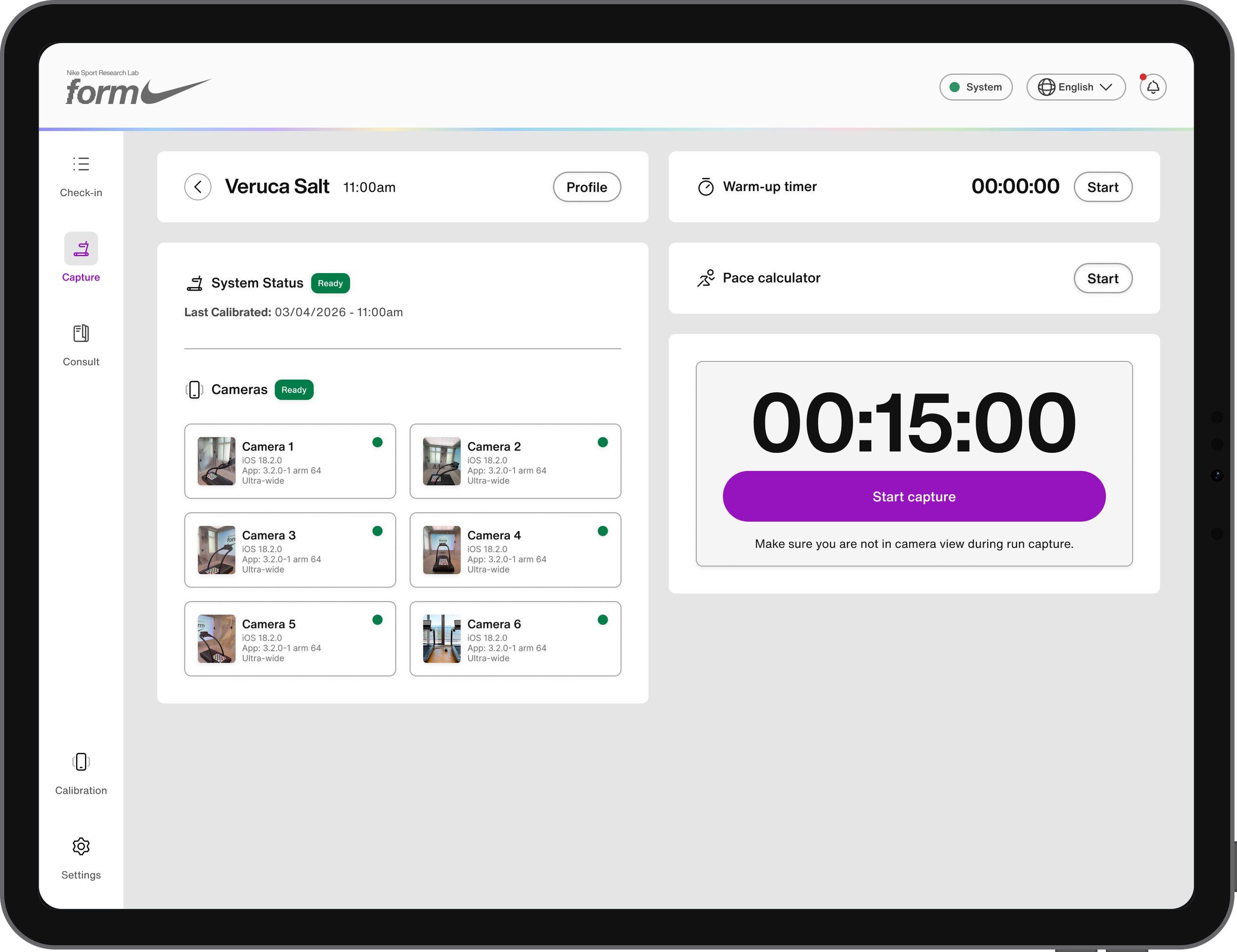
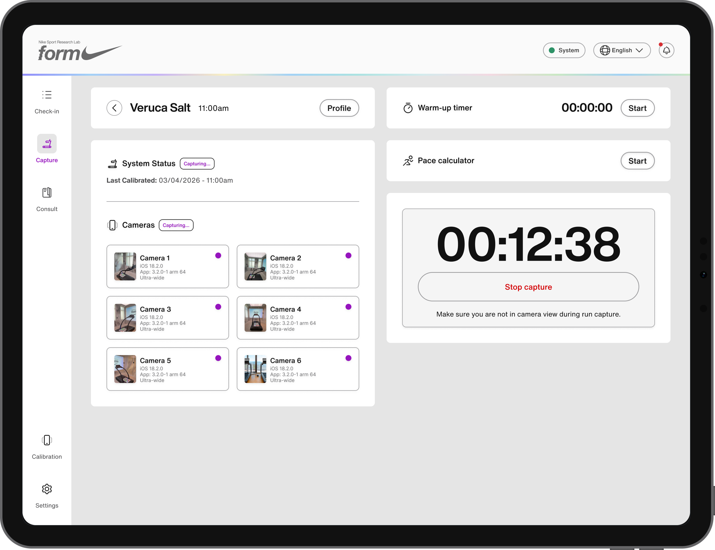
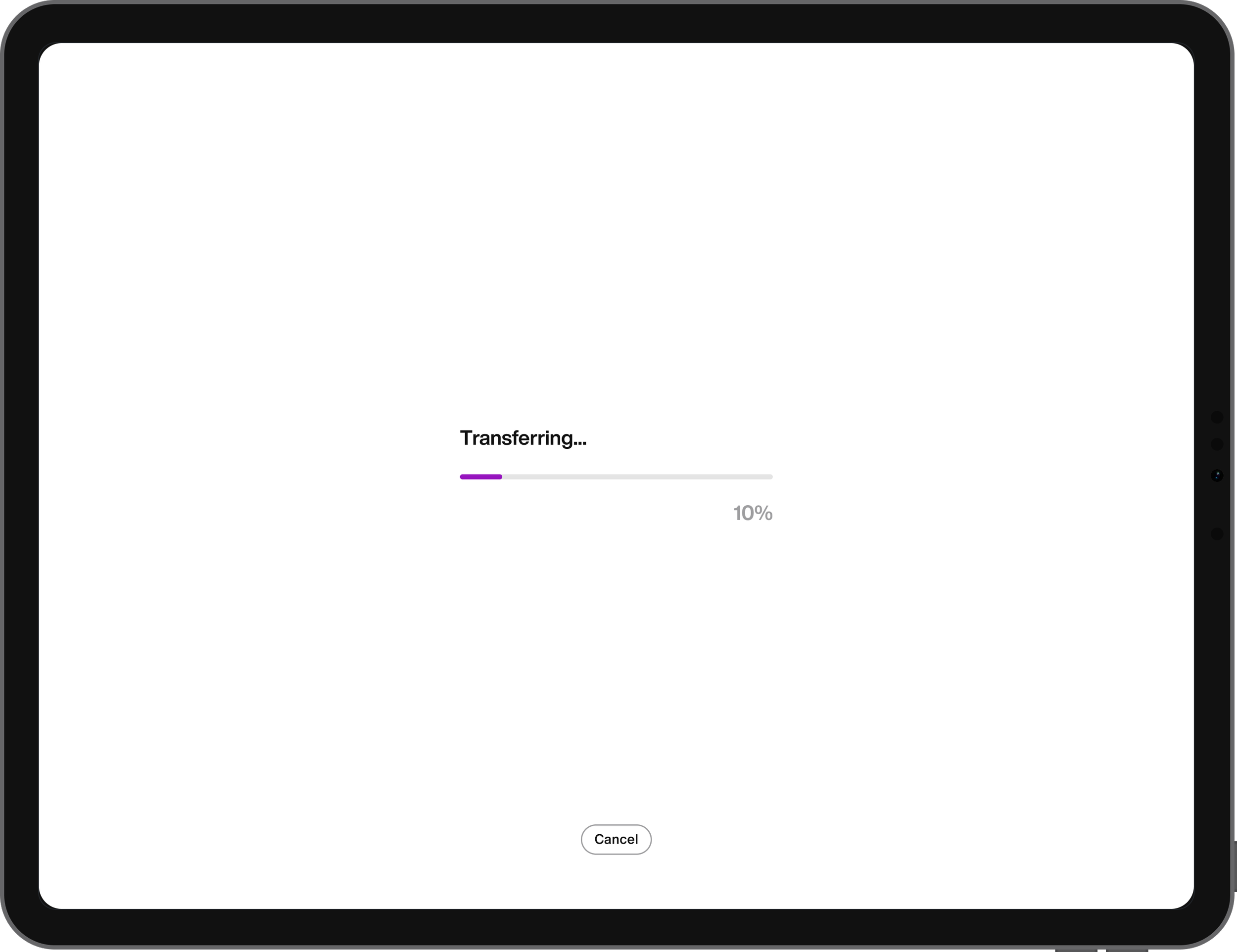
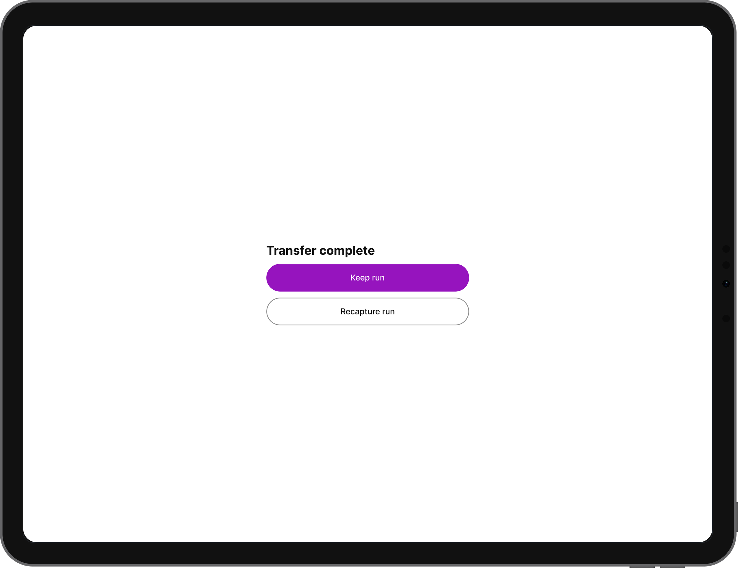
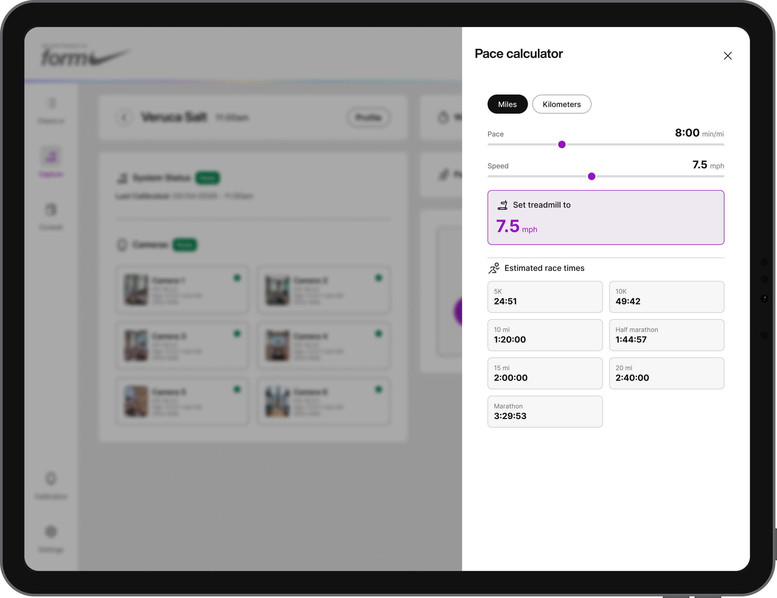
Capture is where the actual running session happens. Operators see live system and camera status for all six rig cameras, a warm-up timer, and a pace calculator side panel to help set the treadmill speed. Starting a capture begins the run timer, when it stops, the footage transfers automatically and the operator chooses to keep the run or recapture it before moving the athlete on to their consult.
Consult
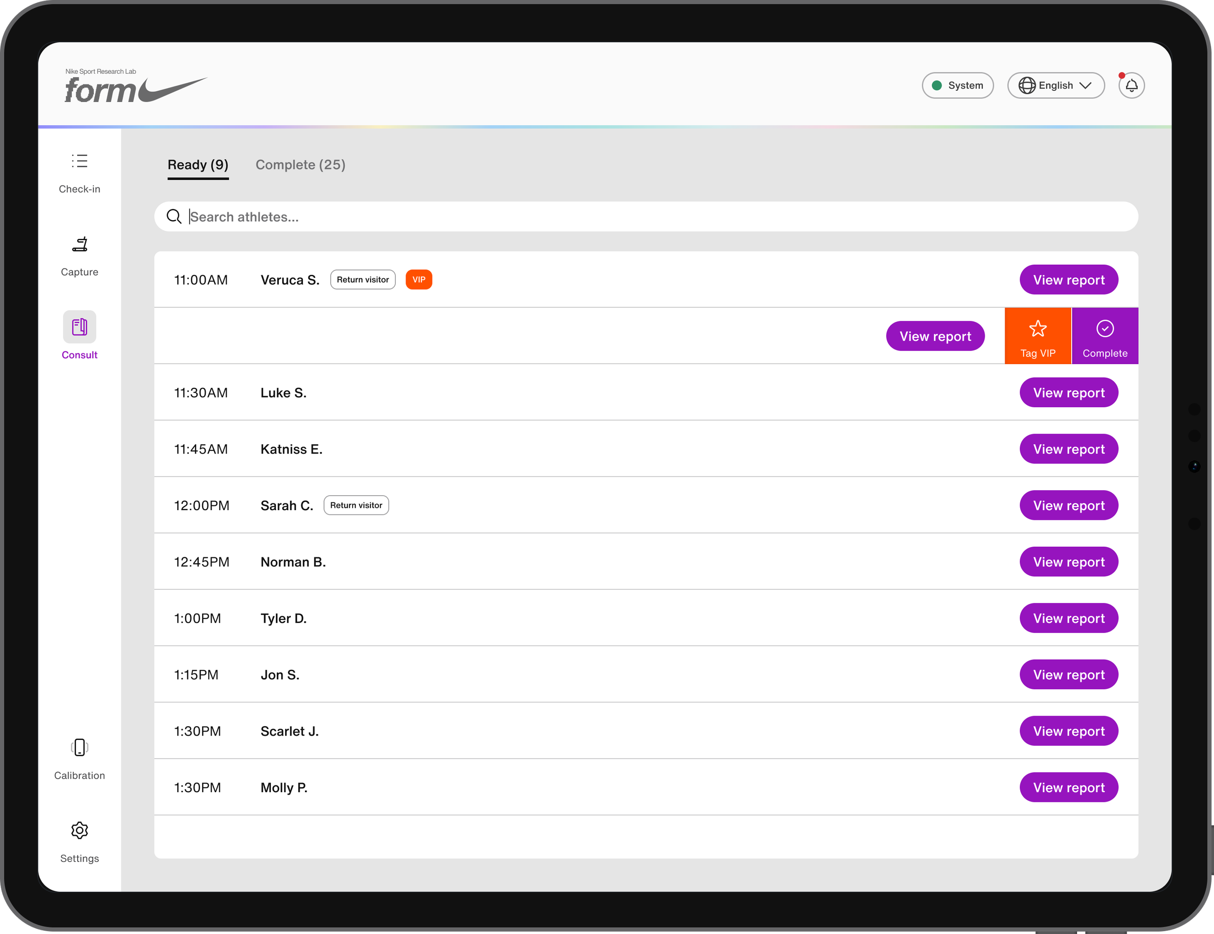
Consult is where the athlete's results come together into a full running assessment, organized into seven sections: Form Shape (a radar chart of key metrics), Form Profile, Form Focus (the athlete's single biggest opportunity area), Running Drills, Workouts, Footwear Profile, and Footwear Recommendations. Each section pairs data visualizations and video breakdowns with plain-language explanations, and the consult is marked complete once the operator has walked the athlete through their results.
Calibration
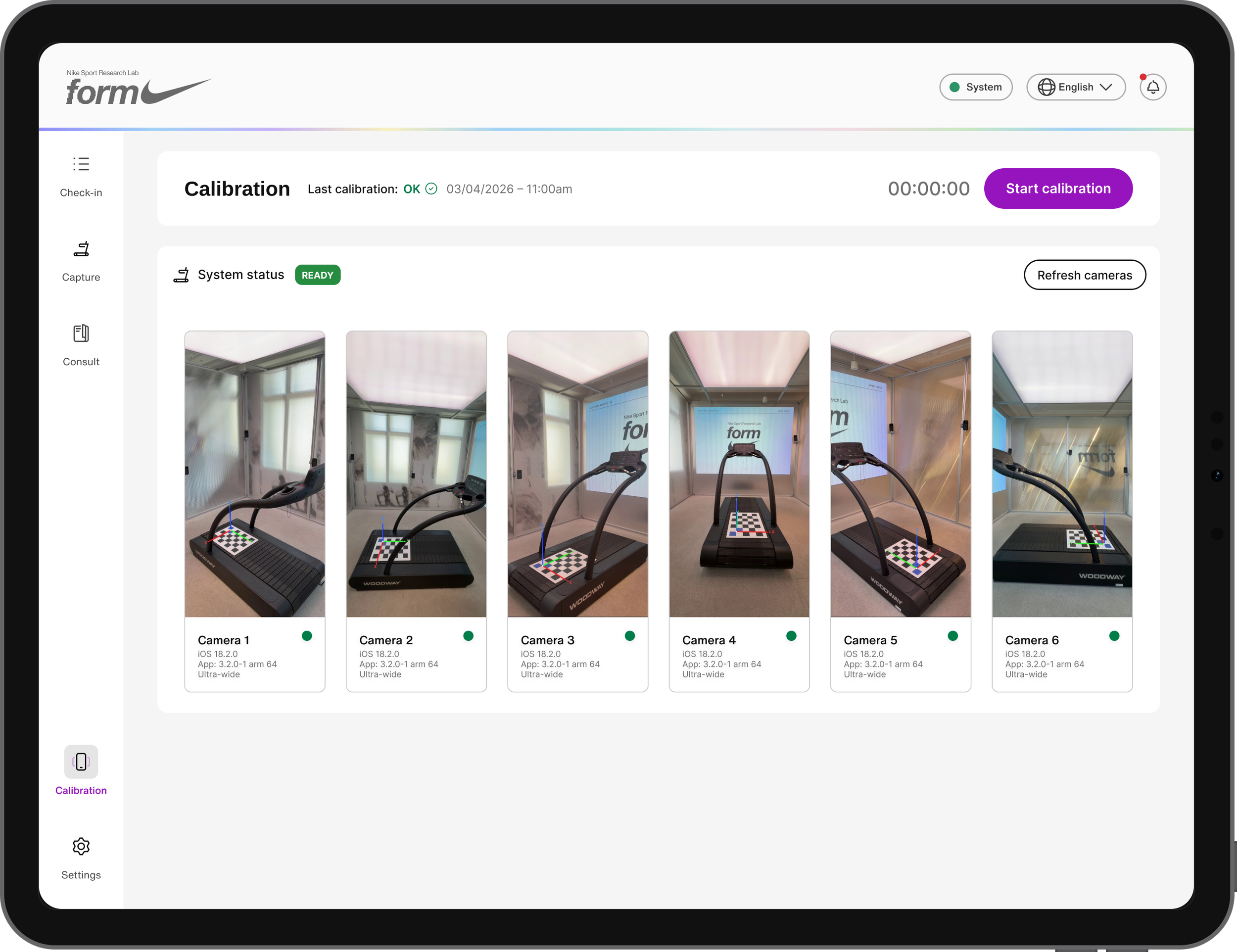
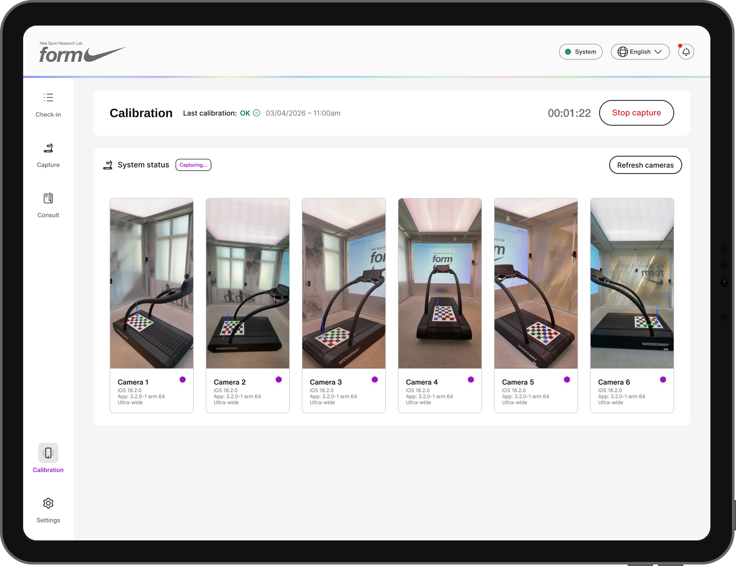
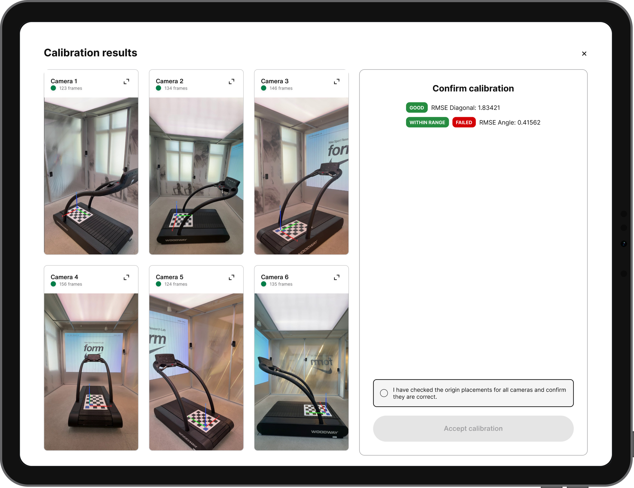
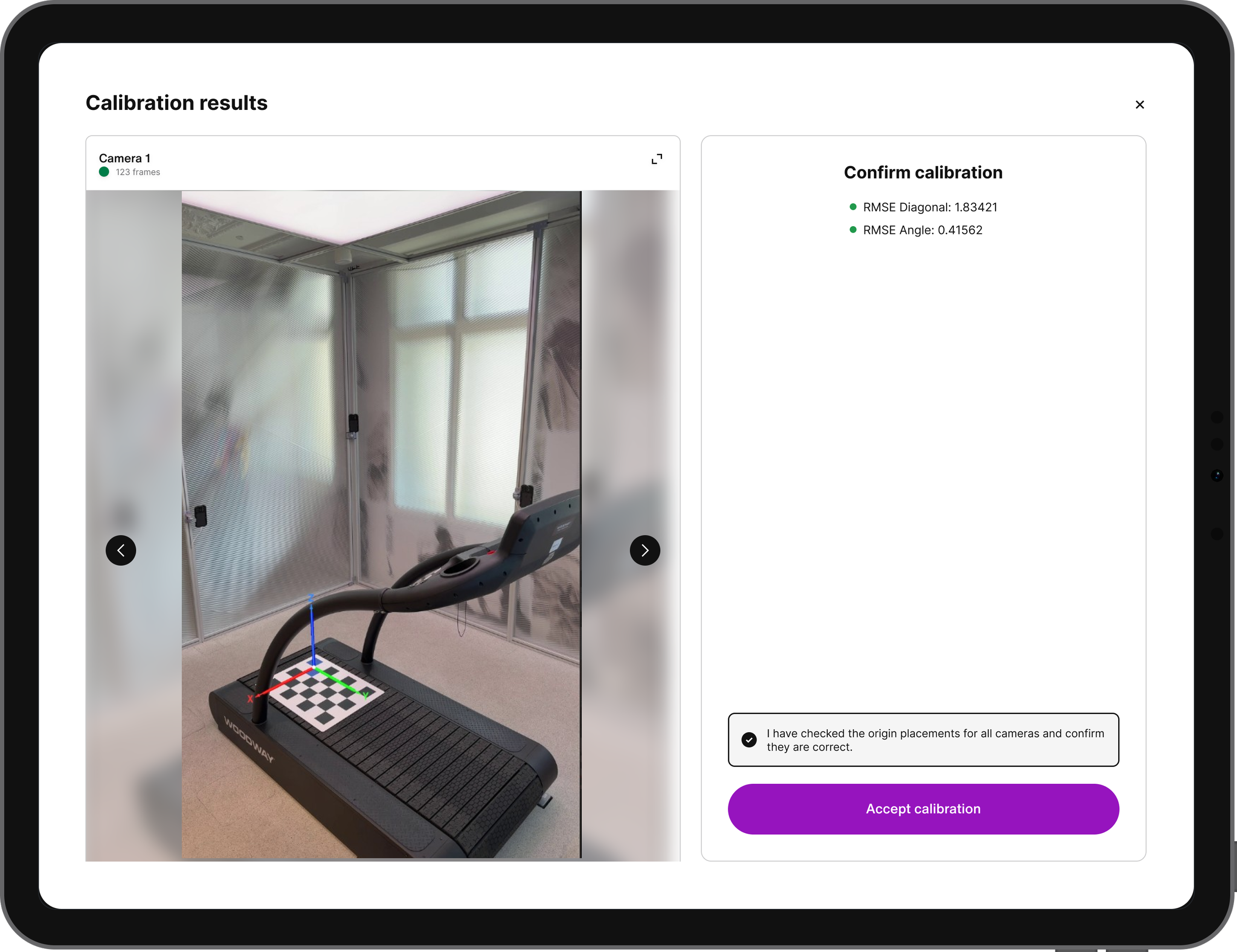
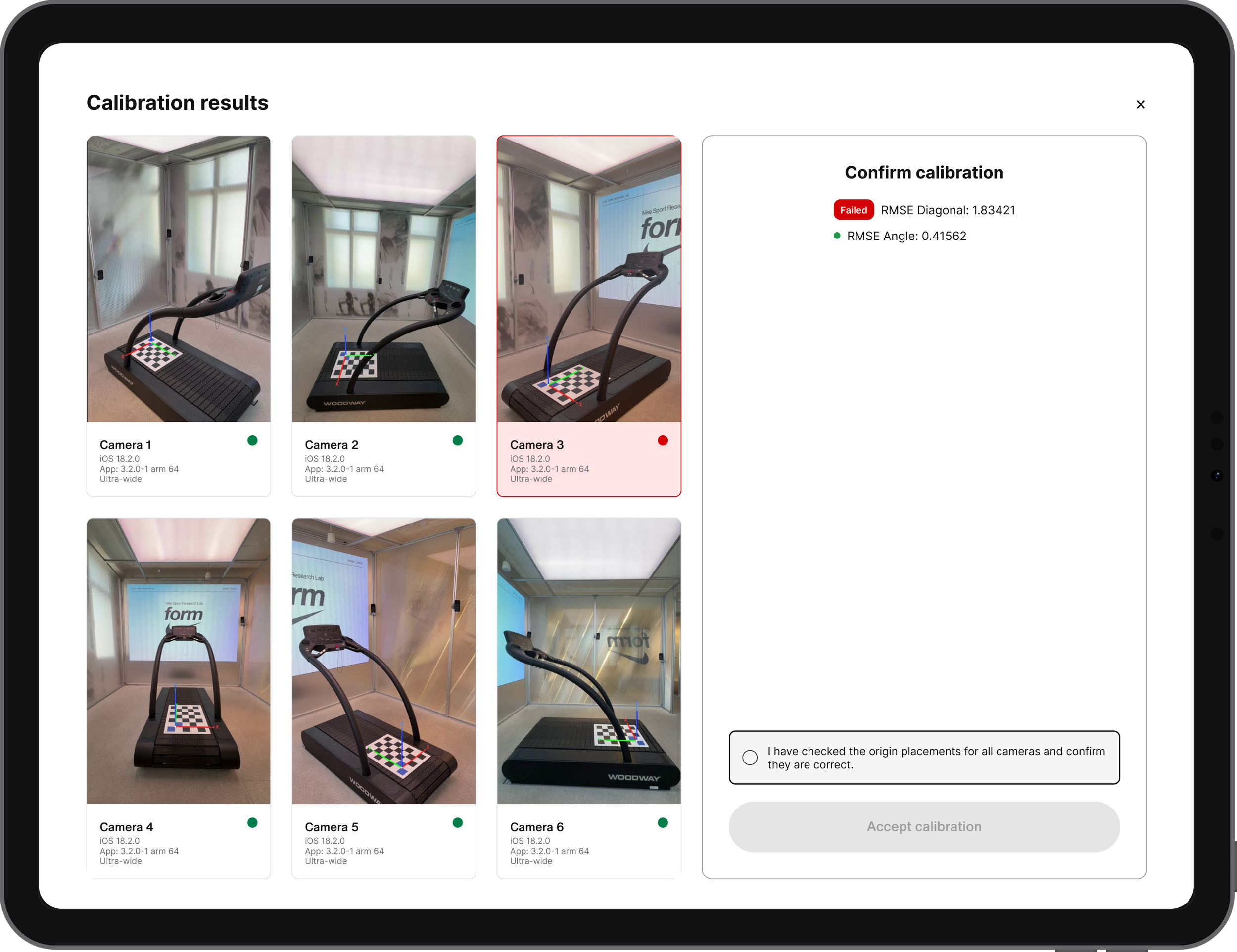
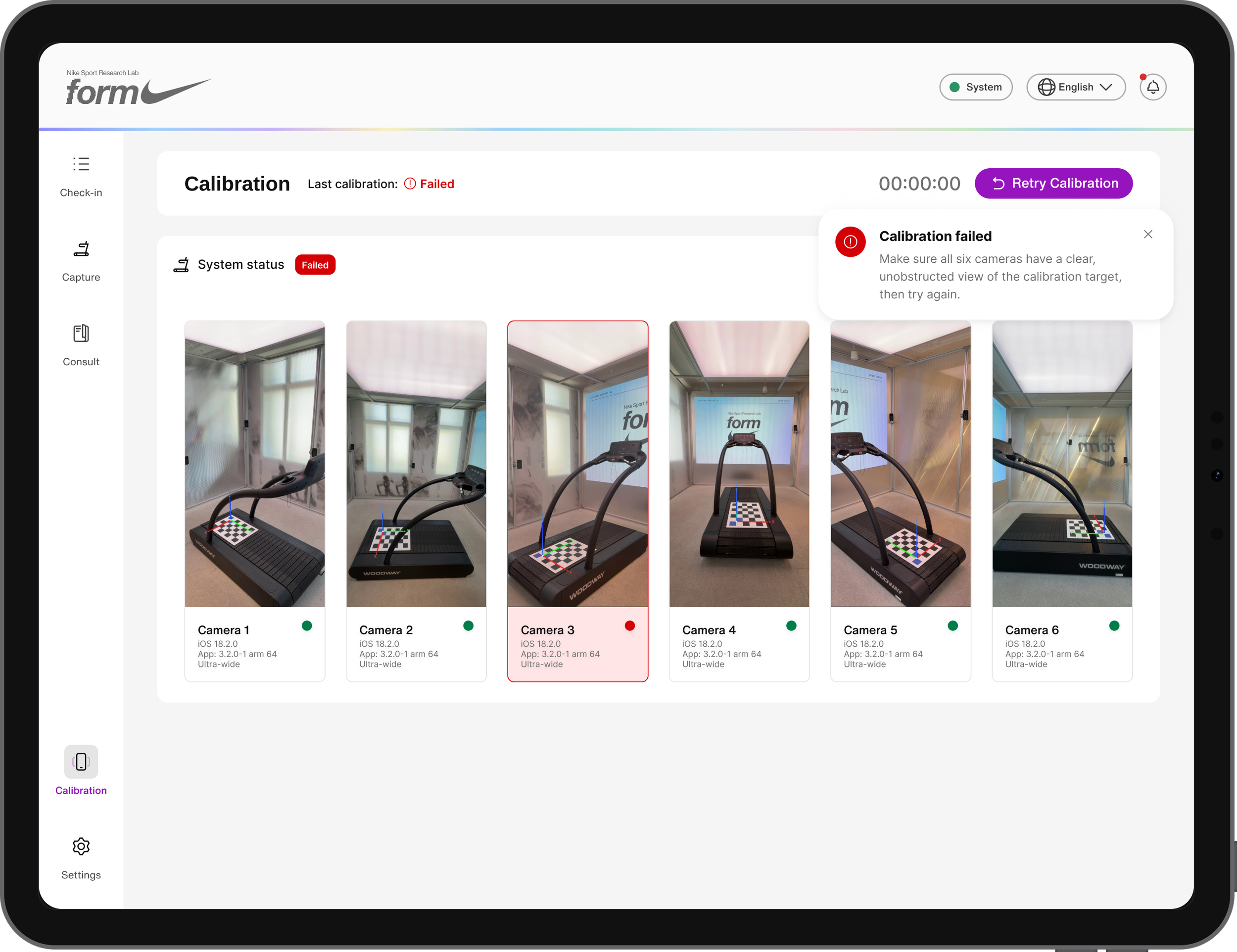
Calibration keeps the six-camera rig accurate before each day's sessions. Operators step through a guided capture sequence per camera, then review a results screen with per-camera captures and calibration accuracy metrics before confirming the system is ready, with a clear failed/retry path if a camera doesn't calibrate cleanly.
Settings
Settings centralizes system health and app configuration in one place: a live system-check card (cameras, Waitwhile API, PC health, Nike backend), appearance/dark mode, language and location, and a toggle to turn the onboarding tour on or off. It also houses supporting tools, a pace calculator, research mode for data collection, a growing library of help resources (starting with a full troubleshooting guide for operators and technicians), a feedback channel, and password-protected admin settings.
Notifications
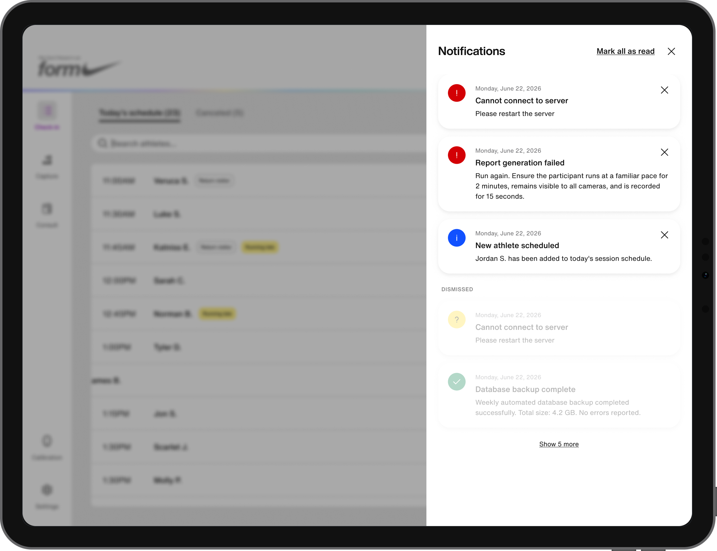
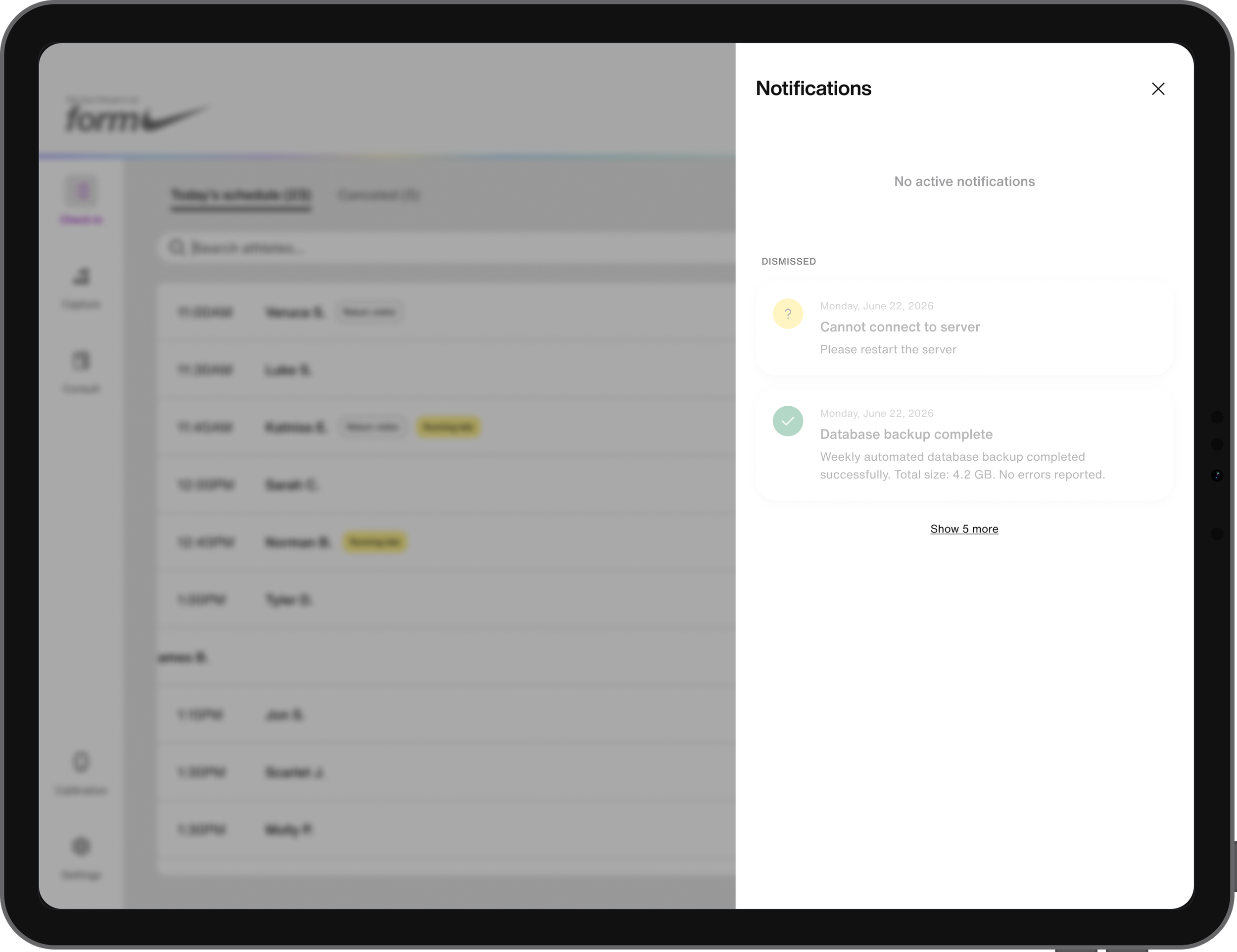
A persistent notification bell keeps operators aware of system issues, critical alerts, warnings, success confirmations, and general informational updates, without leaving their current screen. Notifications can be dismissed individually or all at once, and system-check results surface here automatically.
Results
The consult experience has real numbers behind it.
A post-service survey (17 respondents, single mobile lab event) put the experience at an NPS of roughly +82, 14 promoters, 3 passives, zero detractors.
Small sample, one event, but a strong early signal. Athletes described it as personal, informative, and confidence-building, and several specifically credited the recommendations with helping them run a race more efficiently. That same consult experience is what's now being carried forward into Form System Control App's Consult module, proven work extending into the next phase, not a rebuild from scratch.
Operator and product feedback: this is what they needed
The service-flow structure and the consolidated design make sense to the people who actually use it day to day. The design is built around a clear definition of what success looks like. For operators, that means less time wading through fragmented tools, less cognitive load mid-service, an easier day. For athletes, that efficiency is meant to show up downstream, a more professional, on-brand experience, smoother scheduling and appointments, because an operator's friction with disjointed tools was always something the athlete could feel too, even if they couldn't see the cause.