
Nike Lineup
A concept for managing design team capacity across Nike, built in a few weeks.
Overview
Context
Nike design leadership needed a way to see designer workloads and utilization across categories, so managers could balance resourcing without guesswork. That was living in a shared spreadsheet on an internal server; multiple editors meant collisions and overwritten data, and pulling a specific number for a leadership share-out meant manually hunting through it under time pressure.
I was brought on as a freelancer by a Nike Creative Director to help explore a concept for a purpose-built tool, working alongside my brother Riley Powell, also a product designer. The engagement ran a few weeks. There was no existing direction or prototype, we were building the concept from scratch.
My Role
I moved across strategy and screens both, no clean split between concept and UI. I helped scope what the tool needed to show: capacity by season, category, and individual designer, with an eye toward what a manager actually needs to answer on the spot when leadership asks about a team's workload.
Capacity, at a glance

Nike's design and category managers were tracking who was working on what, and how overloaded they were, in a single shared spreadsheet. Multiple people editing it at once meant version conflicts and overwritten data, and when leadership asked for a quick read on team capacity, someone had to go dig it out of rows and columns on the spot.
I came in as a freelancer to help a Nike Creative Director explore a concept for something better, working alongside my brother Riley Powell, also a product designer. We had a few weeks, no existing direction to build from, and we riffed on the whole thing together rather than splitting it into separate lanes.
The concept was never built or shipped. What we handed off was a visual, click-through direction for what a real capacity-planning tool could look like: workload by season, category, and designer, visible at a glance instead of buried in a spreadsheet.
Design Problems
A spreadsheet was the tool of record for something that needed to be real-time No visualization, no instant reporting, and no way for more than one person to safely edit it at once. Version conflicts and overwrites were a regular occurrence.
Finding an answer took too long When leadership asked for a specific capacity number, a manager had to open the spreadsheet and manually search through rows and columns instead of getting a clear answer immediately.
No shared sense of what "balanced" even meant There wasn't a clear, visual way to see when a category was overloaded versus sitting under capacity, so those calls were being made on gut feel instead of a shared reference point.
Challenges
Starting completely from scratch
No existing concept, no prototype, nothing to react to. We had to define what a well-balanced team even looked like as a Nike-specific metric before we could design around it.
A short runway
A few weeks to go from an open question to a concept worth showing leadership, which meant working fast and skipping anything that would have slowed us down without adding real value.
Solutions
Skipped wireframes, went straight to on-brand screens Using Nike's own visual language meant we could move directly into polished, click-through concept screens instead of spending time on low-fidelity exploration first.
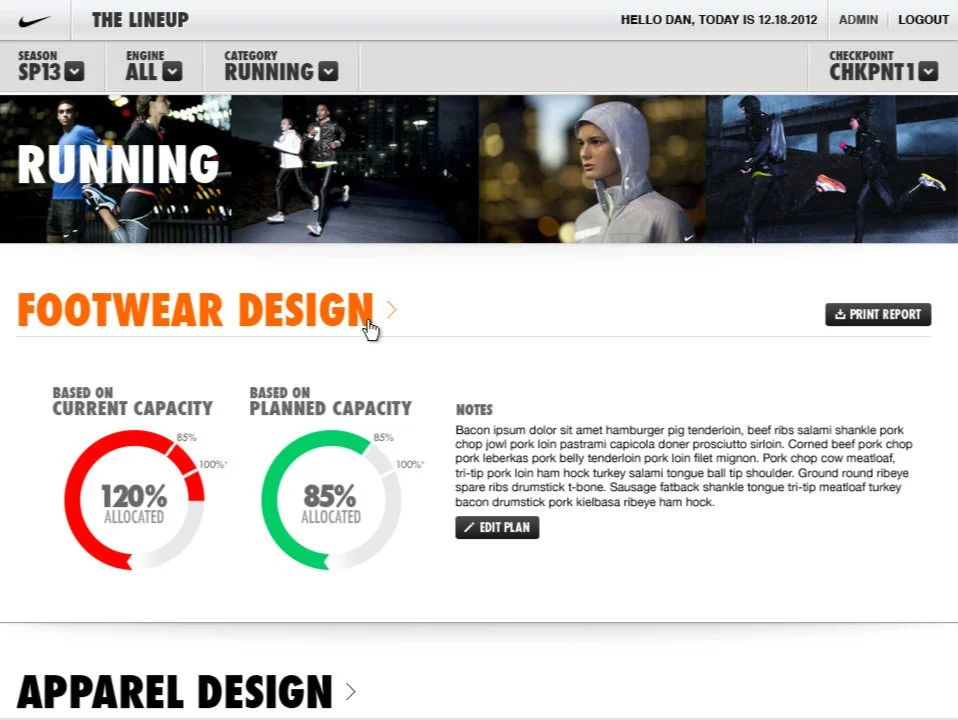
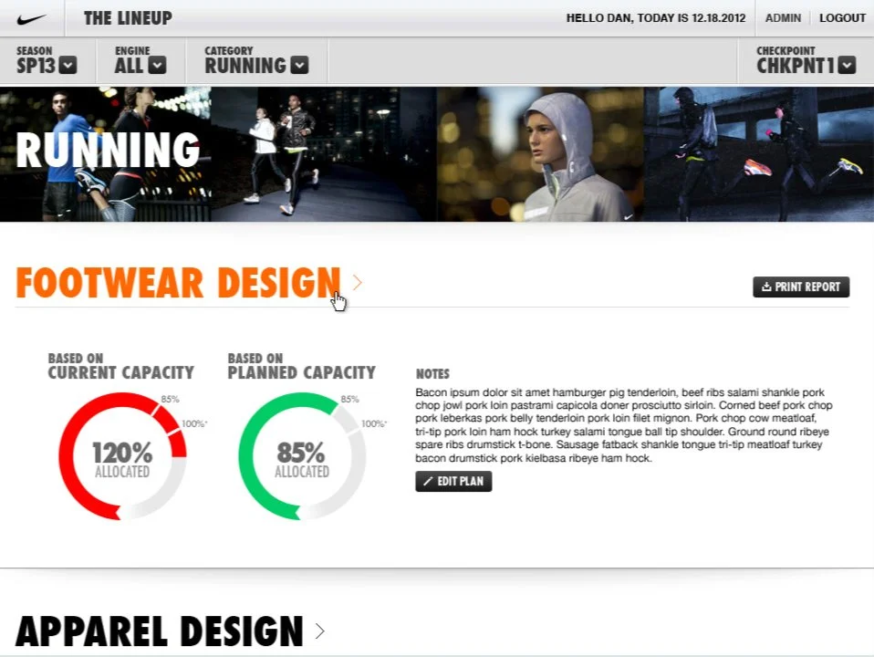
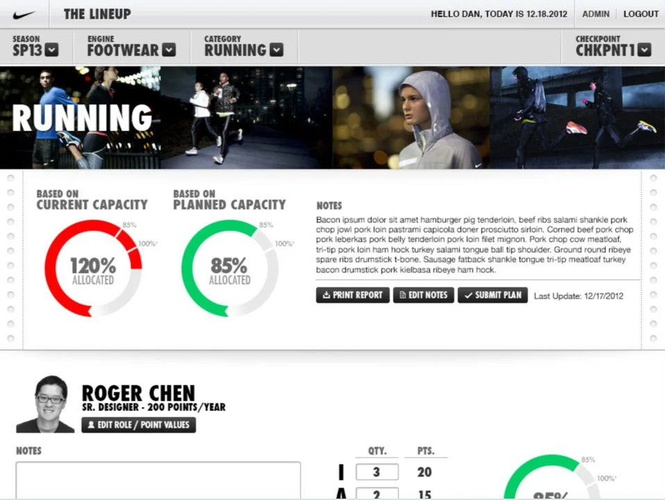
Capacity shown top-down: season, category, designer The concept let a manager see workload at a glance, by season, then category, then down to an individual designer, using Nike's internal project scoring matrix as the underlying metric. Overloaded categories and underused ones were both meant to be immediately visible, not something a manager had to calculate.
Reporting built into the concept itself Print and share tools were designed into nearly every screen, so pulling a number for a leadership conversation wouldn't mean going back to a spreadsheet.


Results
This stayed a concept. It didn't ship or go into production, and I don't know what became of the direction after we handed it off. What we delivered in a few weeks was a clear, visual answer to a real problem, a fast, honest exploration of what a better tool could look like, done in close collaboration with a Nike Creative Director.