
Columbia Sportswear
One mobile-first system, skinned across four outdoor brands at once.
Overview
Context
Columbia Sportswear's four e-commerce brands were stuck on an antiquated foundation, built for desktop in an era when that was still the primary way people shopped online. That had changed. Traffic had shifted hard toward mobile, and the experience hadn't kept up, in places, it was outright broken on a phone.
I was brought on contract, June 2018 through March 2019, to help build a system that could work across all four brands: Columbia, Sorel, Mountain Hardwear, and prAna. I'd worked with the UX lead driving the project before, at Nike, and he knew my work well enough to bring me over for this one specifically.
My Role
The broader design team was around six people. For the mobile-first conversion itself, it was really just me and the UX lead. He was hands-on in template design too, there wasn't a clean split where I stayed in my lane and he stayed in his, the work had real crossover throughout.
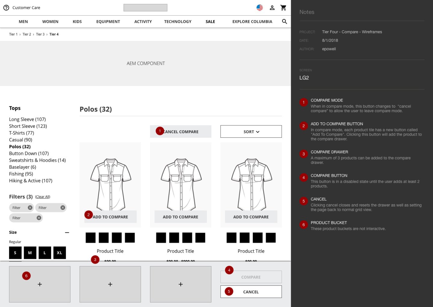
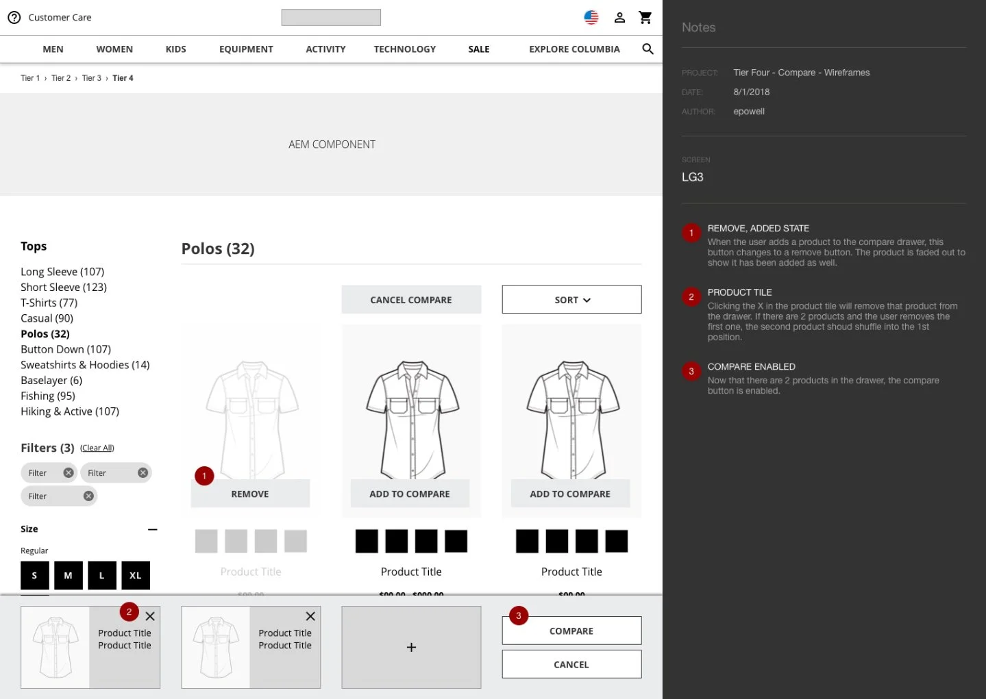
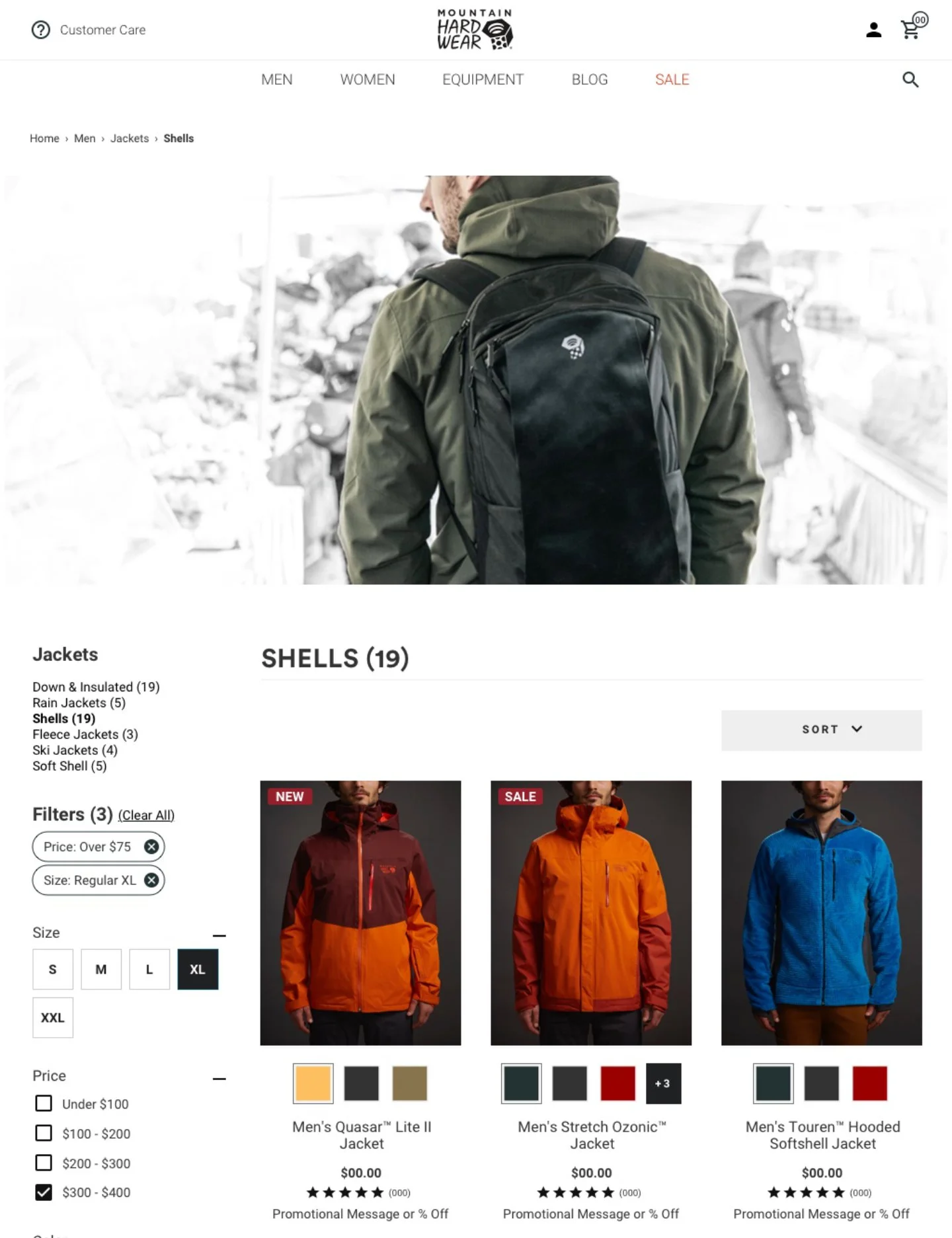
What I mostly drove: the design system itself, and the templates for search and product/category display pages, structural work that had to hold together identically across four brands before any brand-specific styling got layered on top.
Design Problems
The sites weren't built for how people were actually shopping anymore
Traffic had moved to mobile, the experience hadn't, and some elements simply didn't work on a phone.
Columbia's own UX Research team had already done real legwork here
They ran studies using Baymard Institute best practices as a benchmark, and had documentation on friction points and improved flows ready to work from, a stronger starting position than most of Eric's other engagements, where research had to be built from scratch.
The design team's own audit turned up the usual list of symptoms of a site that had outgrown its foundation
Clumsy type, no information chunking, unhelpful input fields, inconsistent branding and controls, all four problems showing up differently across four different brand sites.
Challenges
Designing for four brands at the same time, not one brand first
The obvious approach would be to design a strong version for Columbia, the biggest name, then adapt outward to the other three. That's not what happened. The same templates needed to work across all four brands, so as things were being designed, they were being designed for all four simultaneously. Nothing got built in isolation and then retrofitted.
No major sticking point
Every other project has had some real friction to work through, an escalation, a negotiation, a hard trade-off. This one didn't. It was a genuinely collaborative build with the UX lead, and the complexity was in the four-brands-at-once structure of the work itself, not in any conflict along the way.
Solutions
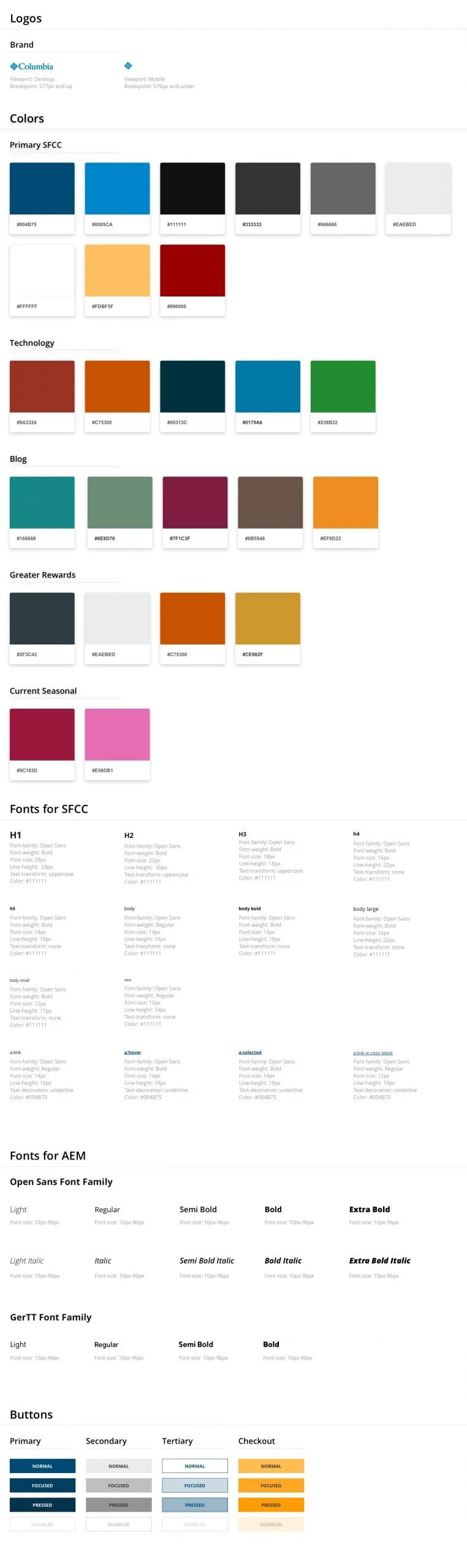
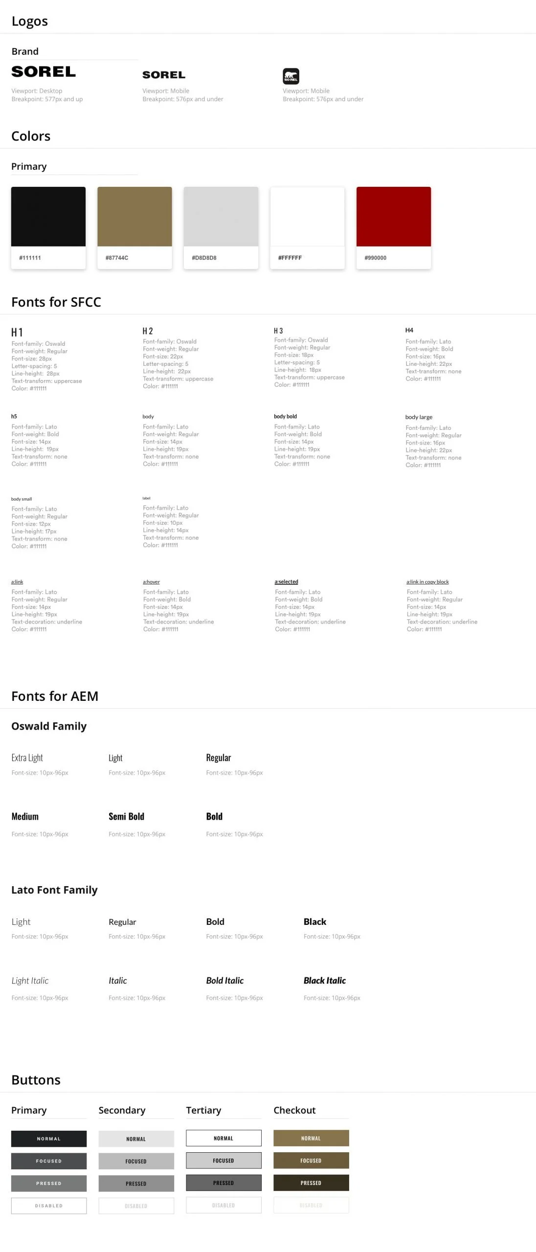
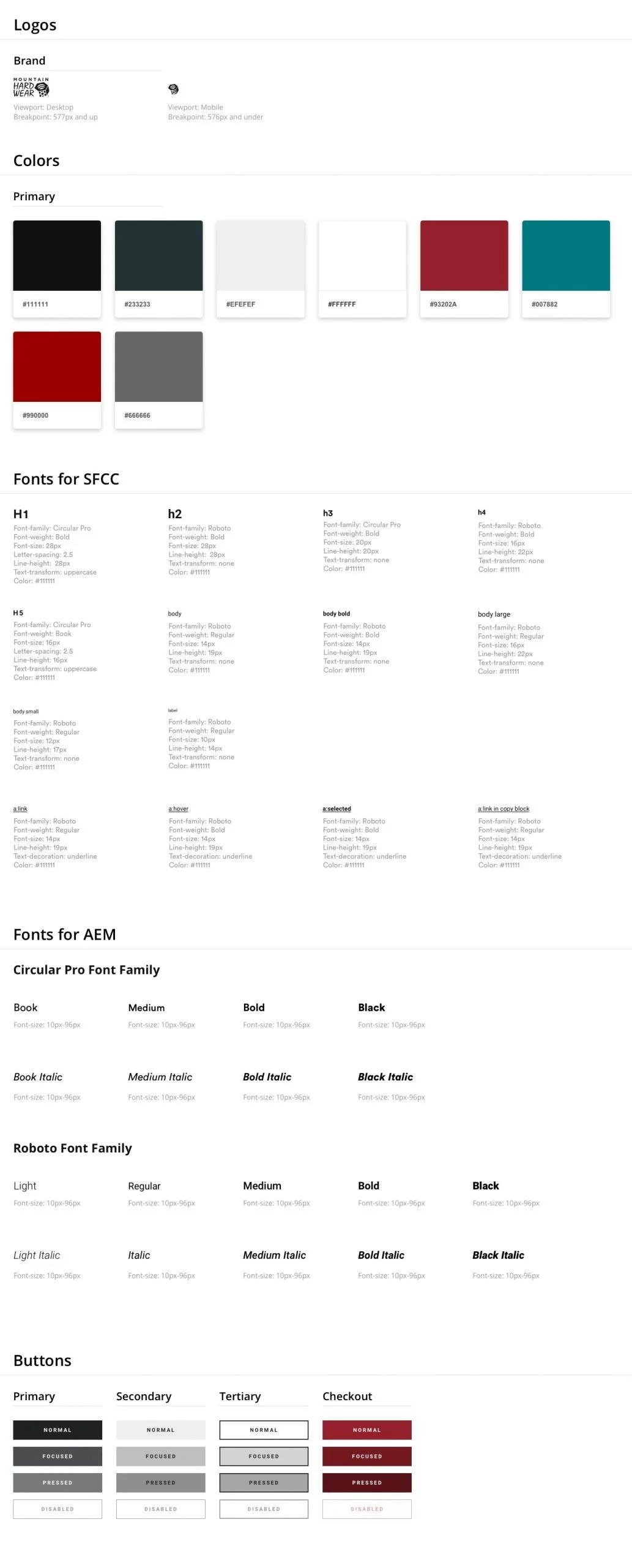
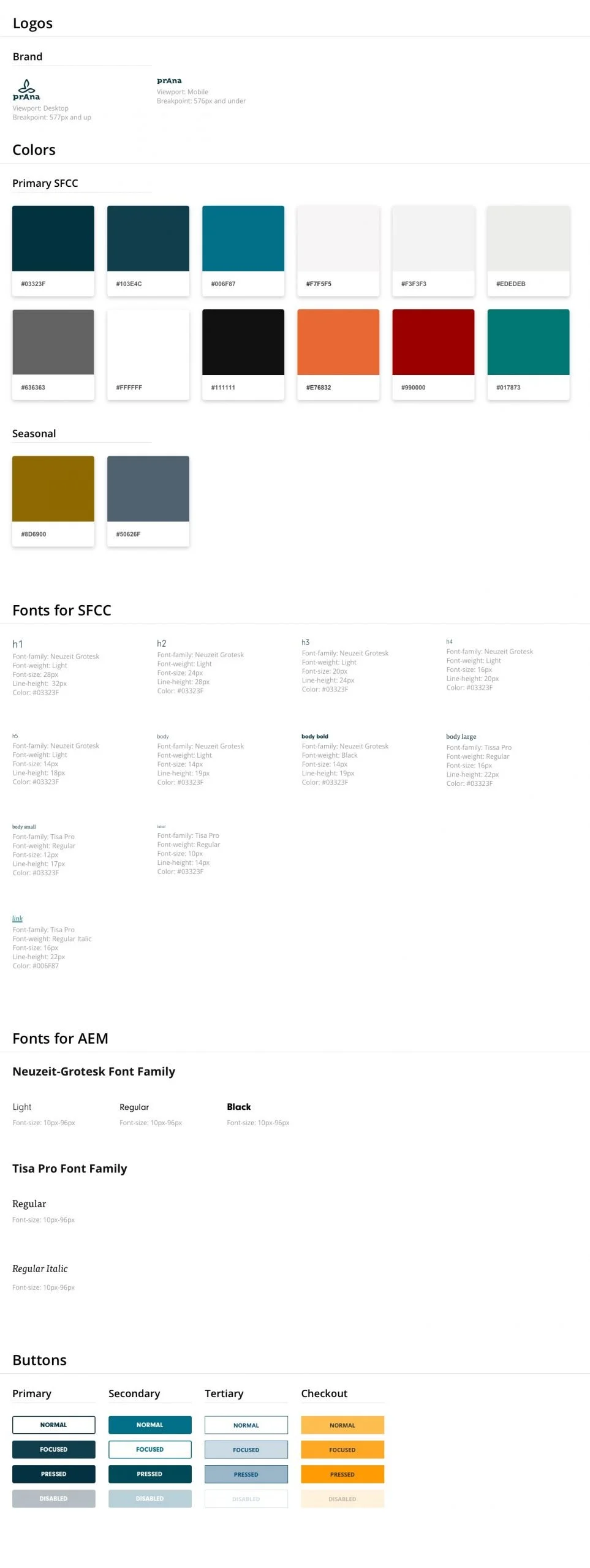
A shared system, built brand-agnostic, styled per brand after the fact
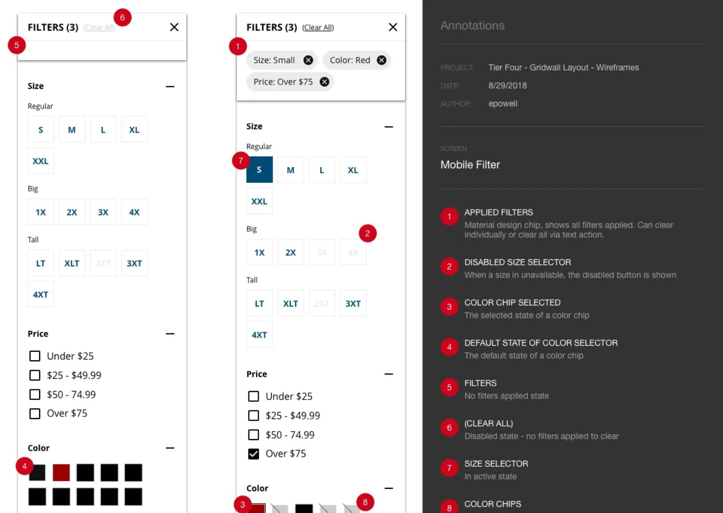
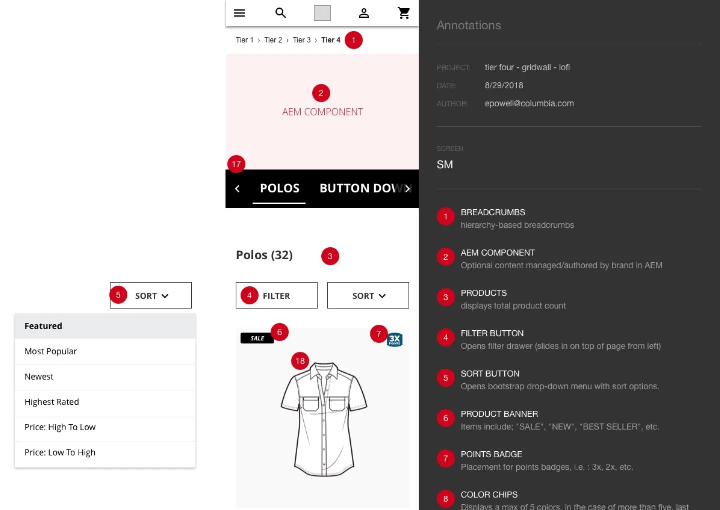
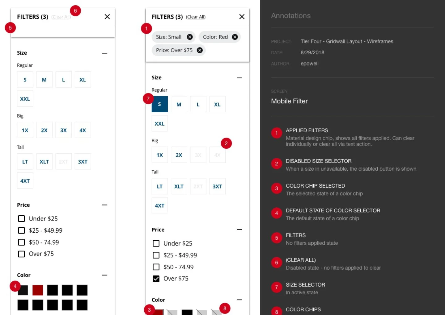
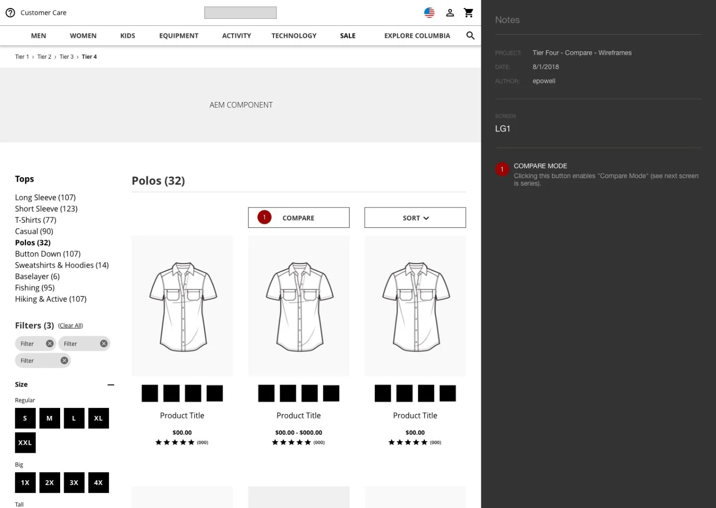
Templates, components, and modules were built without any single brand's look and feel baked in, validated across all four brands' needs at once, and then style overrides for each brand were applied on top once the underlying structure held up.
Search and product/category templates as connective tissue
These were some of the most structurally demanding templates in the system, since they had to behave identically across four different product catalogs and four different brand voices without breaking for any of them.
Fully annotated specs handed to engineering
Standard process, but worth mentioning since it's what let the templated designs and shared elements actually get built consistently once they were approved.



Results
All four brands, Columbia, Sorel, Mountain Hardwear, and prAna, launched their mobile-first redesigns within the ten-month engagement. I stuck around briefly afterward for design support once things were live. I don't have conversion or engagement metrics tied specifically to this work to point to, but the scope alone says something: one system, four brands, all shipped.