
Create a premium Walmart subscription membership account page for Walmart+
Requirements
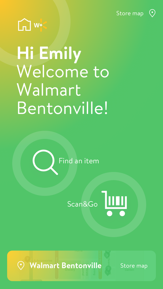
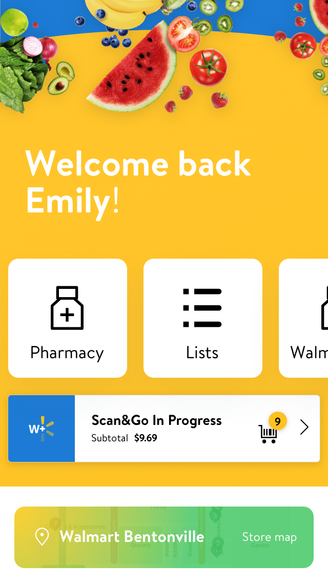
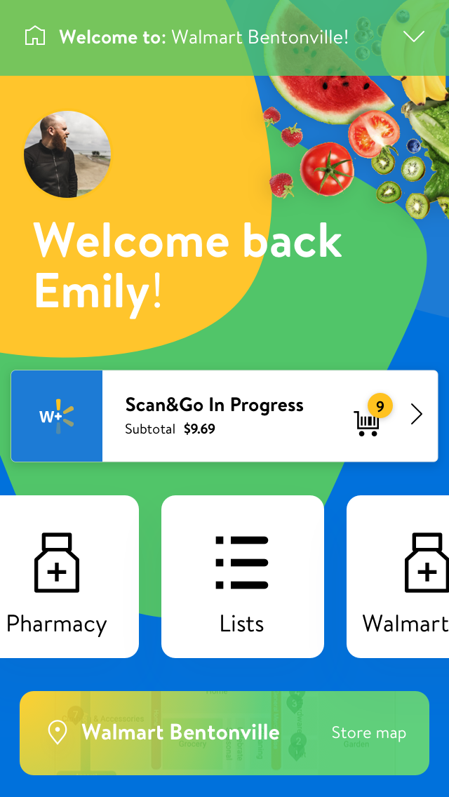
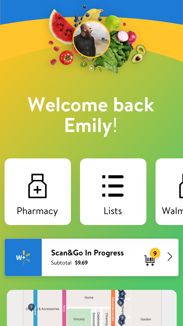
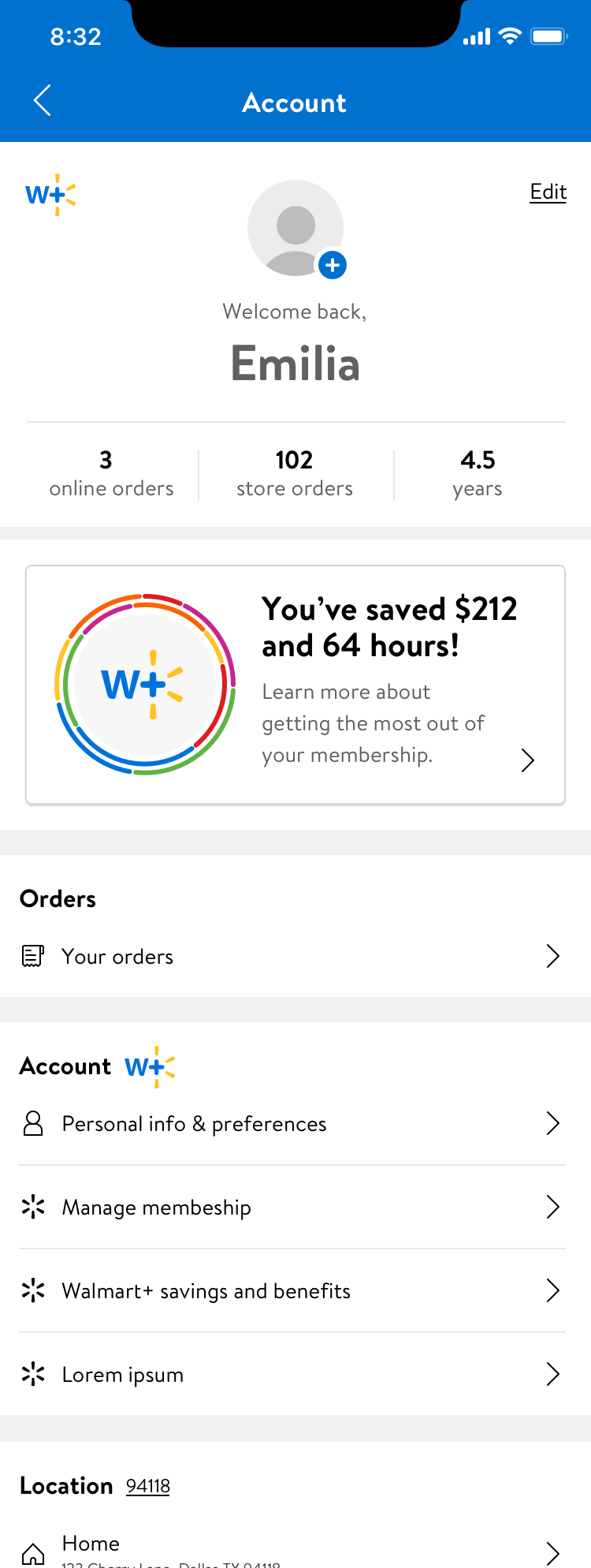
With Covid-19 impacting everything everywhere, the shopping needs of Walmart customers were rapidly changing. More and more people were utilizing services like contactless checkout (Scan&Go) and pick-up and delivery. Walmart had an existing program called Delivery Unlimited (DU); for a small monthly fee, a subscriber would get free delivery, but this wasn’t meeting the consumer’s or the company’s needs. There was a significant increase in usage of these tools, and Walmart wanted to look to the future and create even better ways to serve customers with a new subscription-based membership program. This premium service would need to offer continually adapting benefits and perks in addition to tools for shopping in this new world. The new service would be called Walmart+ and became the #1 priority for product teams. I was brought in on the project to help create the W+ dashboard. What does the “home” of W+ look like for customers? There were several problems to work through; is it part of the account? Is it its section, and if so, how does that compete with navigation within apps and on the web? What things would a W+ member want to see there? Is it savings? Is it a place for all things W+? is it just settings? These were the questions I had, and I got to work exploring them within a very rapid timeline.
Research
We started with very little research outside of existing studies with Delivery Unlimited which, although interesting, there was not much to carry over since DU is integrated into the shopping, cart, and checkout paths. I spent some time looking at competitive examples of what best-in-class user dashboards look like and what functions are present. I also explored user dashboards and account pages in apps from unrelated categories; banking and budgeting, social, health, analytics, gaming, and more. This very light research helped form some foundations for exploration. As we get more info and requirements, we need to iterate and come back to more in-depth UX research.
Design
I was working directly with my Sr. Manager, the modus operandi was to create several different versions of the dashboard. I jumped into screen design with the freedom to explore outside the Walmart design system.
Round 1
These early explorations were rough and wild.
Round 2
I was beginning to explore control styles and fpo content hierarchy.
Round 3
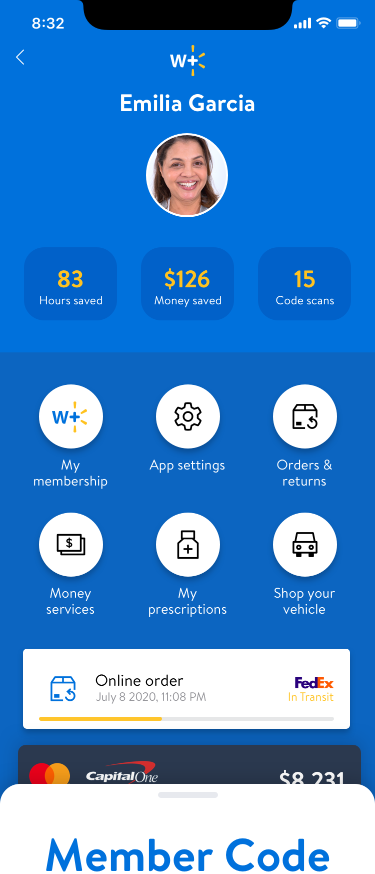
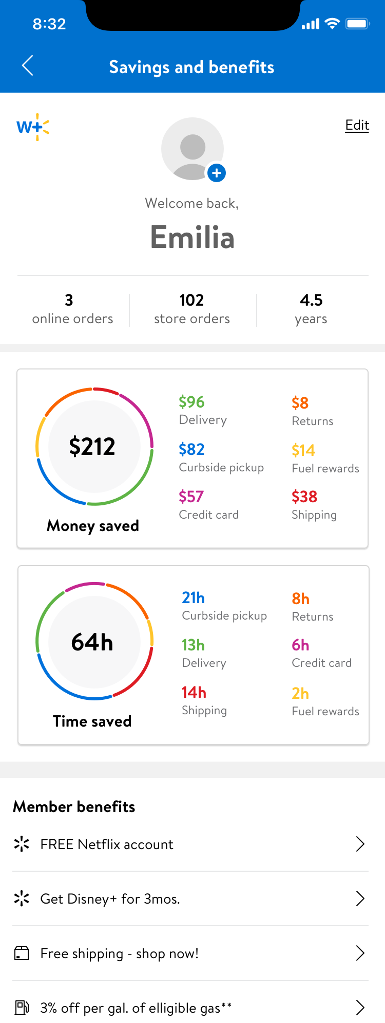
Explorations around tracking data, savings, status, progress, etc.
Round 4
Integrating some W+ branding into the screens as I continued to explore variations.
Round 5
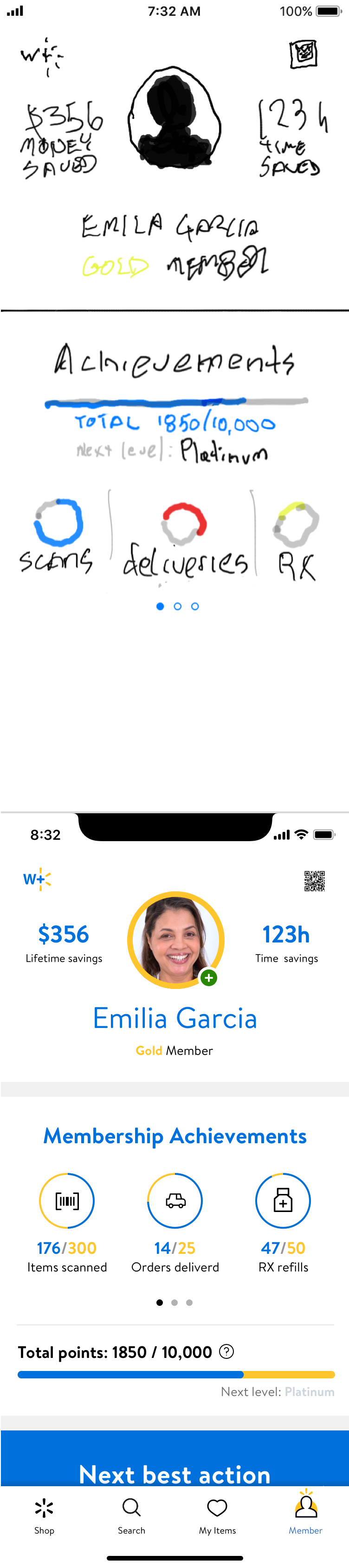
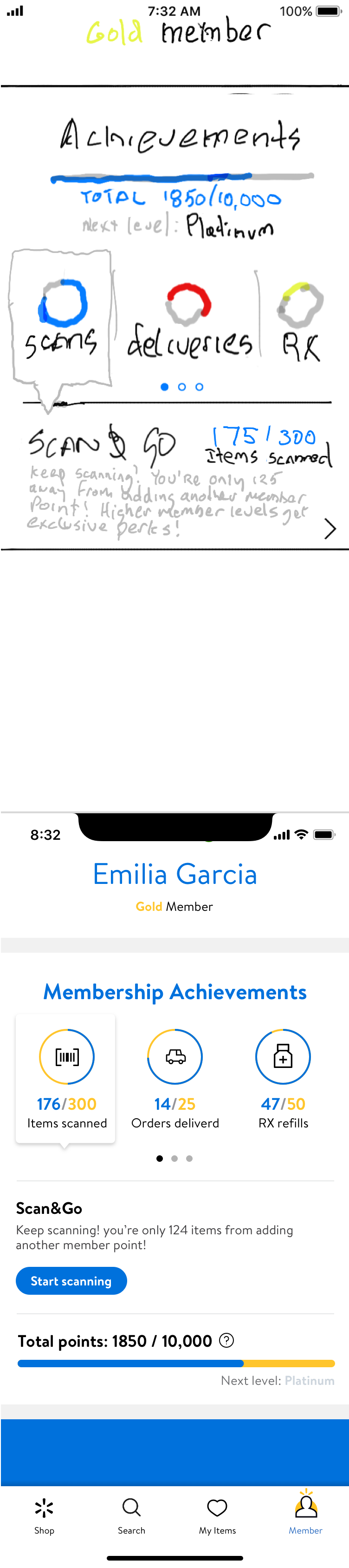
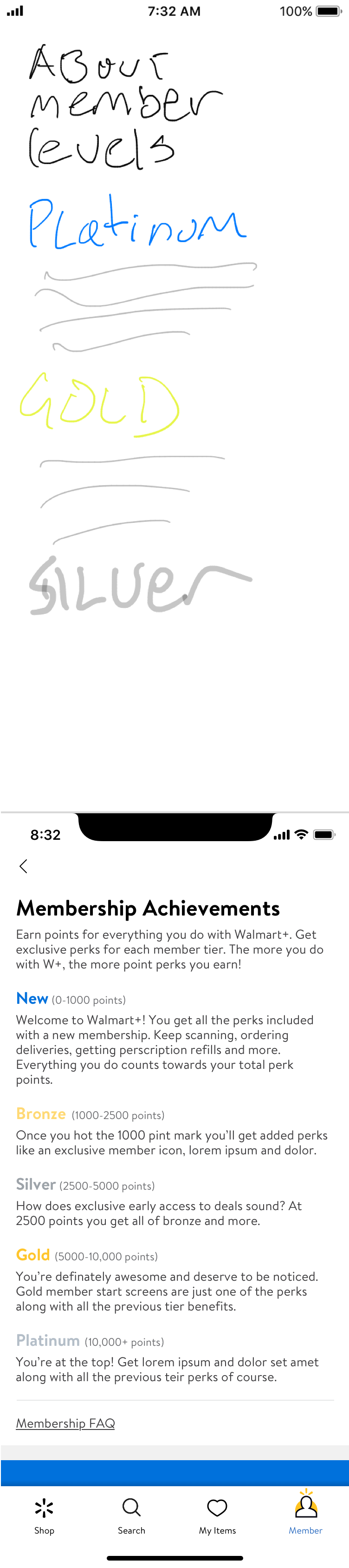
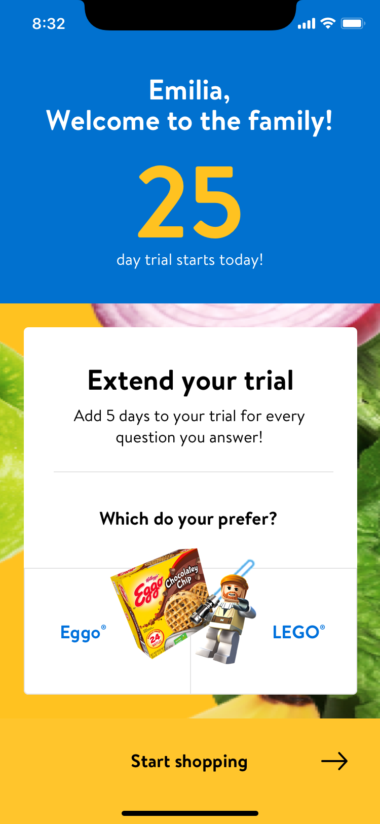
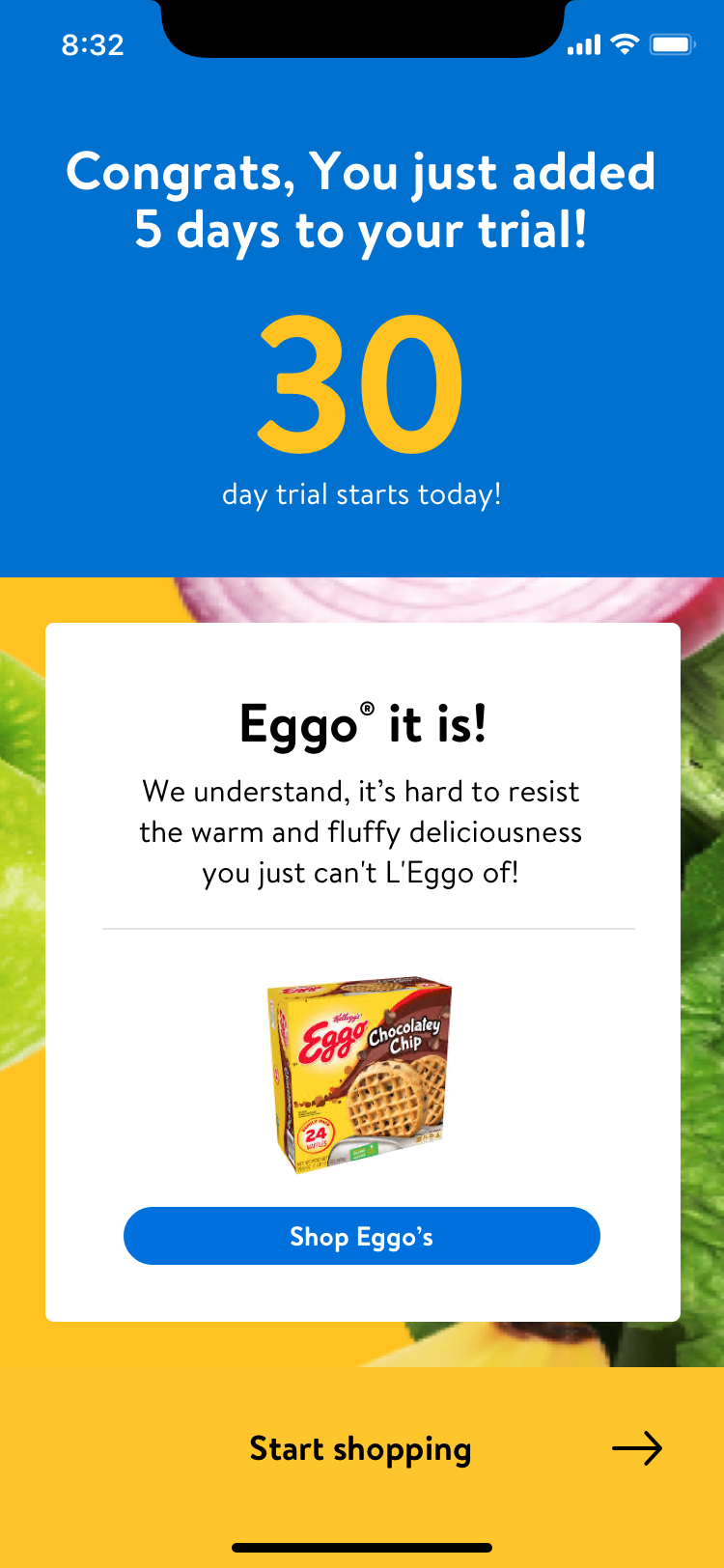
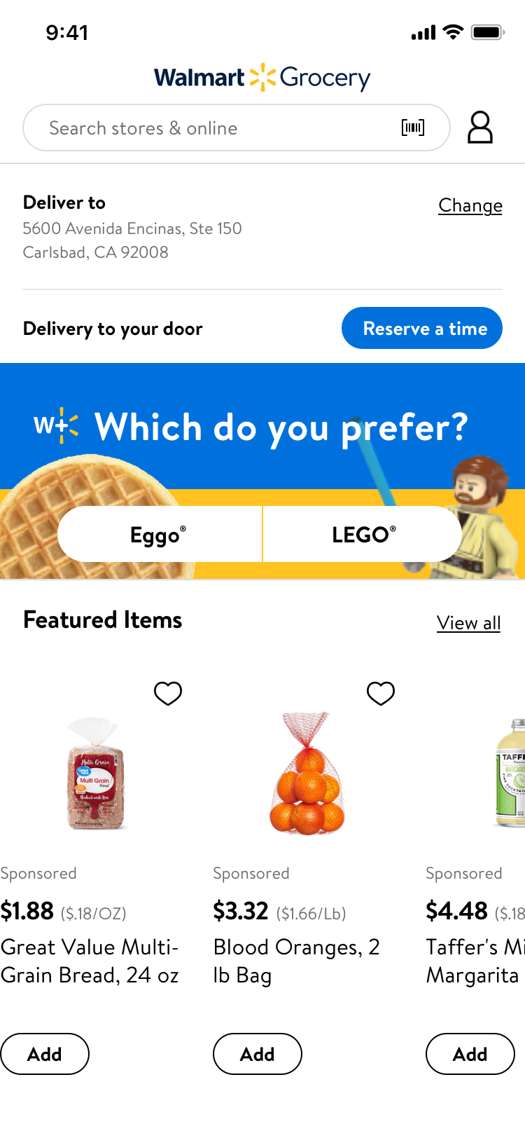
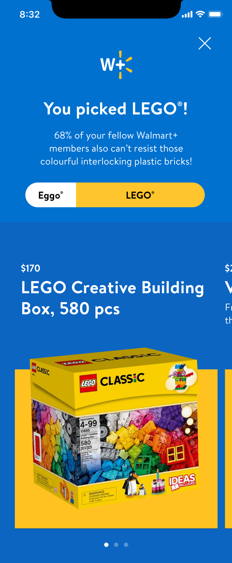
Midnight idea (scrappy sketch): exploring gamifying membership.

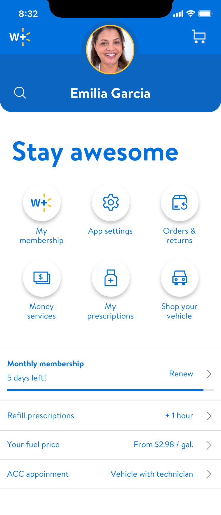
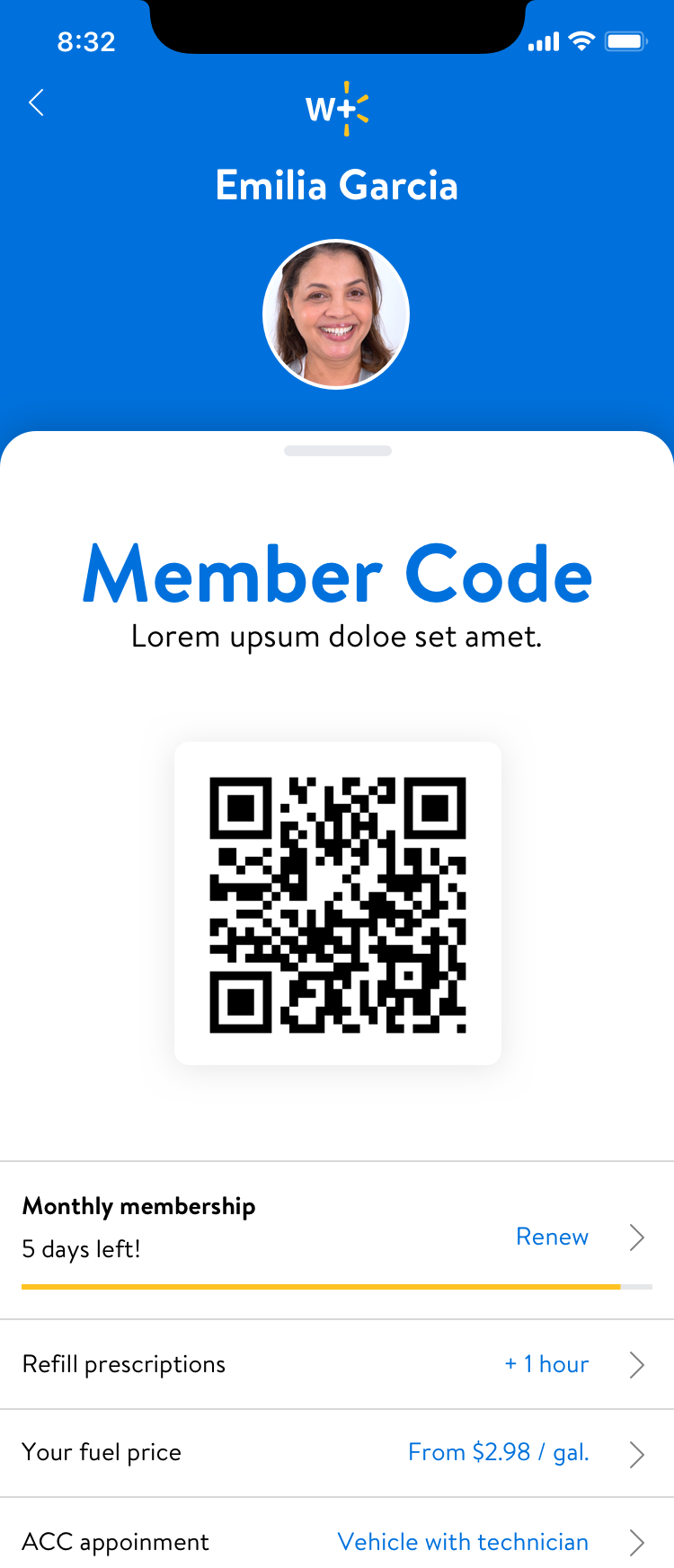
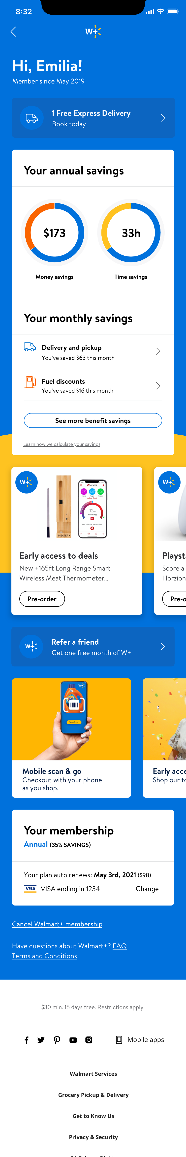
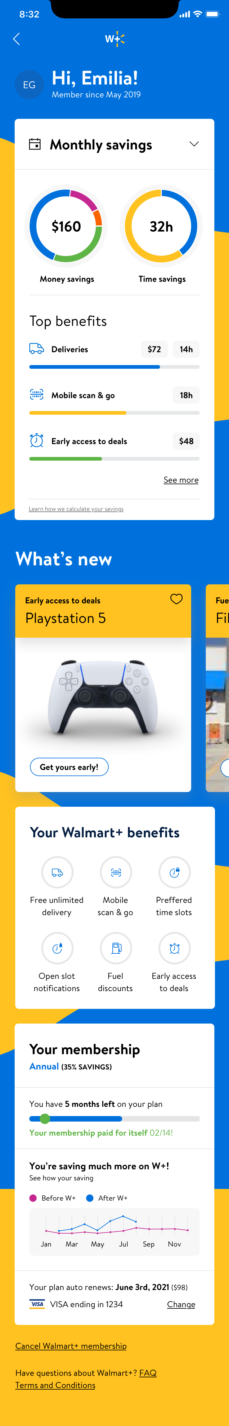
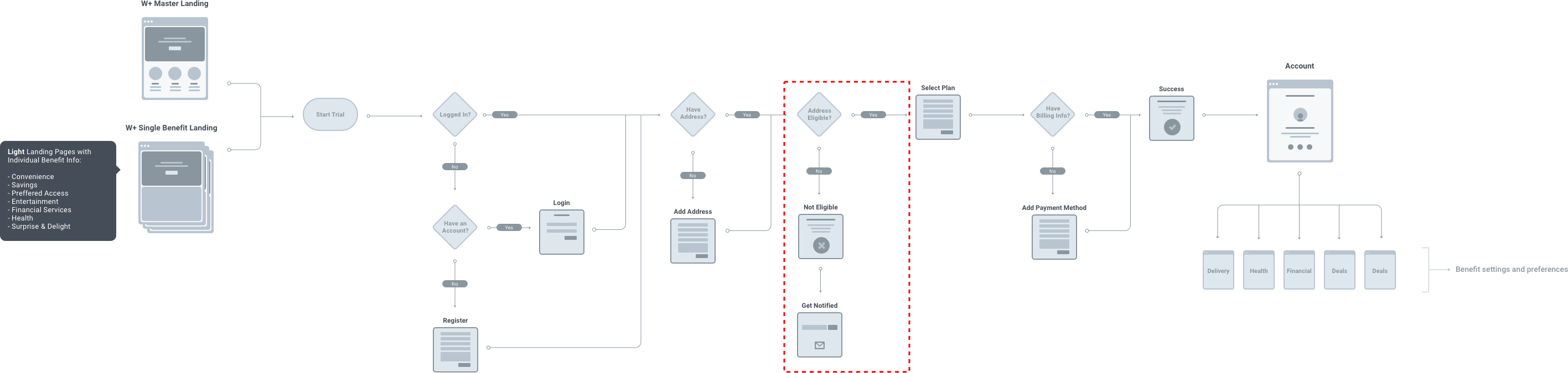
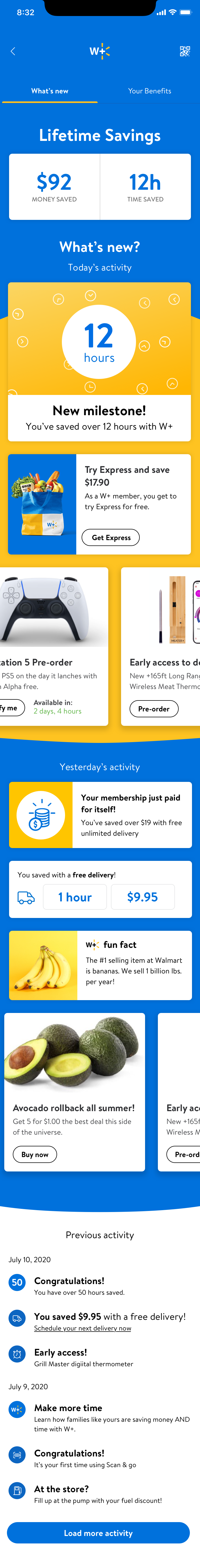
Architecture
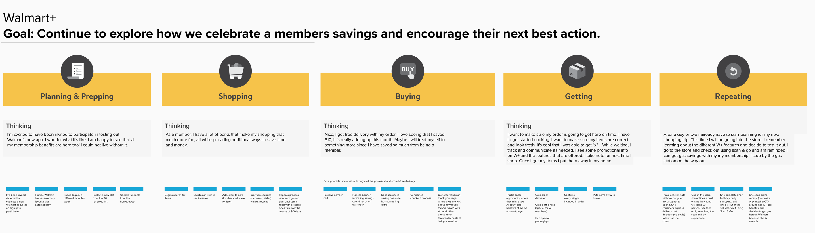
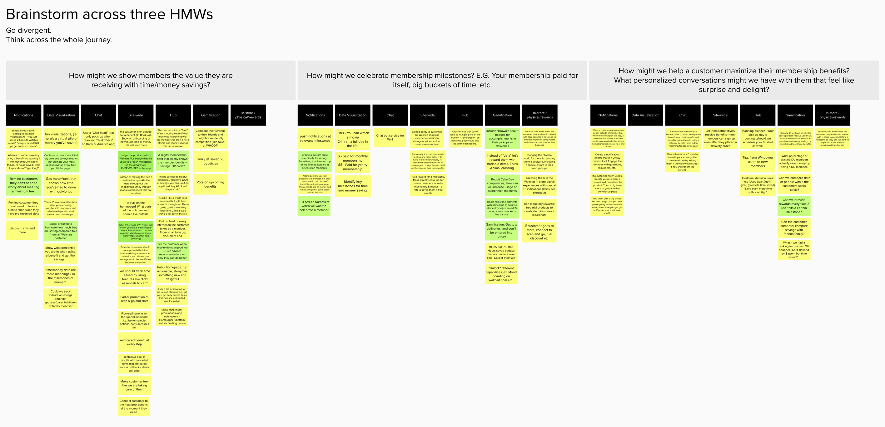
At this point, we started getting actual requirements, we had plenty of ideations to share, and things were getting buttoned up. We took a side step to look at how the whole W+ account navigation could work; I led team brainstorms around user flows and subsequent best actions and celebration moments, which created some excellent output!
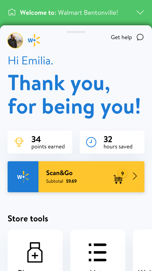
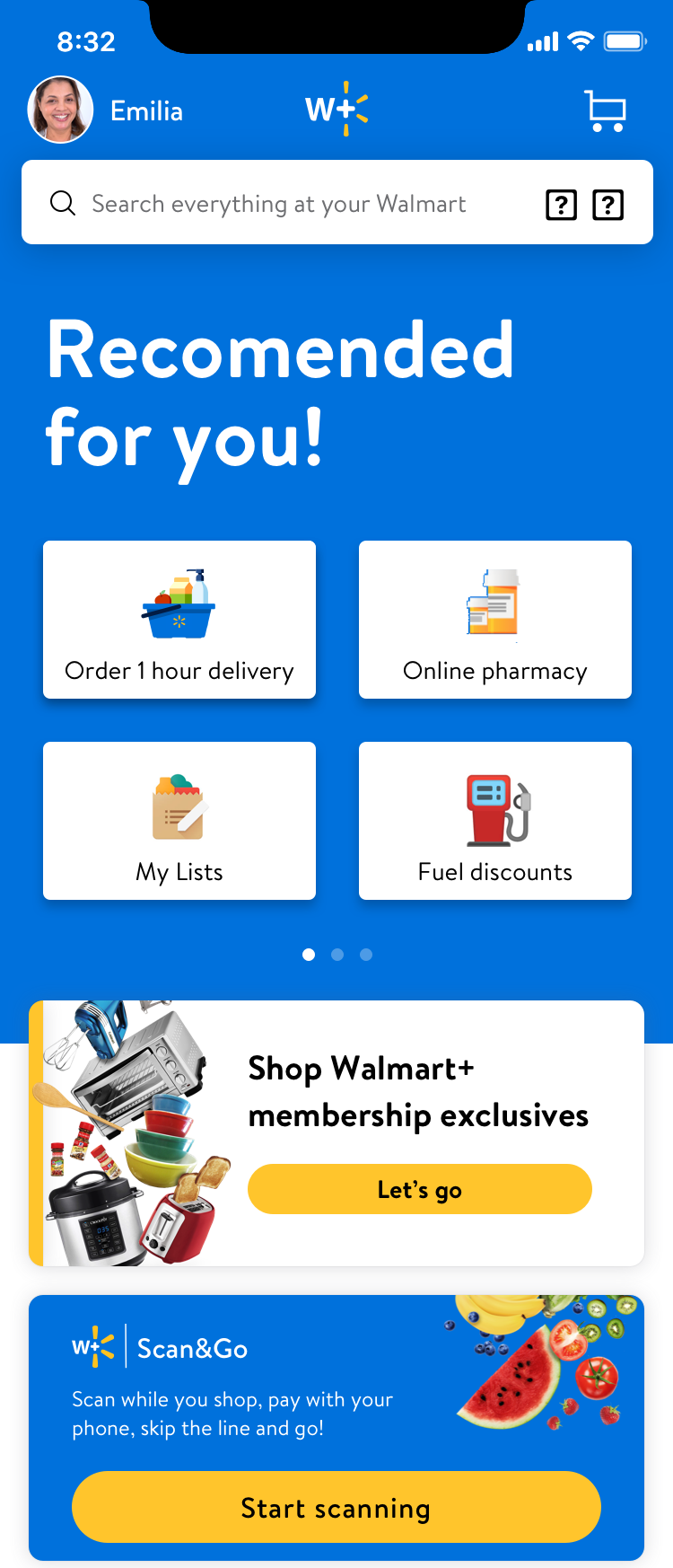
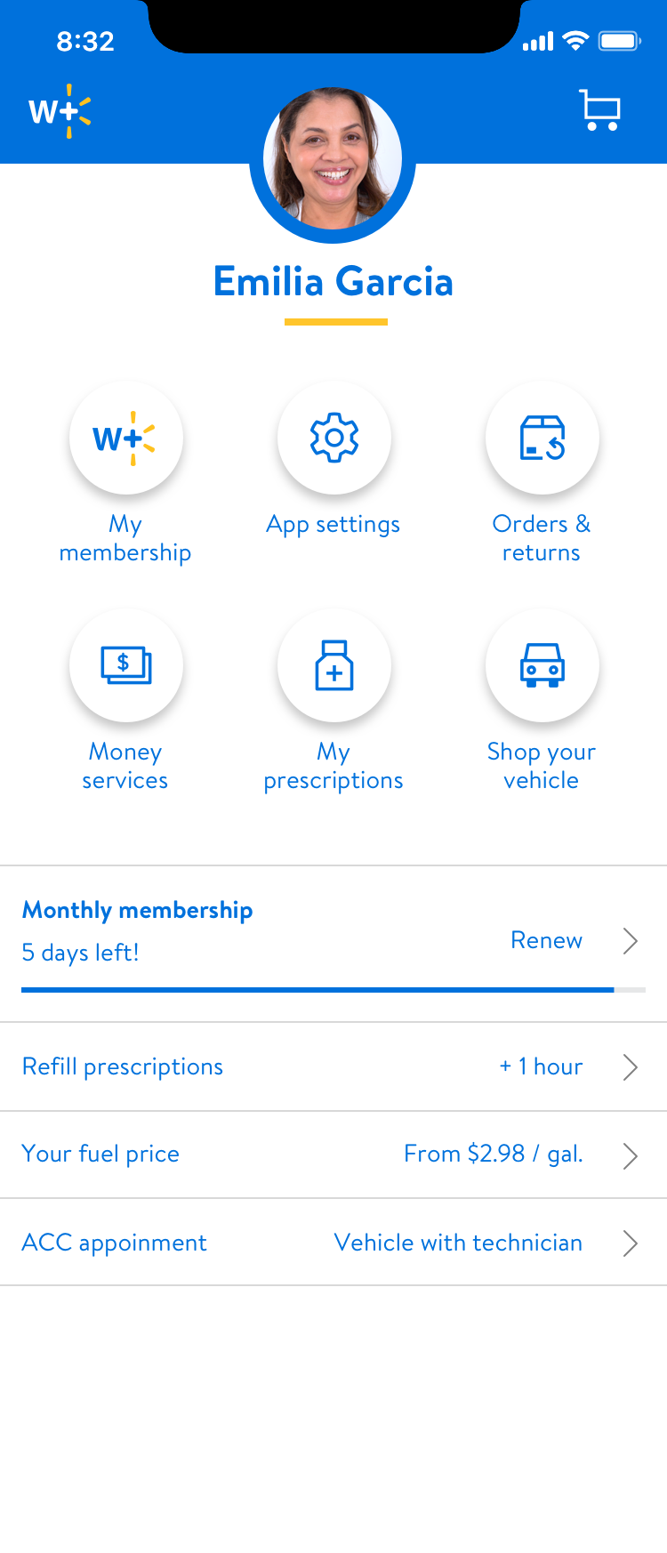
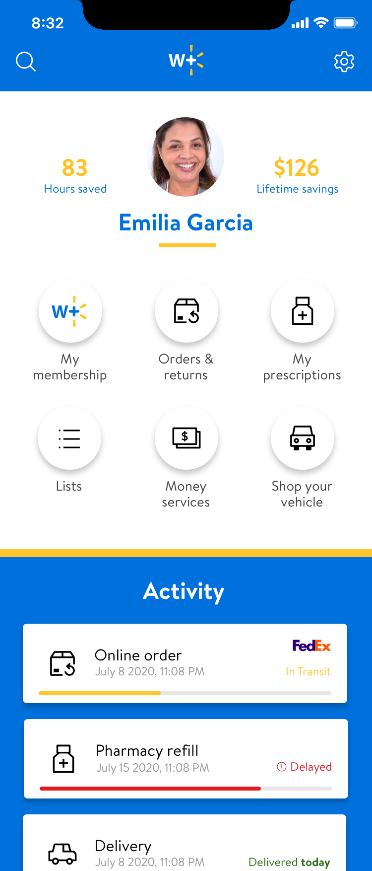
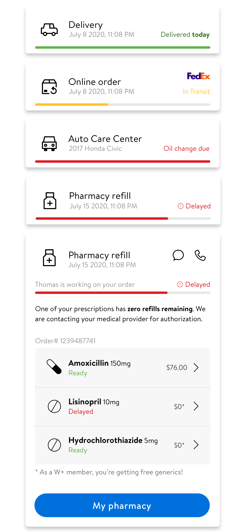
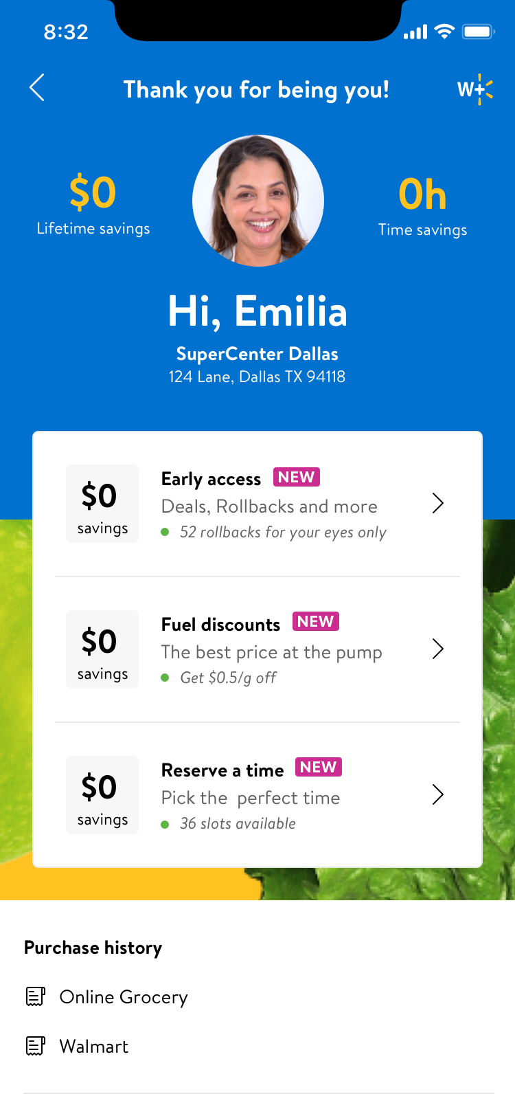
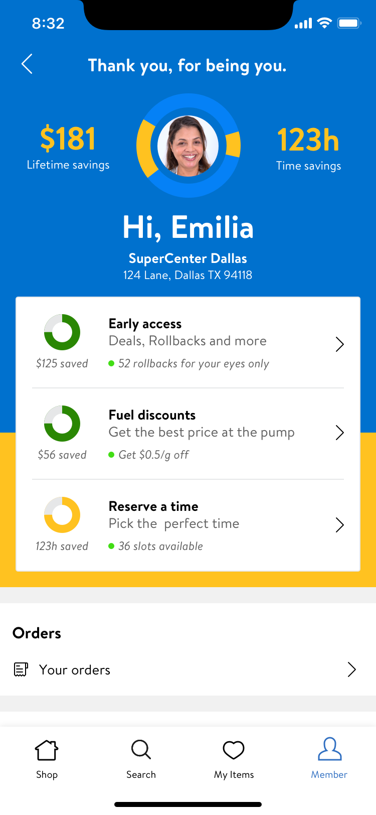
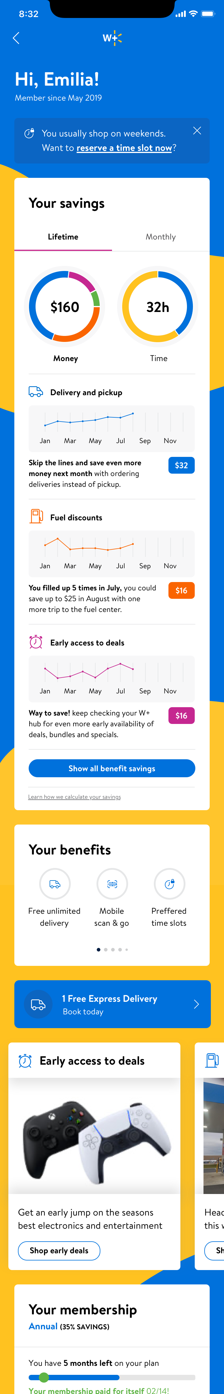
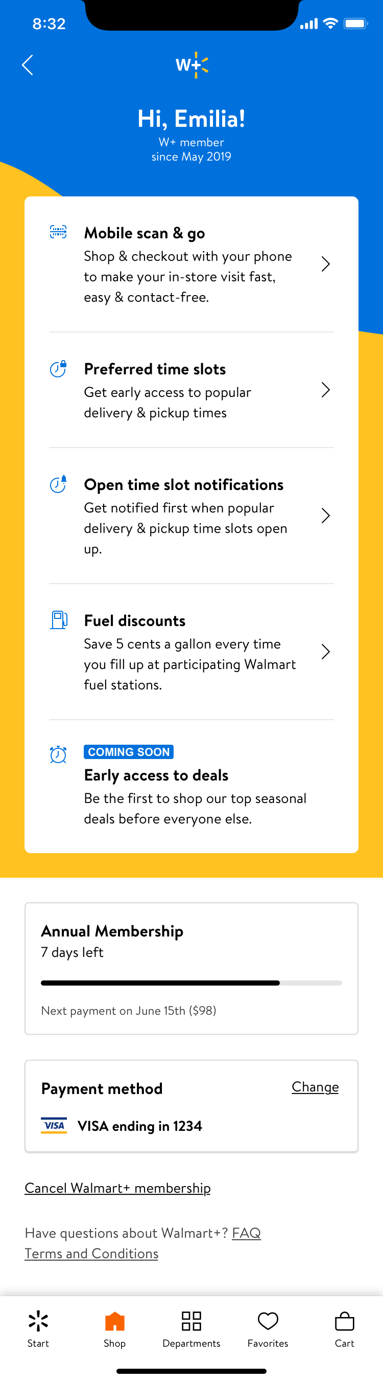
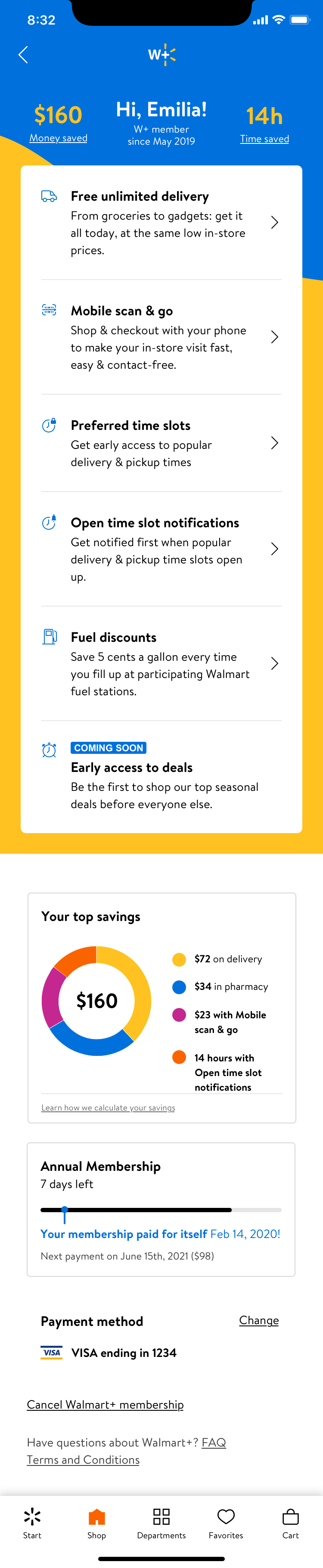
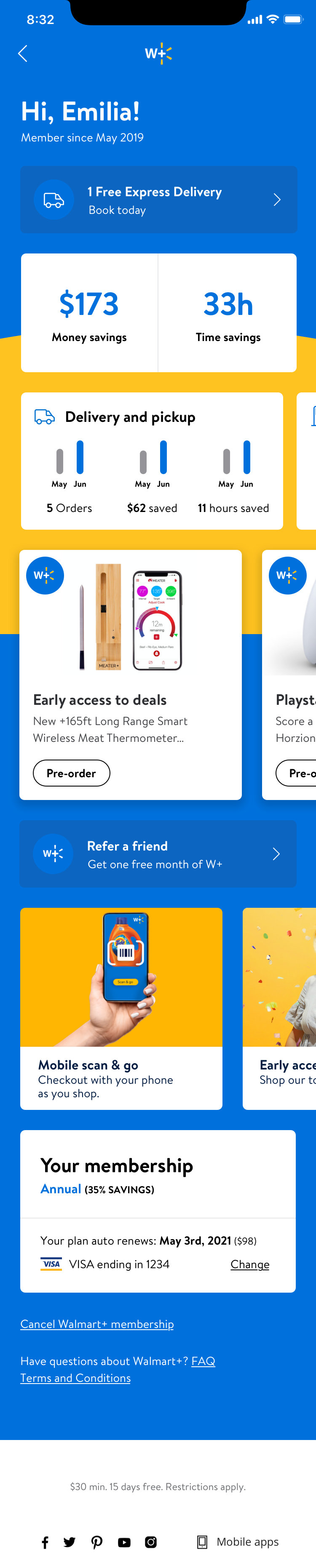
MVP release
As I continued this work, we had simultaneous product and engineering planning. From the explorations, brainstorms, and countless meetings, a solid schedule, actual W+ benefits& perks, and a dialed-back MVP requirements dock came into play.
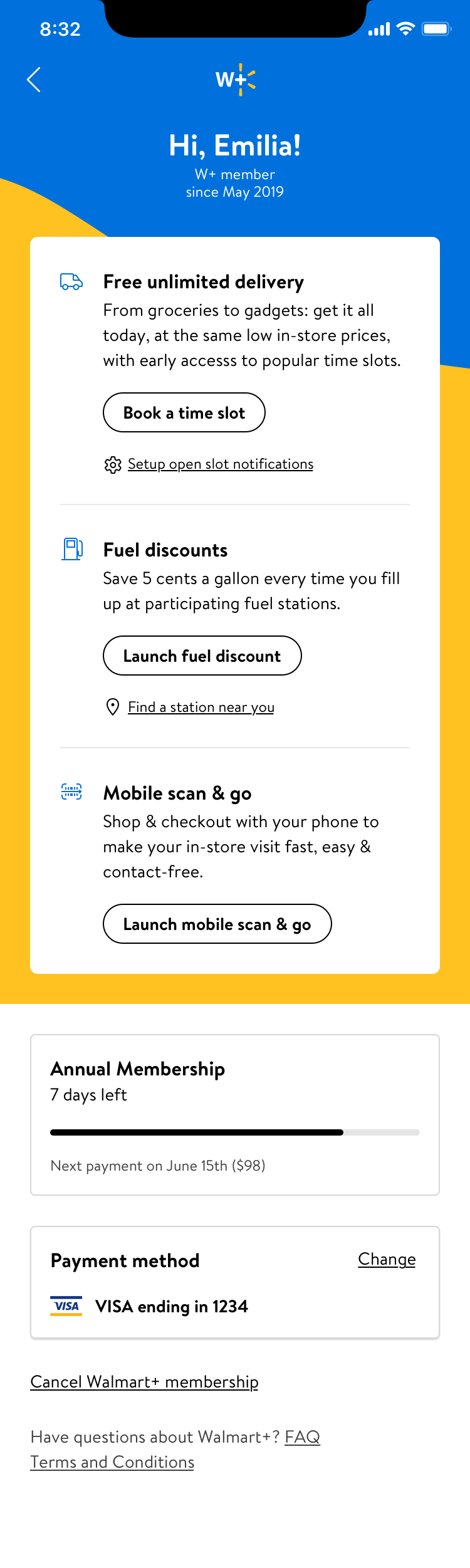
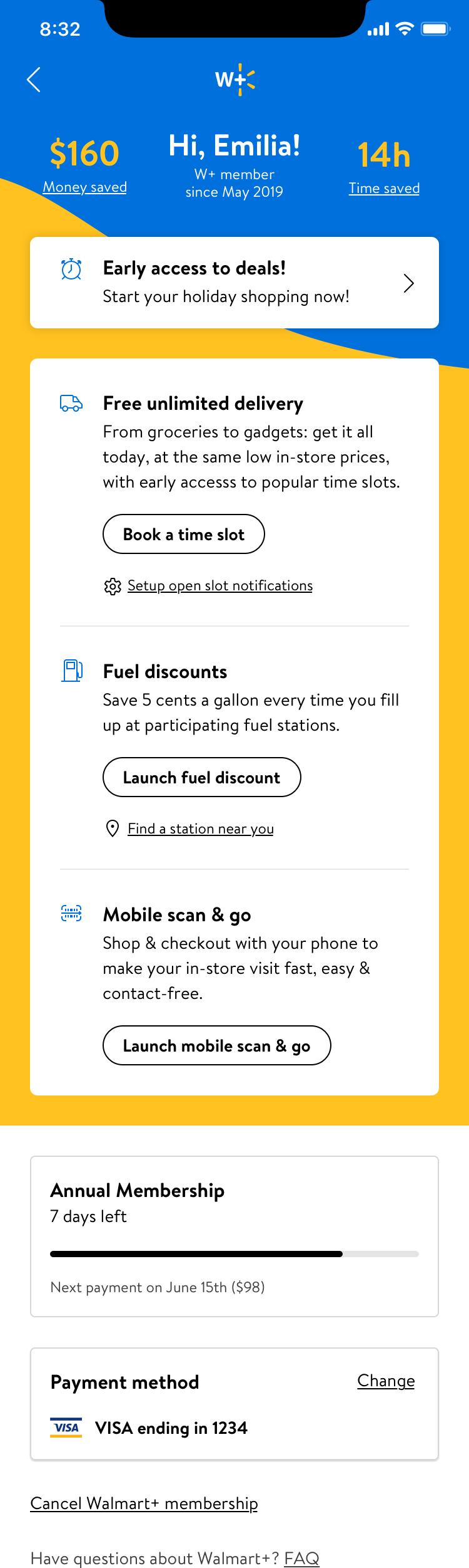
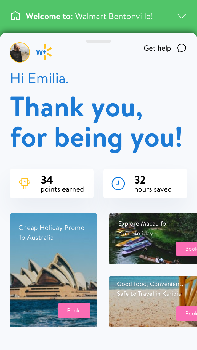
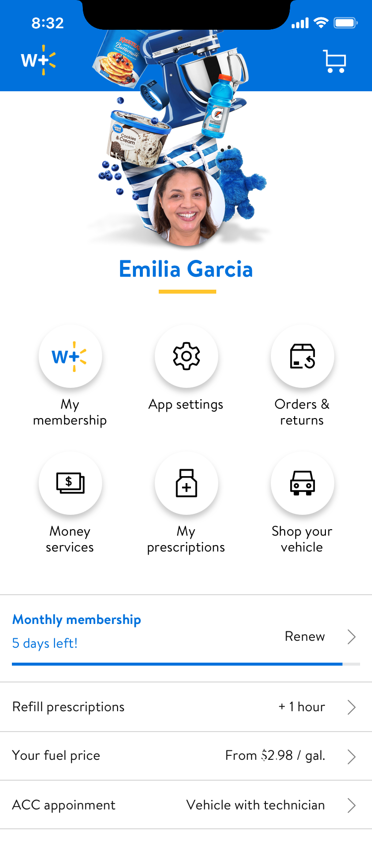
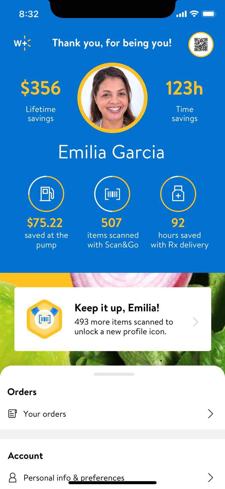
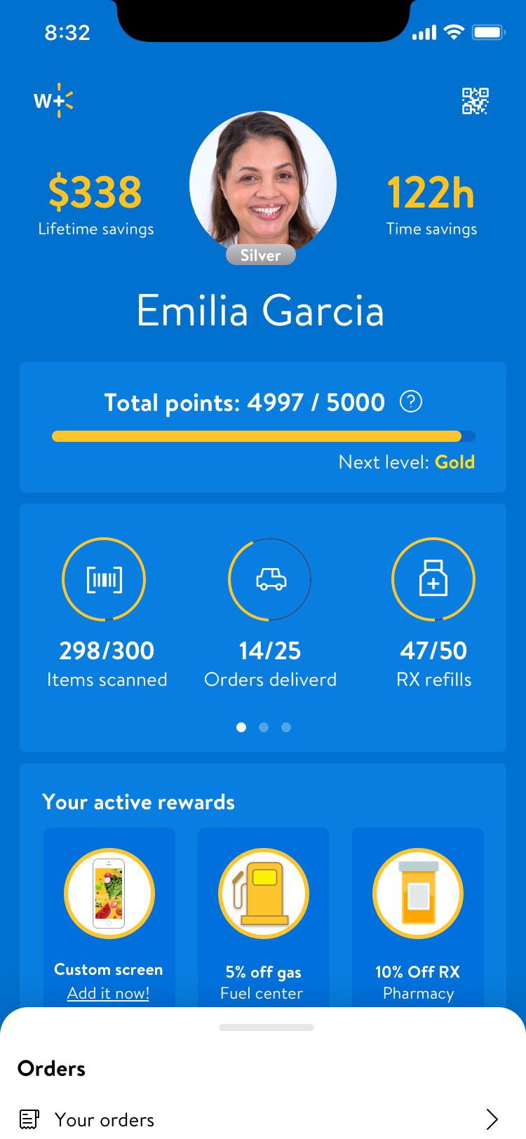
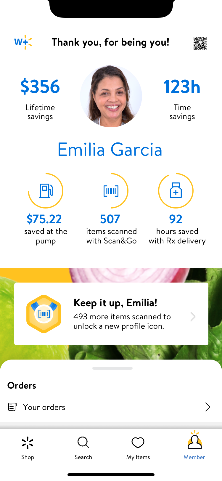
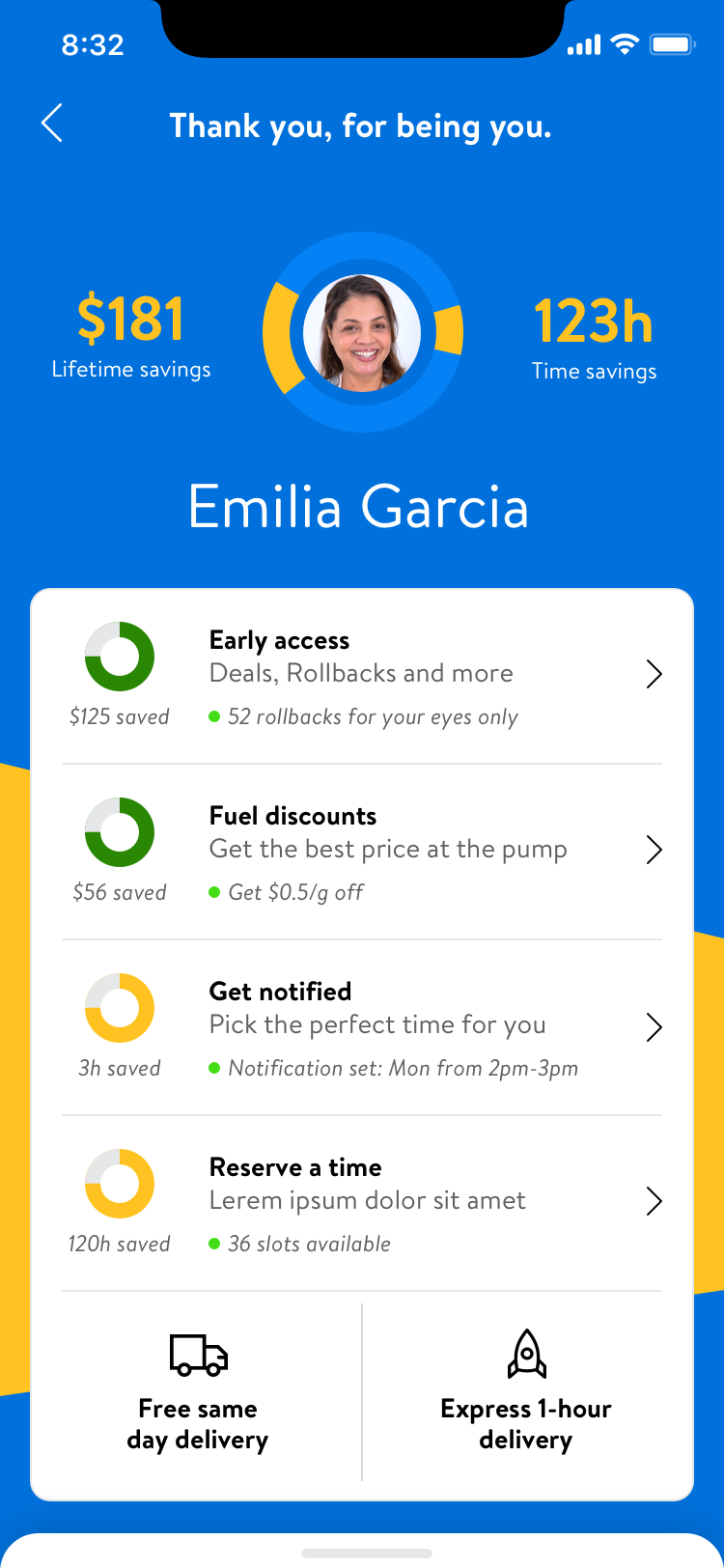
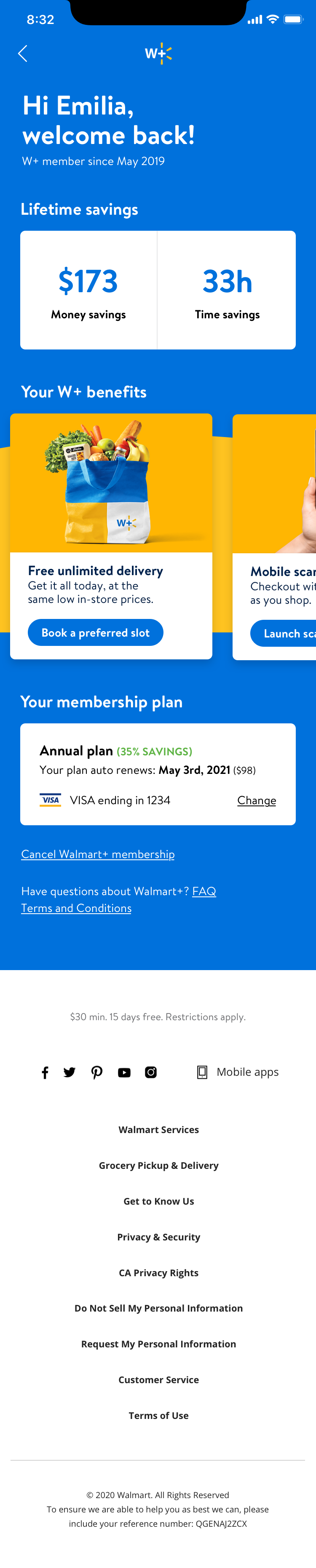
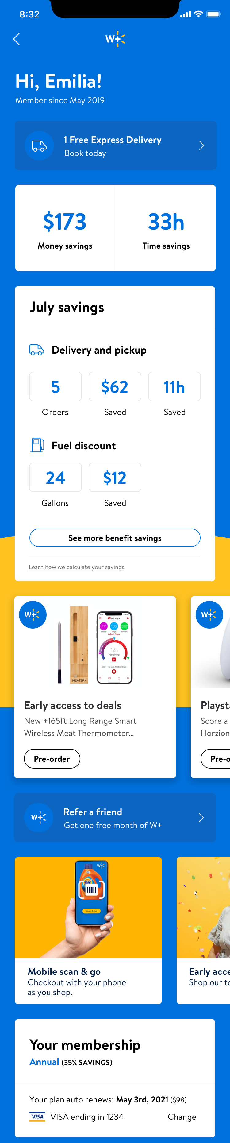
Post MVP
As these screens were being shared out and built by engineering, leadership was challenged with the concept of W+ vs. what was being built, and we had a significant pivot to expand these Post MVP screens into a “post” MVP version.
- Date: July 30, 2020
- Company Walmart
- Role Lead Product Designer
- Platform iOS, Android, Web