
Walmart+
Walmart's whole identity is built on one promise: we already give you the lowest price. So when the company decided to build a paid membership on top of that promise, the project started with an honest problem.
Overview
Context
Walmart+ launched publicly on September 15, 2020, built on top of an earlier program called Delivery Unlimited and accelerated hard by the pandemic, Walmart had rolled out two-hour Express Delivery just months earlier, in April 2020, as shopping habits shifted overnight. Leadership wanted to take that momentum further: a single membership pulling together delivery, in-store tools like Scan & Go, and fuel discounts, positioned as the next evolution of how Walmart served its customers. Walmart was careful in public messaging never to call it a Prime competitor, even though everyone covering the launch read it that way.
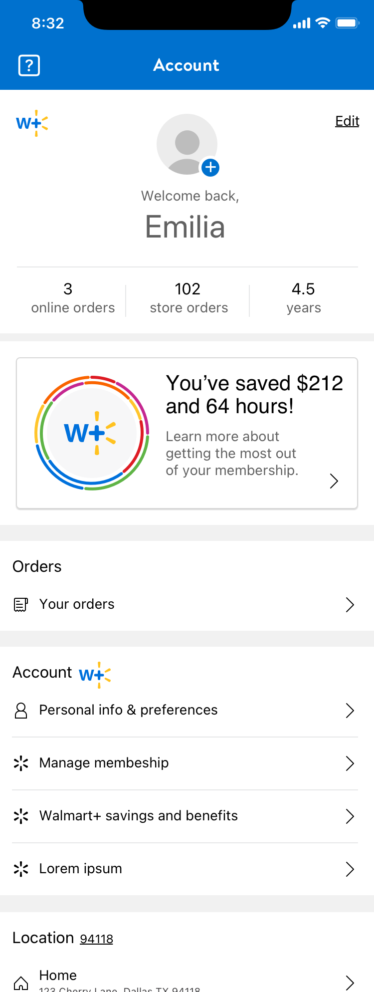
I was brought onto the project directly by the Sr. Director of Product Design, on the strength of earlier work: Automotive Fitment, a redesign of Walmart's automotive fitment tools aimed at reducing incorrect purchases and returns, and sole design ownership of Gift Finder, which drove double-digit conversion growth. That track record is what put me on Walmart+ to answer a genuinely open question: what does the "home" of a paid Walmart membership look like? Is it part of the account? Its own section? How does it compete with navigation that already exists across the app and site? What does a member actually want to see there, savings, status, settings, all of it?
My Role
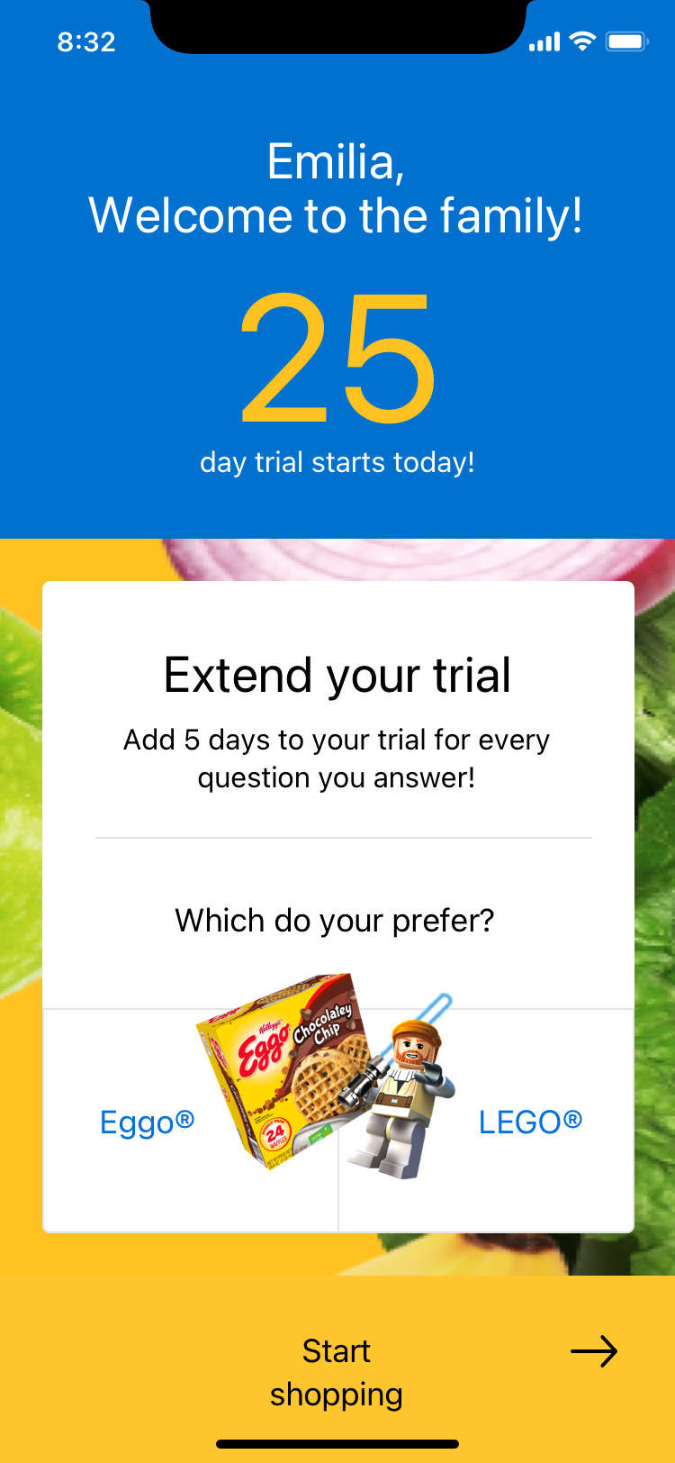
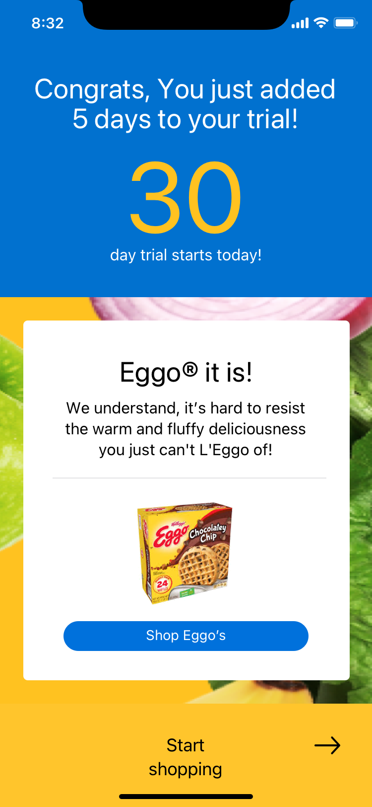
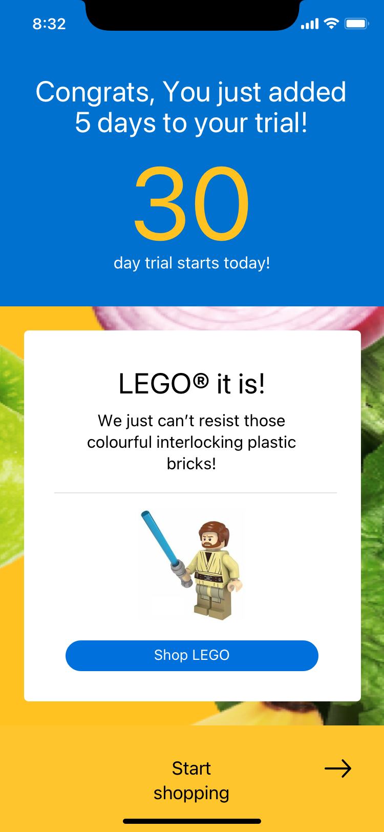
I was the primary designer on the Walmart+ account and dashboard experience, working under creative direction from the Sr. Director of Product Design. Most of what shipped in the MVP was my design work end to end, from early exploration through final screens. The Sr. Director ran his own parallel design track alongside mine, and we synced periodically to share modules and ideas, one example being the trial extension survey, a short quiz mixing playful questions with genuine preference data, that came out of one of those syncs.
How do you sell someone a subscription without implying the free version was never actually the best deal?
Walmart's whole identity is built on one promise: we already give you the lowest price. So when the company decided to build a paid membership on top of that promise, the project started with an honest problem. How do you sell someone a subscription without implying the free version was never actually the best deal?
I came onto Walmart+ off the back of leading Automotive Fitment and Gift Finder at Walmart, work that later led me to eBay Guaranteed Fit. That track record is why the Sr. Director of Product Design brought me directly onto W+, to design its account dashboard and answer a question nobody had fully worked out yet: what does the "home" of a Walmart membership look like?
Early on, W+ was still a concept, and it wasn't obvious it would even feel on-brand. As the design work took shape, leadership liked what they saw, and it became the company's highest-priority project. That raised the stakes on the original tension instead of resolving it. My job became finding ways to make membership feel premium and worth paying for, without making the free Walmart experience look worse by comparison.
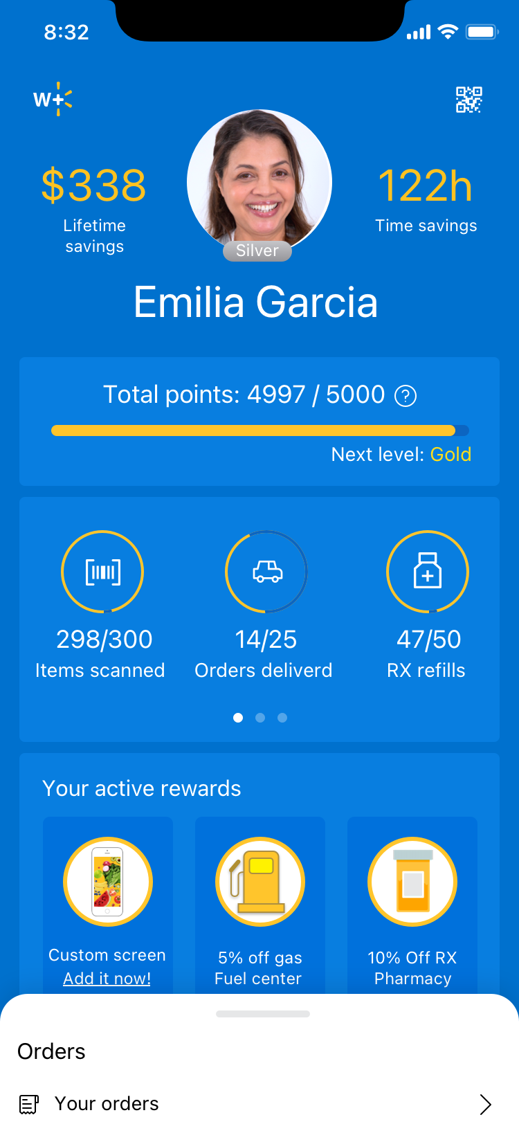
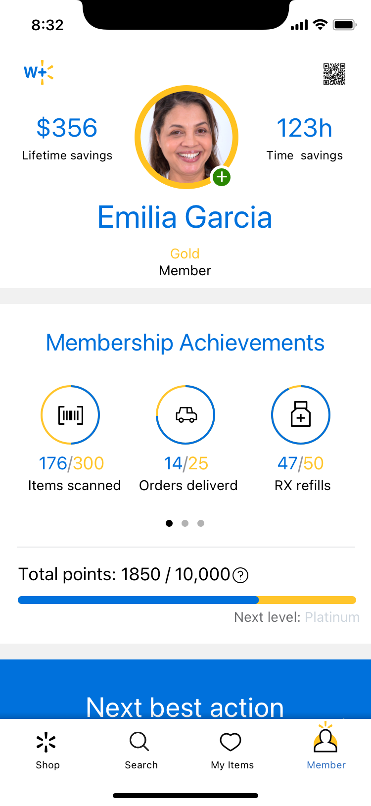
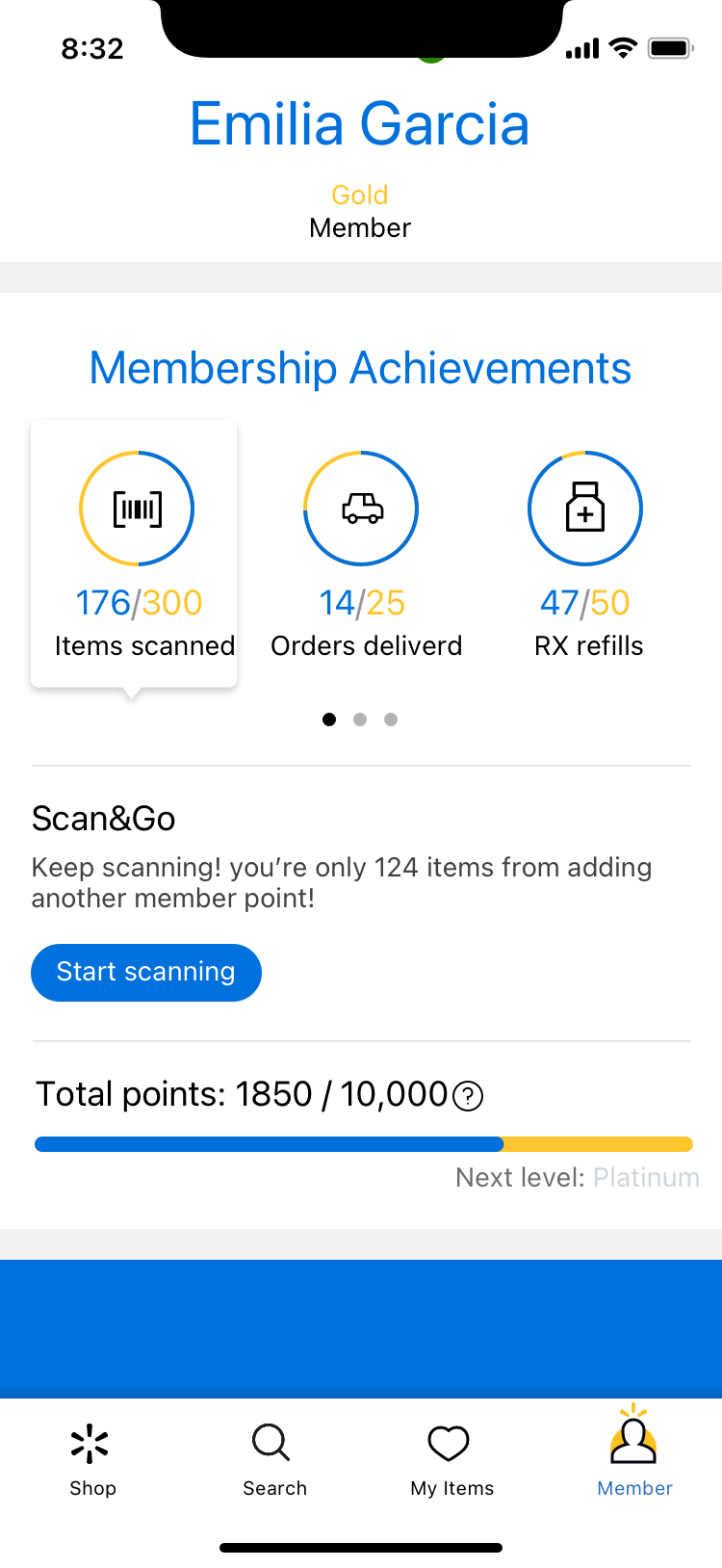
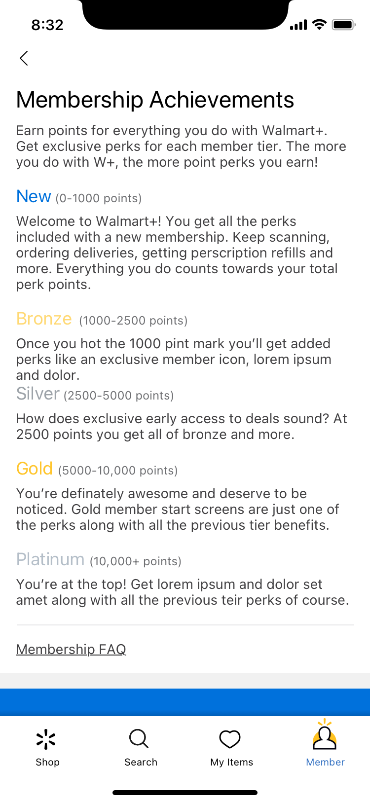
Gamification was already on the table as a direction when I joined those conversations, and I pushed it further with an idea of my own, status tiers like gold and silver, unlocked by how much someone used their benefits. Watching that get set aside taught me as much as anything I actually designed. Not every good idea survives contact with brand risk, and that's a distinction I hadn't had to sit with this directly before.
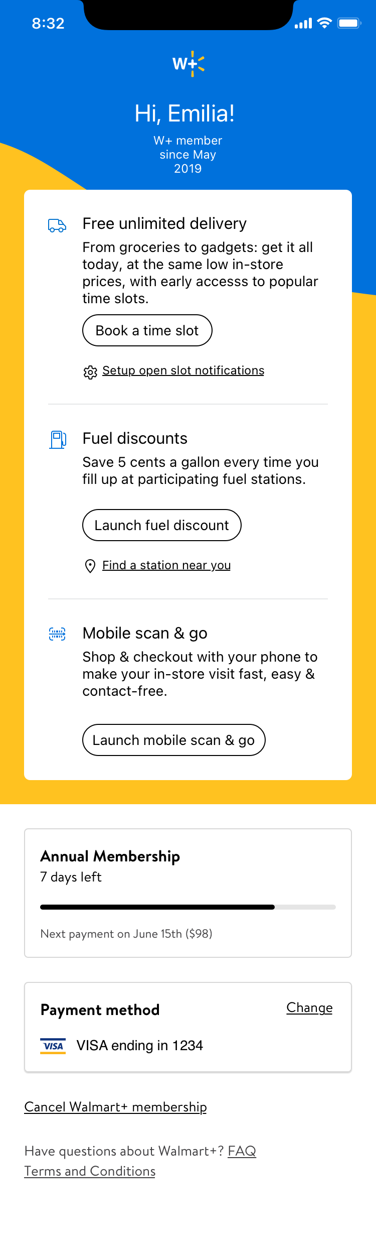
The MVP screens I designed became the foundation of what launched publicly on September 15, 2020. Usability research that came back a few months later surfaced confusion, over what "unlimited delivery" actually meant, over reserved time slots, over fear of a hard-to-cancel membership, and that research has shaped continuous iteration on the experience ever since.
Keep reading below for the fuller story.
Design Problems
A subscription on top of "everyday low prices"
Walmart's brand promise was already built around giving customers the best price, full stop. A paid membership sitting on top of that promise risked reading as a quiet admission that the free experience was never quite the best deal. Leadership had to figure out what a membership could offer that justified a price tag without undercutting decades of brand positioning. That took time to work out, and the design work had to move without a settled answer.
Very little to build on
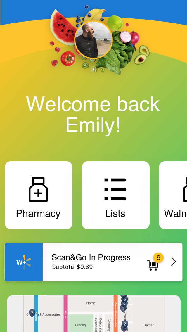
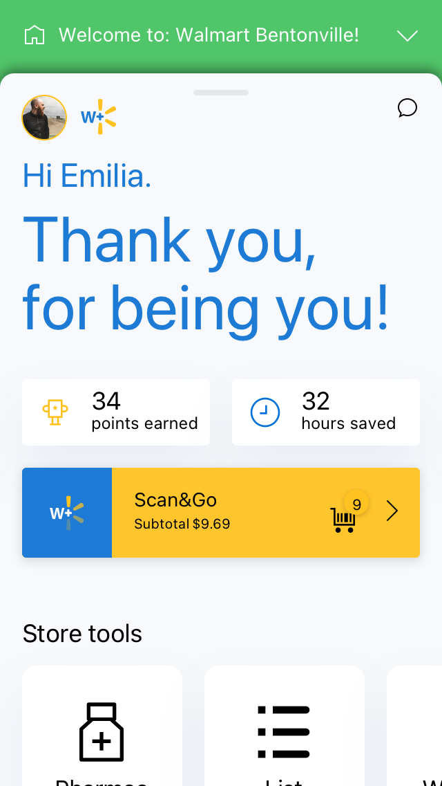
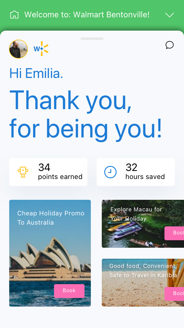
Outside of Delivery Unlimited, a smaller subscription tightly integrated into cart and checkout, there wasn't much existing research to carry over. I looked at competitive membership dashboards and pulled inspiration from unrelated categories entirely, banking apps, budgeting tools, social platforms, fitness and gaming dashboards, just to find a starting point for what a "home" for a membership could even look like.
The stakes kept rising
What started as a conceptual bet, would this even feel like Walmart, became the company's top design priority as soon as leadership saw the early work land. That's a good problem to have, but it meant the brand-positioning question above got harder to answer, not easier, the more excited everyone got.
Challenges
Waiting on a moving answe
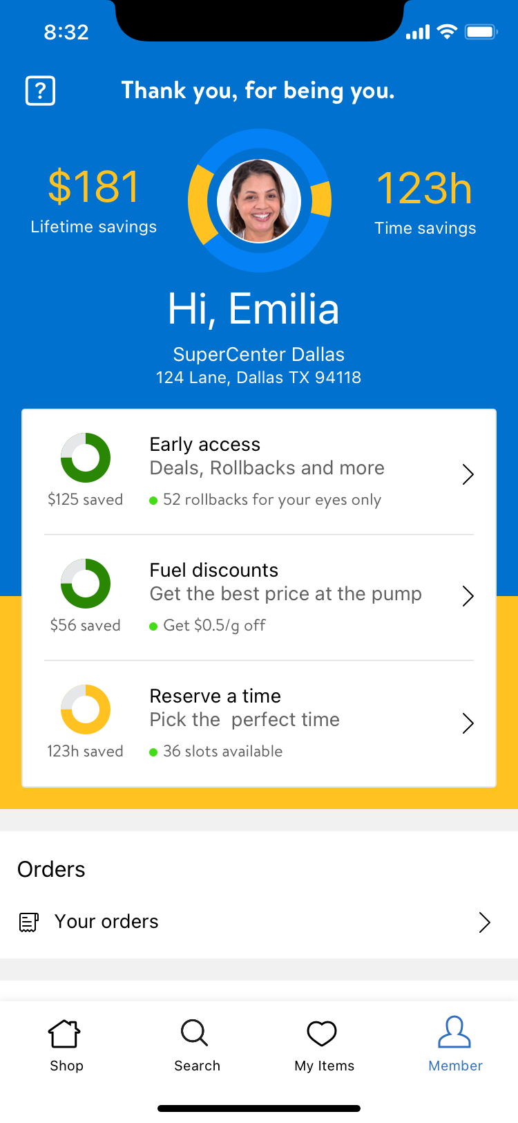
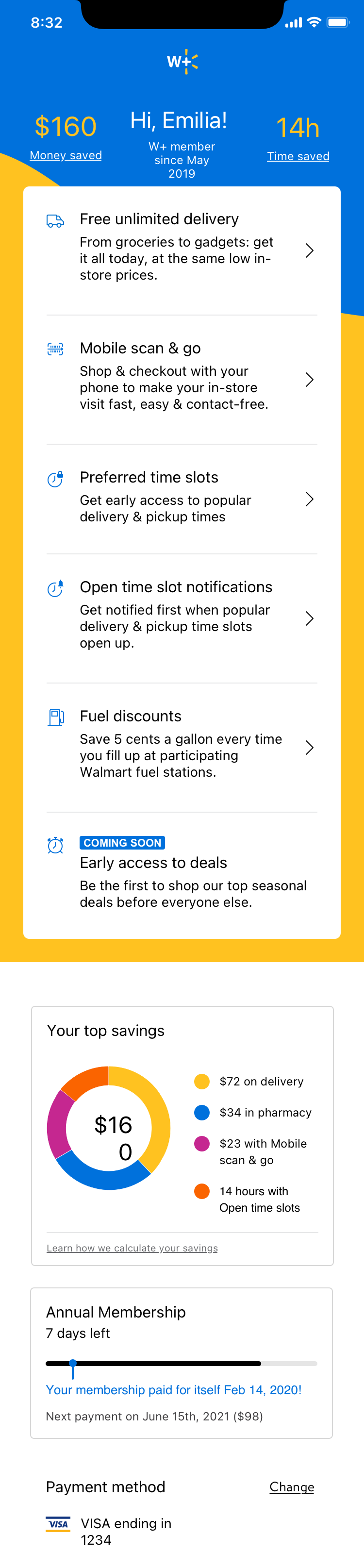
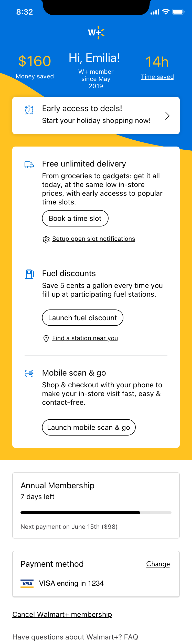
Leadership spent time working out what would make membership worth the price: preferred delivery time slots, fuel discounts, faster access to in-demand slots. That work happened in parallel with mine, and it wasn't fully settled while I was designing. I had to build toward benefits that were still being defined, rather than a locked list of features.
Premium without punishing the free experience
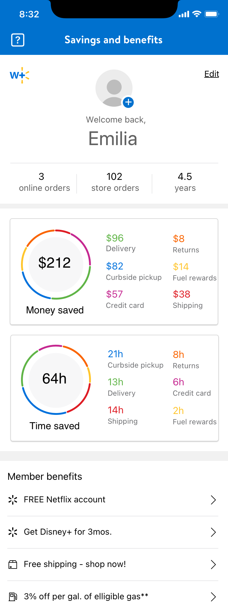
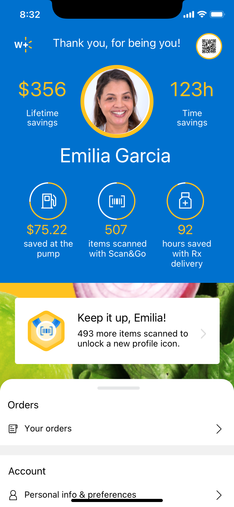
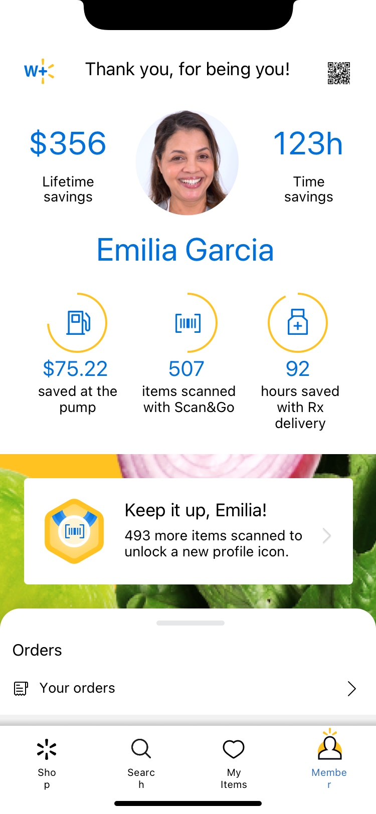
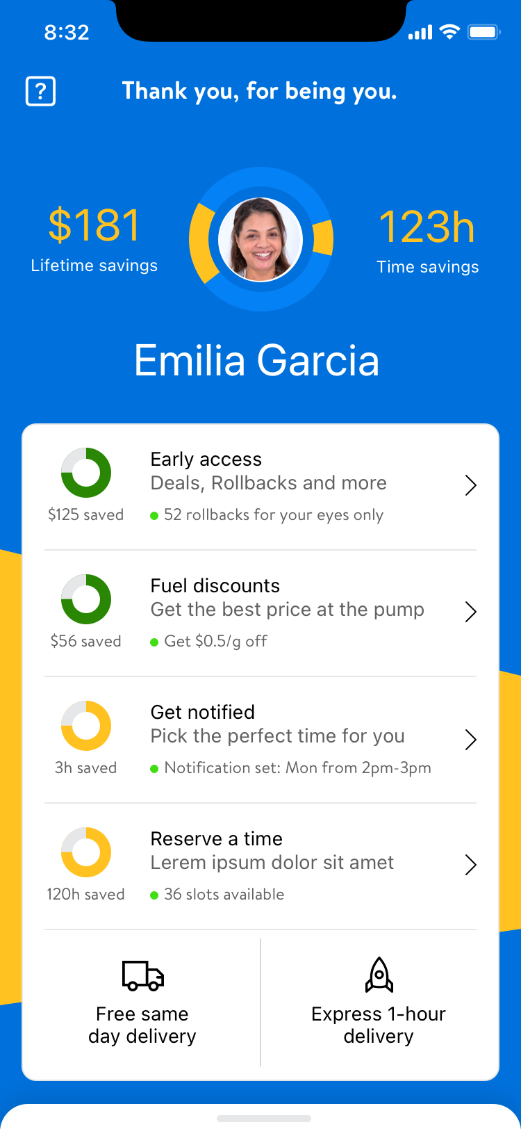
Once benefits started taking shape, my job was to make them feel immediate and worth paying for, without making the regular Walmart experience look diminished next to it. Showing too much, too many callouts, too much granular savings data, too many perks stacked on a single screen, started to make the base experience feel like the consolation prize. Restraint became the actual design skill here, more than polish.



An idea that didn't survive brand risk
Gamifying membership was already a direction being explored when I joined those conversations. I pushed it further with my own idea inside that direction, status tiers like gold and silver, unlocked by how much someone used their benefits. It was a fun idea, and it went into conversations with leadership. It didn't make the cut. I wasn't the one making that call, it wasn't my decision to make, but sitting in those conversations taught me something I hadn't had to learn as directly before: a good design idea and a good business decision aren't always the same idea, and knowing the difference is its own skill.
Solutions
A lot of exploration before any of it got locked
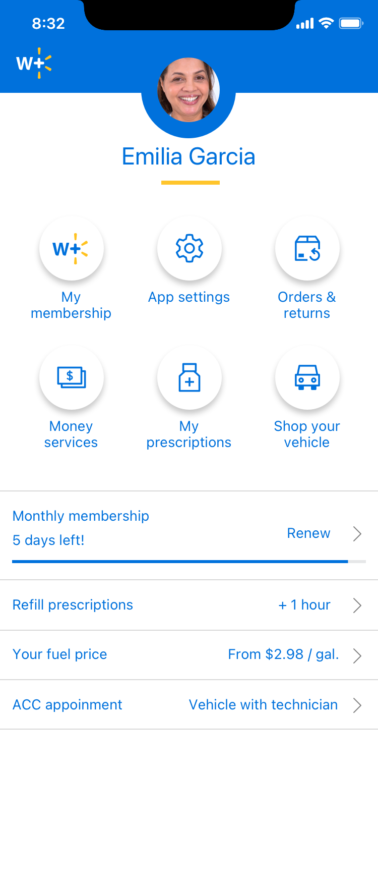
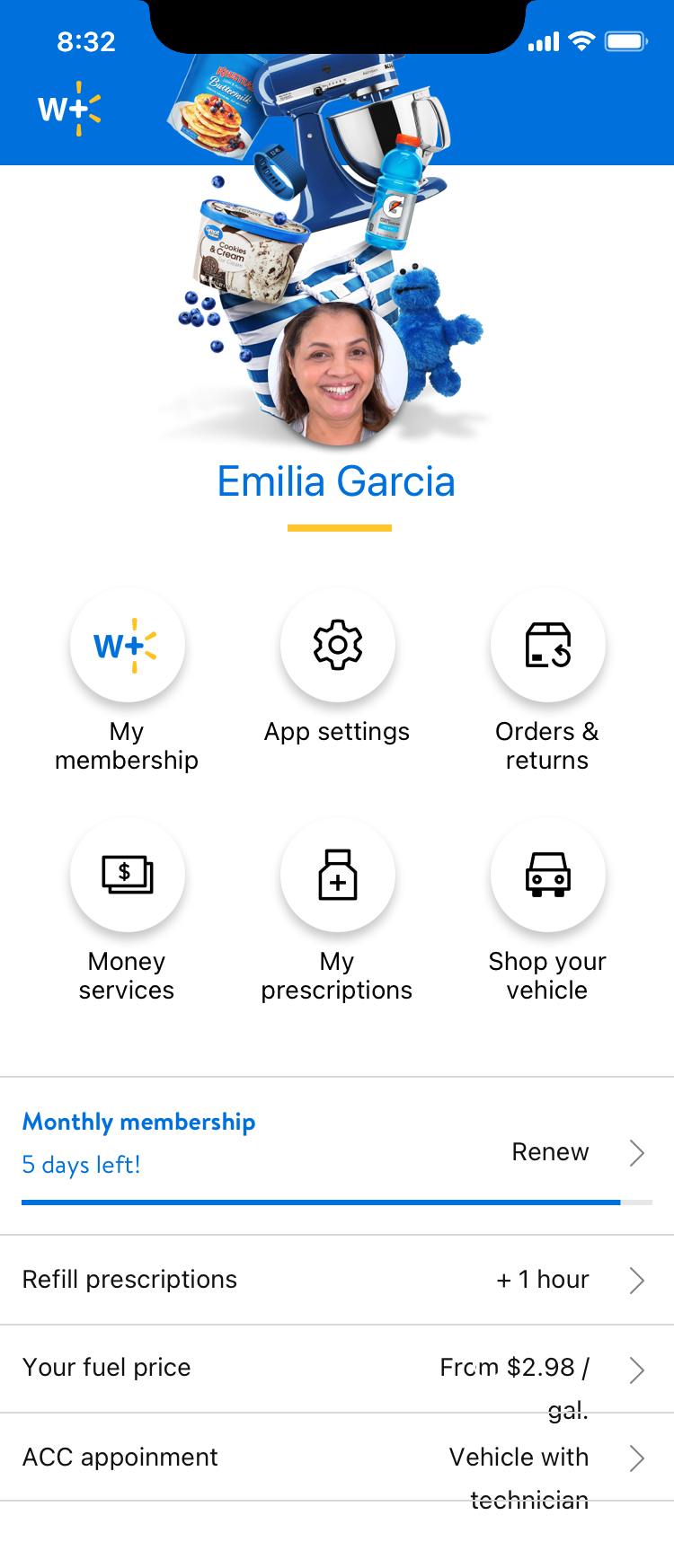
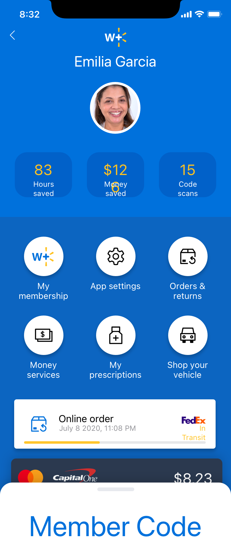
I moved through several distinct rounds: rough, wide-open concepts first, then a pass focused on control styles and content hierarchy, then an exploration of savings, status, and progress tracking as a way to show ongoing value. A later round integrated actual W+ branding into the screens as the visual identity started to solidify. None of these were precious, they were built to be thrown away, which is what most of them were.
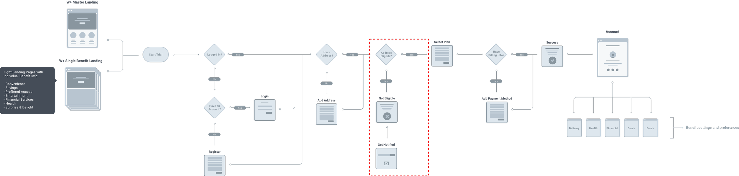
Architecture work, done as a team
Once actual requirements started landing, I worked with the Sr. Director to figure out how the whole W+ account navigation should work, running brainstorms around user flows, best-next-action moments, and small celebration moments that could make
What actually shipped
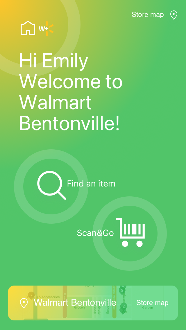
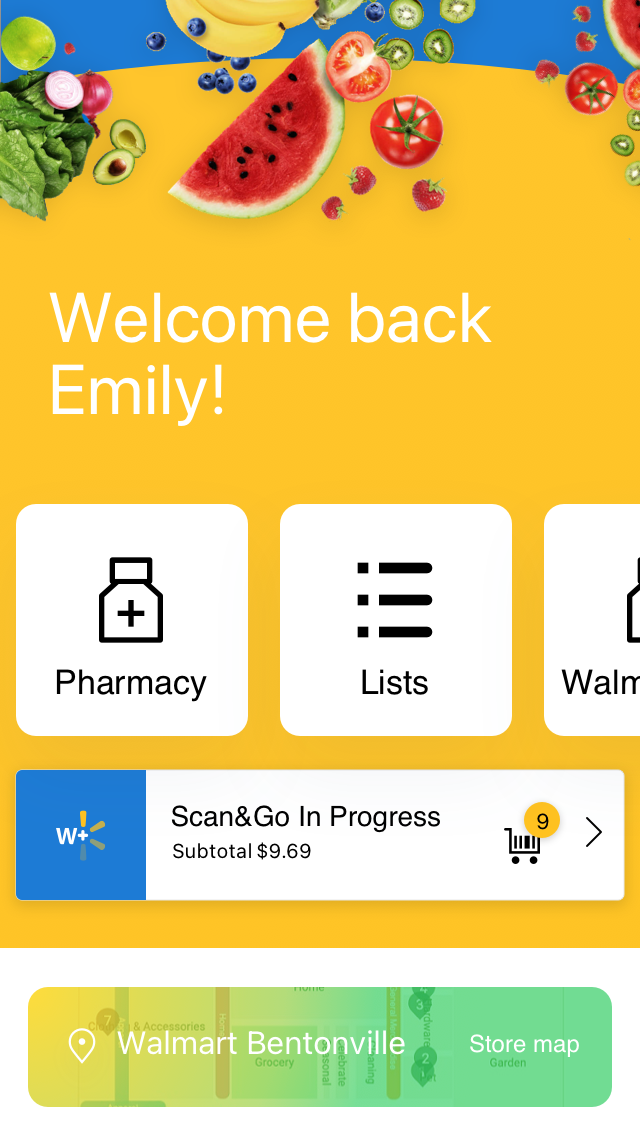
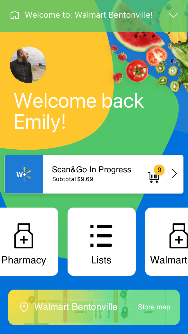
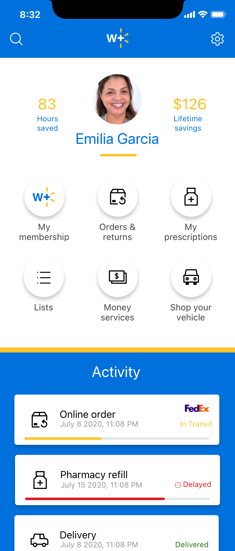
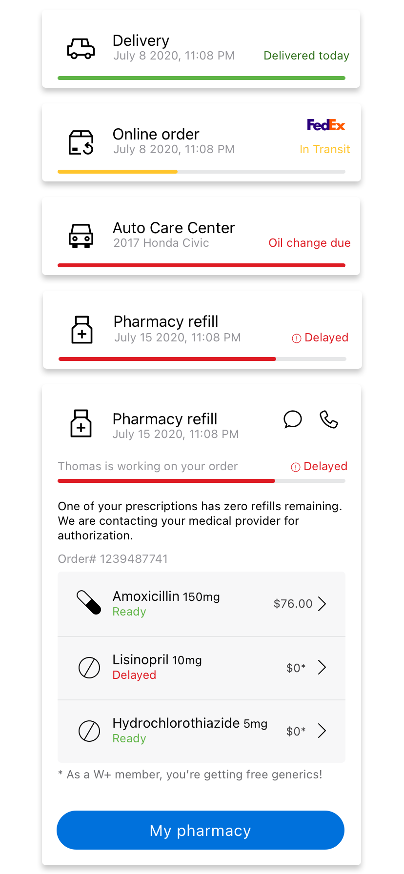
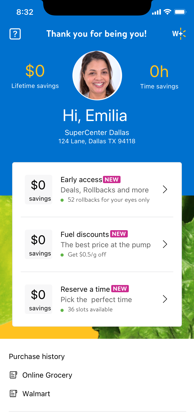
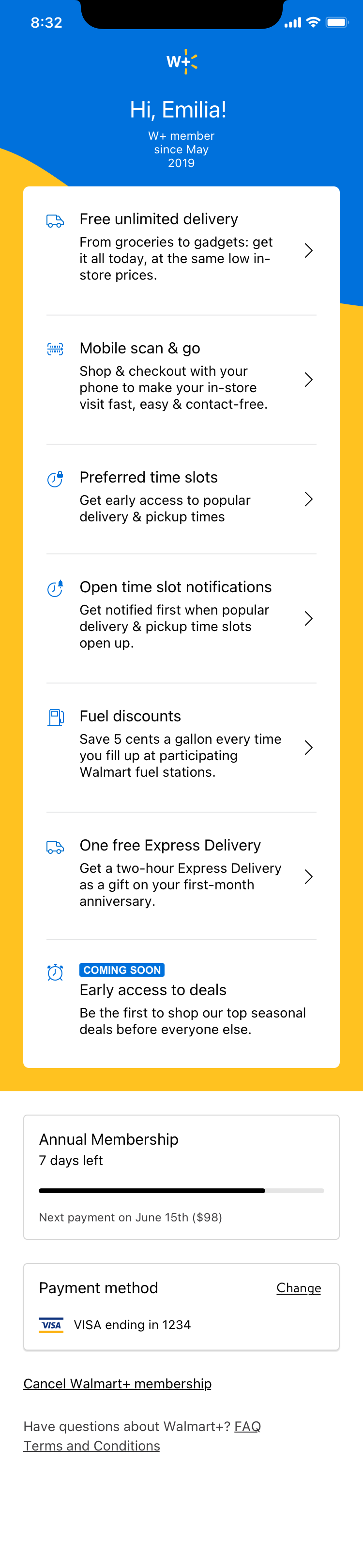
The MVP settled into a smaller, more disciplined set of account screens: day-zero states for new members, states for members without delivery access, and the core dashboard structure the rest of the experience was built around. It's a noticeably smaller footprint than the exploration rounds that came before it, on purpose. The parts that made the cut were the parts that could justify themselves against the brand risk, not just the parts that looked good in a deck.
Research shaped what came after, and kept shaping it
A usability study run a few months after MVP screens were built, 17 participants walking through three different entry points into W+, surfaced clear gaps: people couldn't tell what "unlimited delivery" actually meant and often confused it with Amazon Prime, reserved time slots read as either item-availability signals or first-come priority depending on who you asked, and plenty of people expected to check out from their phone with Scan & Go and were let down to learn they still had to use a self-checkout kiosk. There was no separate "phase two," this fed directly into the same ongoing design work, and W+'s account experience has kept iterating off findings like these since launch.
Results
Walmart doesn't publicly disclose Walmart+ subscriber counts, so I don't have an internal number I can point to as a direct result of this work. What's publicly known: the service scaled to somewhere around 8 million members within its first five months, and to roughly 11.5 million by early 2022, according to third-party estimates, with members shopping more often and spending more per visit than non-members. That's a company-wide outcome, not a claim about my specific screens, but it's the backdrop this design work shipped into.
What I can speak to directly is the MVP account experience became the actual foundation of what launched publicly in September 2020, and it's kept evolving from there based on usability findings rather than assumptions. The bigger result for me personally was learning where design ambition needs to yield to brand and business risk, watching an idea I believed in get set aside for reasons that had nothing to do with craft, and coming out the other side better at telling the difference between a good screen and a good decision.