
boohma
Designing a best-in-class out-of-home media planning tool, map UI and all.
Beautiful, functional chaos, tamed.
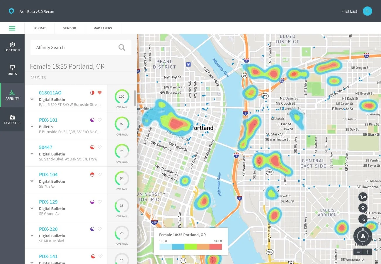
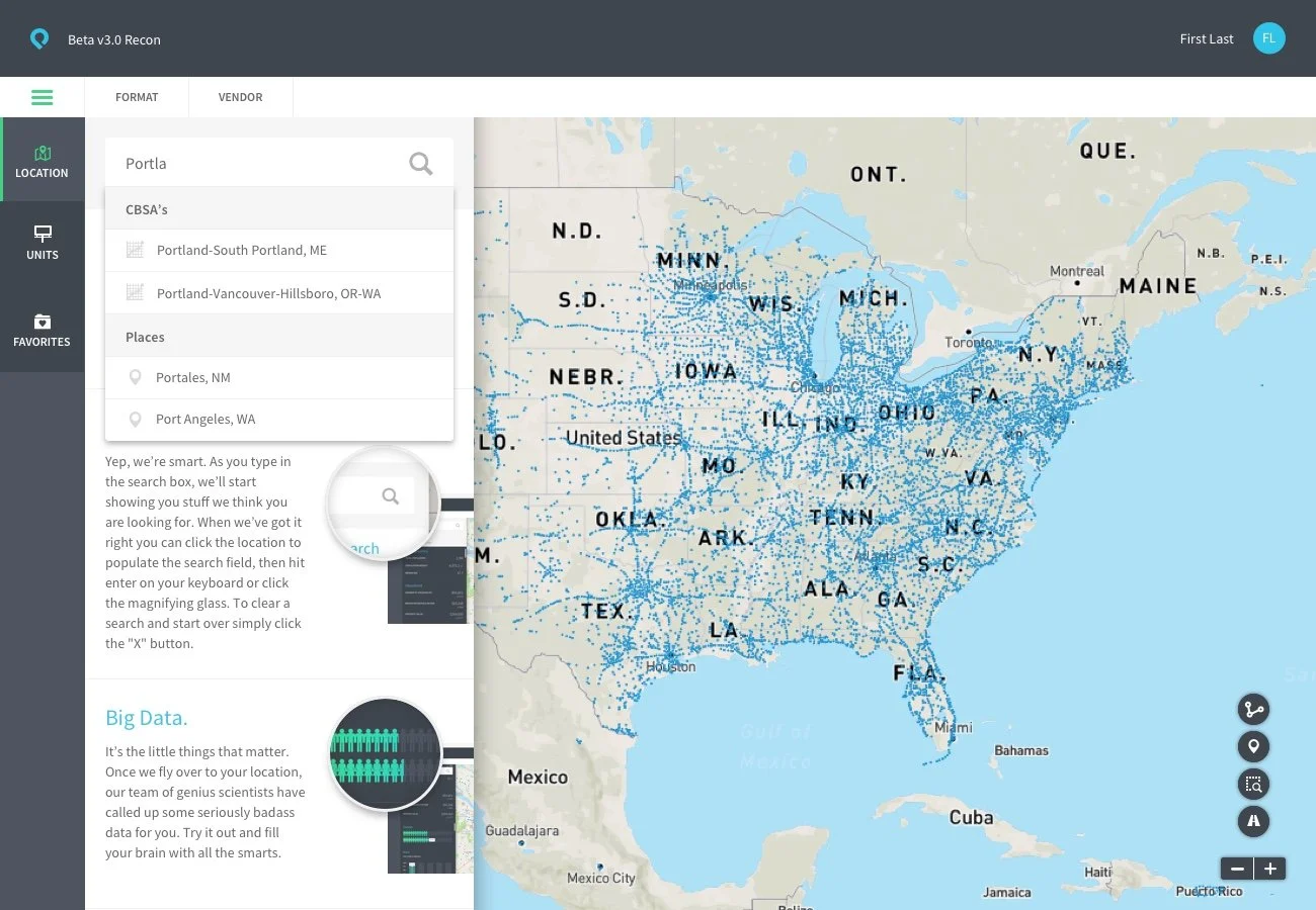
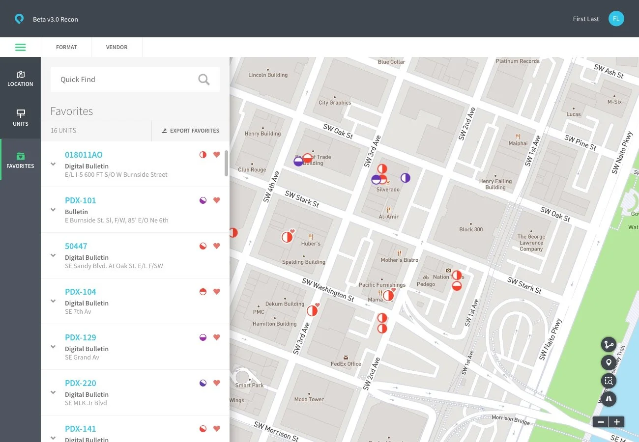
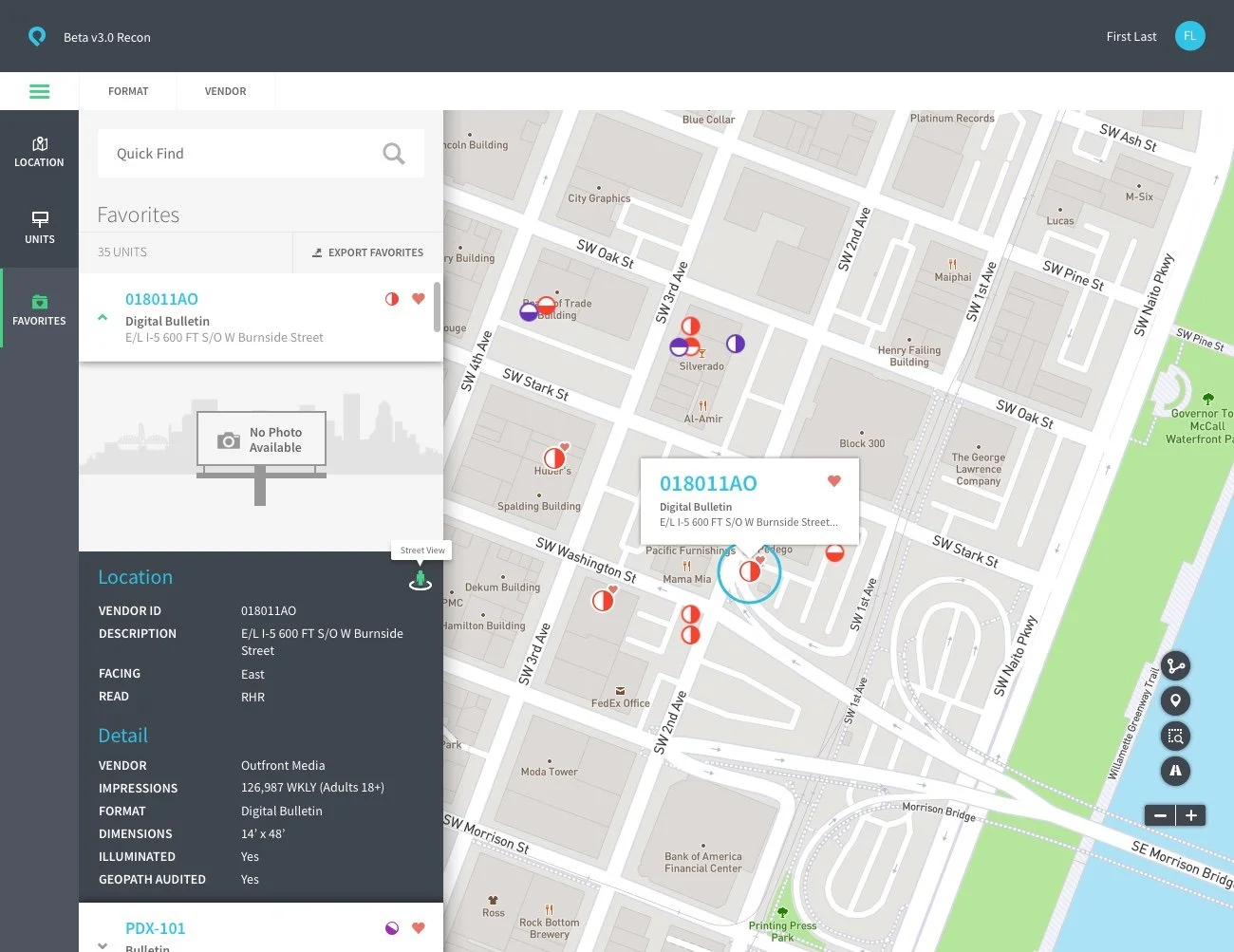
Boohma was billups' out-of-home media planning platform, a tool for buying and managing billboard, transit, and kiosk ad placements across a real map of the physical world. Underneath it sat an enormous pile of live data: traffic patterns, sensor feeds, demographic profiles, billboard and kiosk status, all of it needing to sit on one map without turning into noise.
I came on as UX Director to lead design on the product from an engineering-built pilot beta that needed a full front-end rebuild. I helped interview and hire a new UX team and got them up to speed on the category, learned the world of OOH media planning from the ground up myself, and led the design of the tool media buyers would actually use all day, centered on a map that had to carry more live data than almost anything I'd designed before.
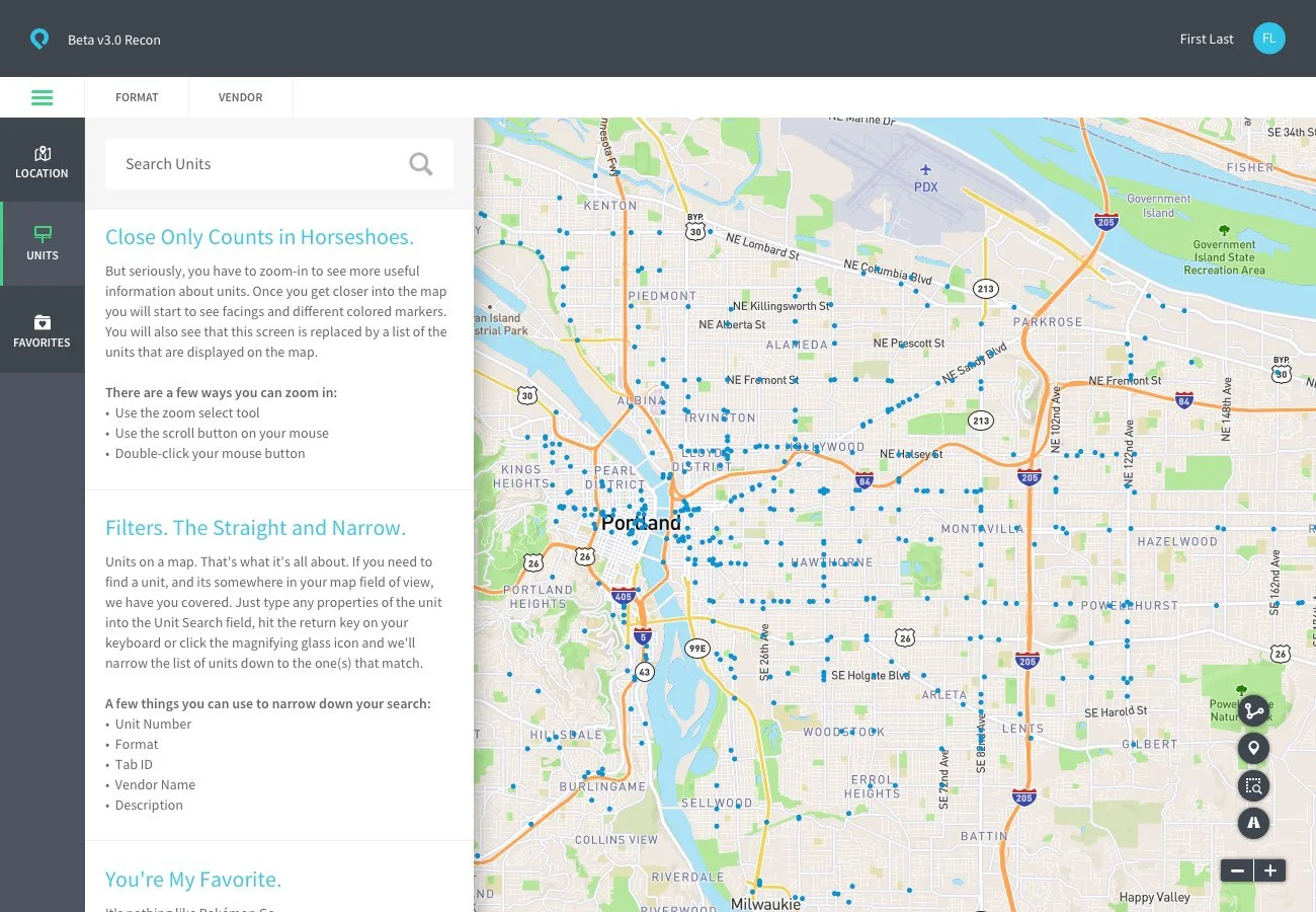
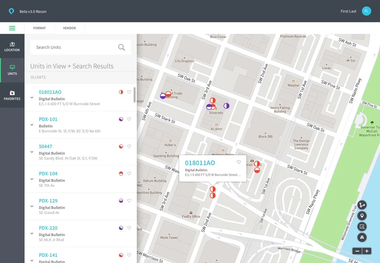
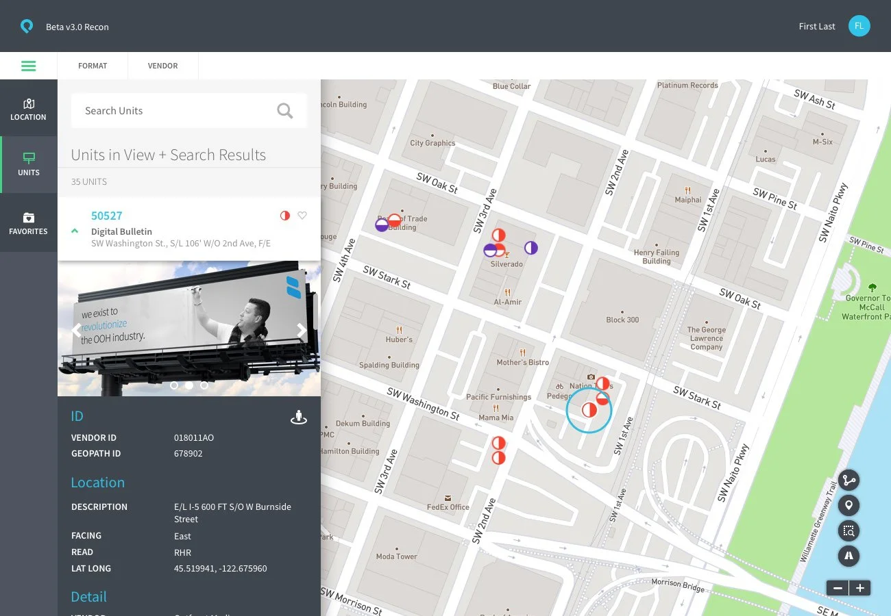
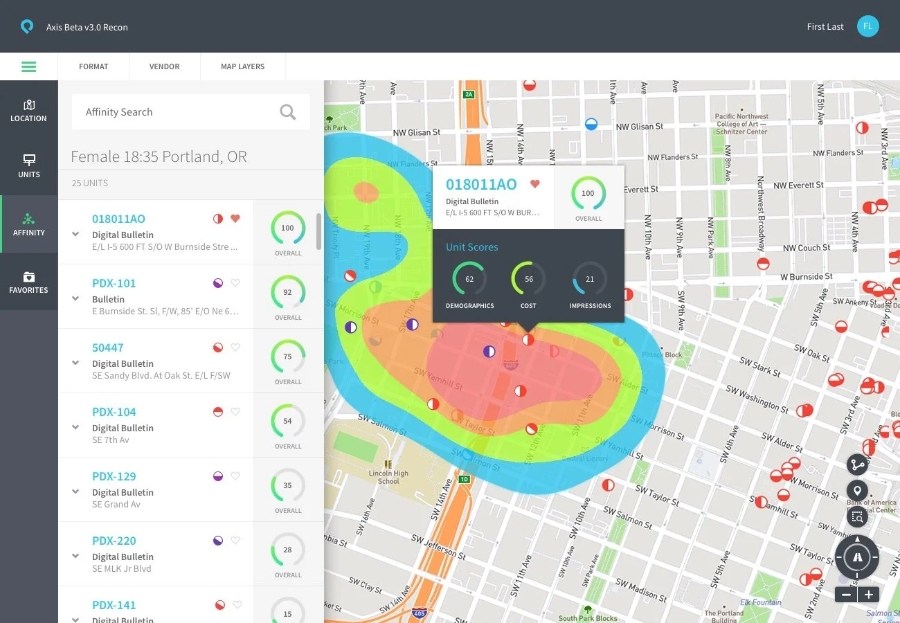
The hardest problem wasn't any single screen. It was the map. Too many data layers on at once and it's unreadable, too few and it's useless for the job someone's actually trying to do. The fix was context, showing different data depending on what a media buyer was actually doing in the moment, not everything, all the time.
Keep reading below for the full story
Overview
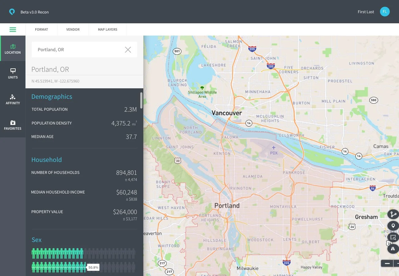
billups had built its reputation on the data and relationship side of out-of-home advertising, buying, planning, and managing ad placements across billboards, transit, and digital kiosks. Boohma was meant to turn that expertise into software: a platform media buyers could use to plan campaigns against a live map of available inventory, backed by real-time traffic data, sensor data, and demographic profiles.
Engineering had already built a pilot beta, enough to prove the data side worked. What it didn't have was a front end anyone could actually use. I came on as UX Director to lead that rebuild, and to help push the company toward treating design as a real part of how the product got built, not something layered on after engineering finished.
My Role
What I designed
The map UI and its system of data layers, the core of the product
Navigation architecture, personas, and user flows
Look and feel, mood boards, and color palette for the app
Most of the product's instructional and system-level copy
What I led
Research into OOH media planning: media formats, buyer workflows, vendor and client relationships, competitive tools in and out of the category
A lean, symbol-library-based process that let the team skip wireframes and iterate directly on high-fidelity screens
Collaboration with engineering on design sprints, running two weeks behind dev, iterating through bugs, enhancements, and detailed UI specs
Interviewing, selecting, and onboarding a new UX team, then getting them up to speed on the OOH category
Design Problems
A pilot beta with no real front end
Engineering had proven the data worked. What media buyers would actually see and use hadn't been designed at all. The gap wasn't small, it was the whole product experience.
An enormous amount of live data with nowhere obvious to put it
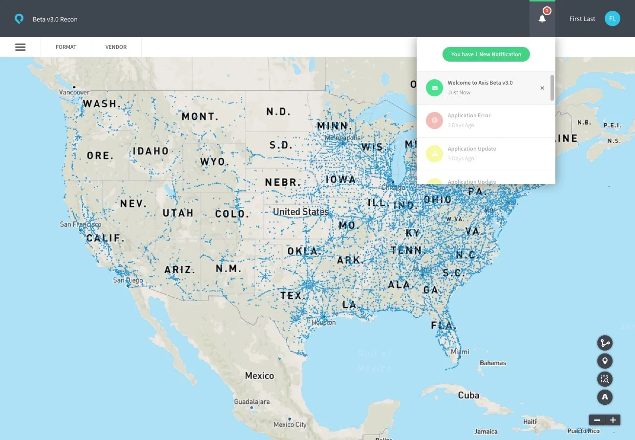
Real-time traffic data, sensor data, global billboard and kiosk status, demographic and marketing data, all of it needed to live somewhere. The obvious place was the map. The obvious problem was that a map showing all of it at once is unreadable.
No existing pattern for this category
Out-of-home media planning software wasn't a space with an established best-in-class product to draw from. I researched maps and data visualization broadly, inside and outside the category, competitive tools, other industries entirely, just to find a real starting point.
Challenges
Designing a map that could hold that much data without becoming noise
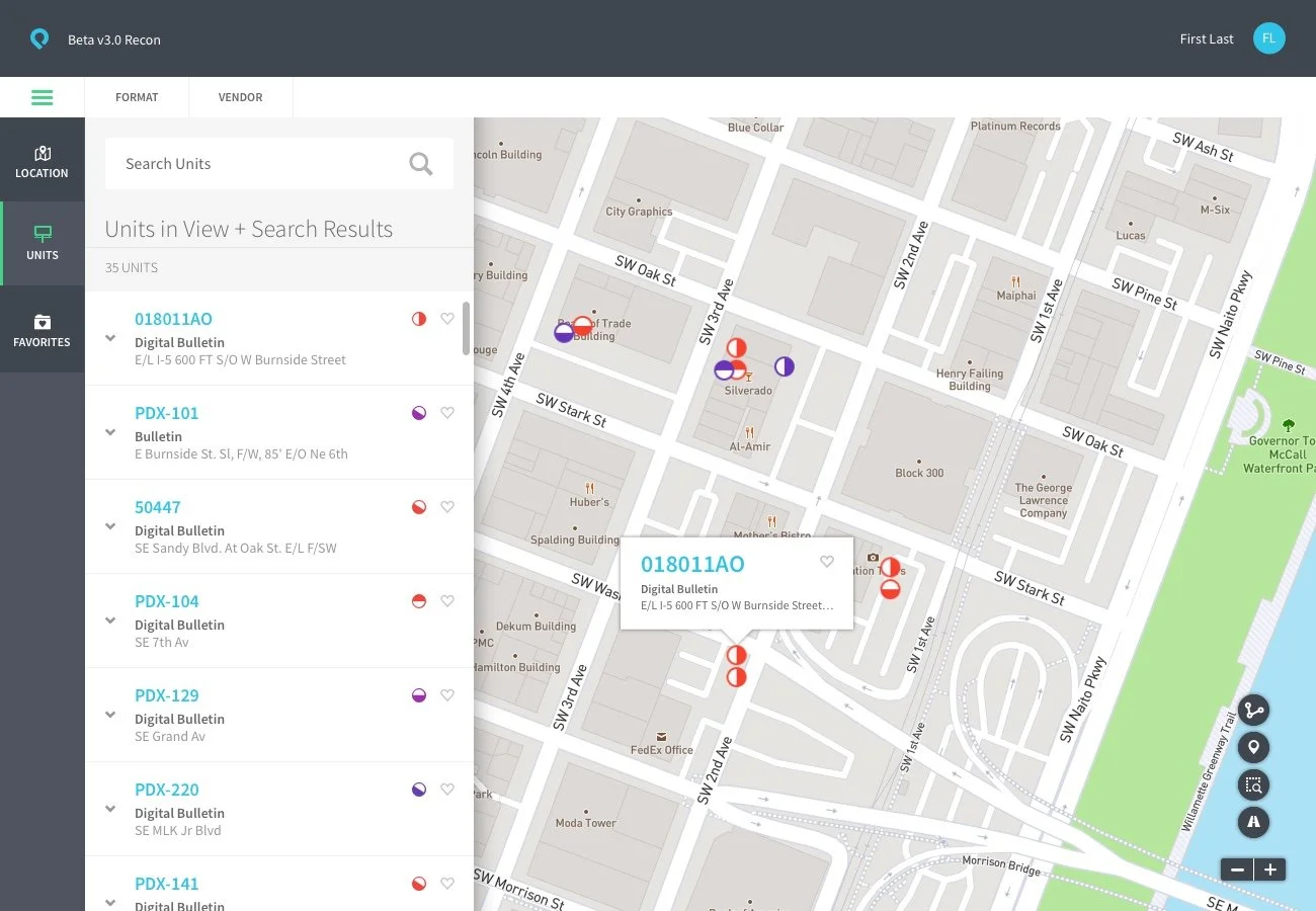
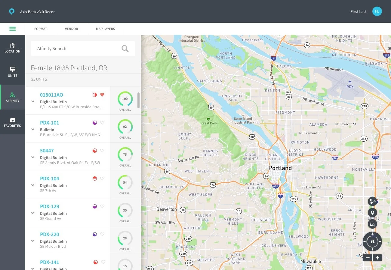
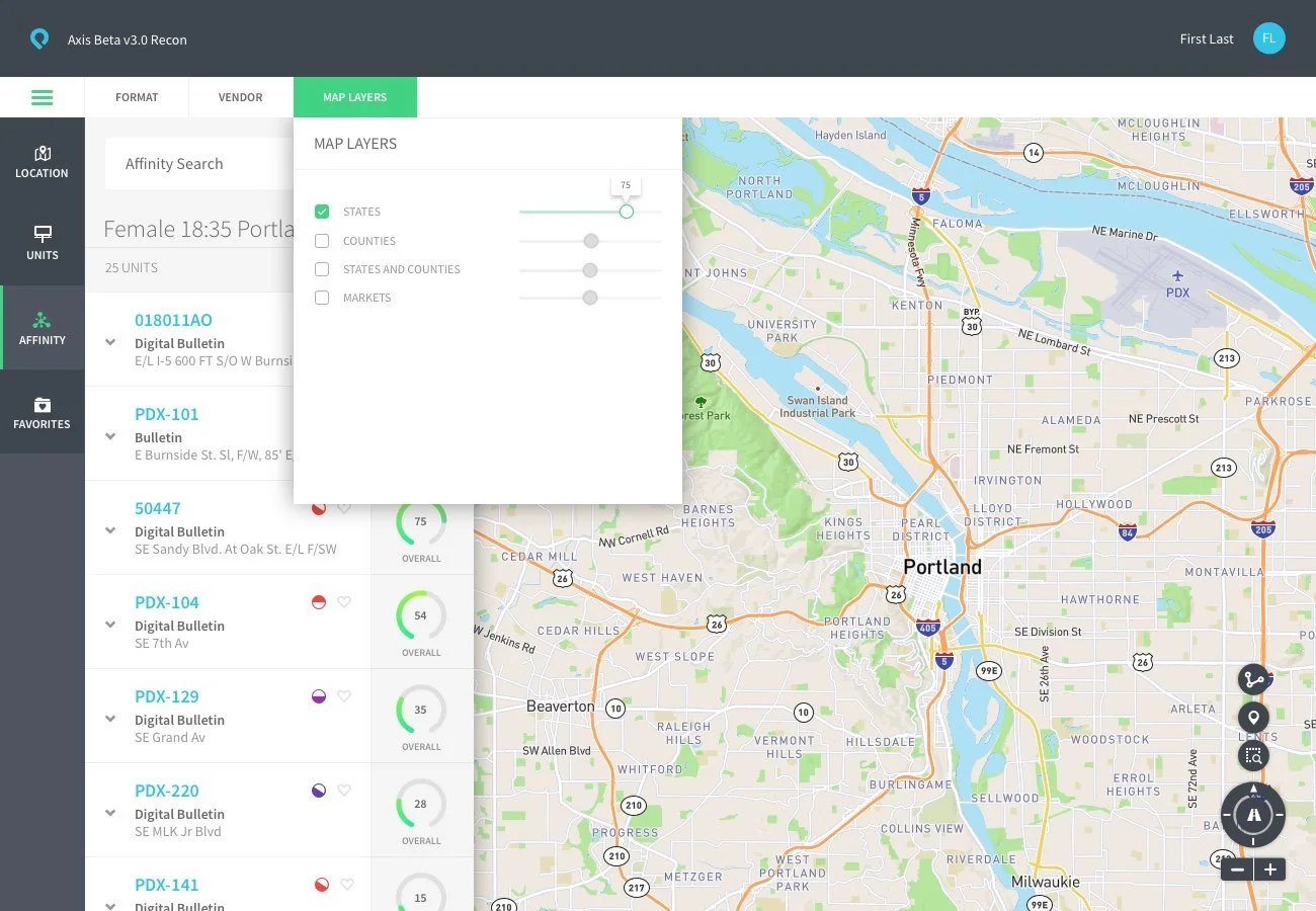
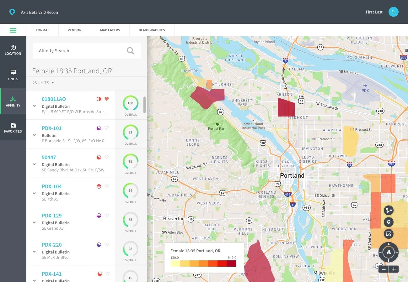
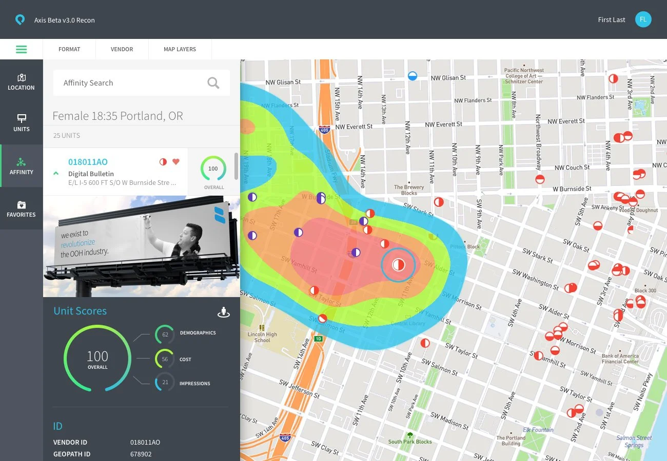
Every data type mattered to somebody, but not to everybody, all the time. A media buyer running an affinity search cared about heatmap data, traffic patterns, and demographic overlays. A media buyer just checking placements cared about facing direction and availability. Building one map that could serve both without dumping every layer on screen at once meant the map had to respond to what someone was actually trying to do, not just what data existed.
Building a design process that didn't exist yet
There was no established design workflow at billups to plug into. I built one: a library of Sketch symbols the team built and used as we designed, which let us pivot fast on colors, layouts, and field sets across a large number of screens without redoing wireframes every time something changed.
Getting engineering and design working in step
Design sprints ran two weeks behind engineering, which meant constantly iterating against a moving target, revised screens, bug fixes, enhancement requests, and detailed UI measurements, as the two tracks converged toward release.
Solutions
A map built around context, not just data
Instead of a fixed set of layers always visible, the map surfaced different data depending on the task. Affinity search brought heatmap, traffic, and demographic layers forward. A straight placement search prioritized facing direction and availability instead. Toggling layers on and off, and showing or hiding data based on what someone was actually doing when they entered the map, was the mechanism that kept a genuinely dense dataset usable.
A visual system built to outclass anything else in the category
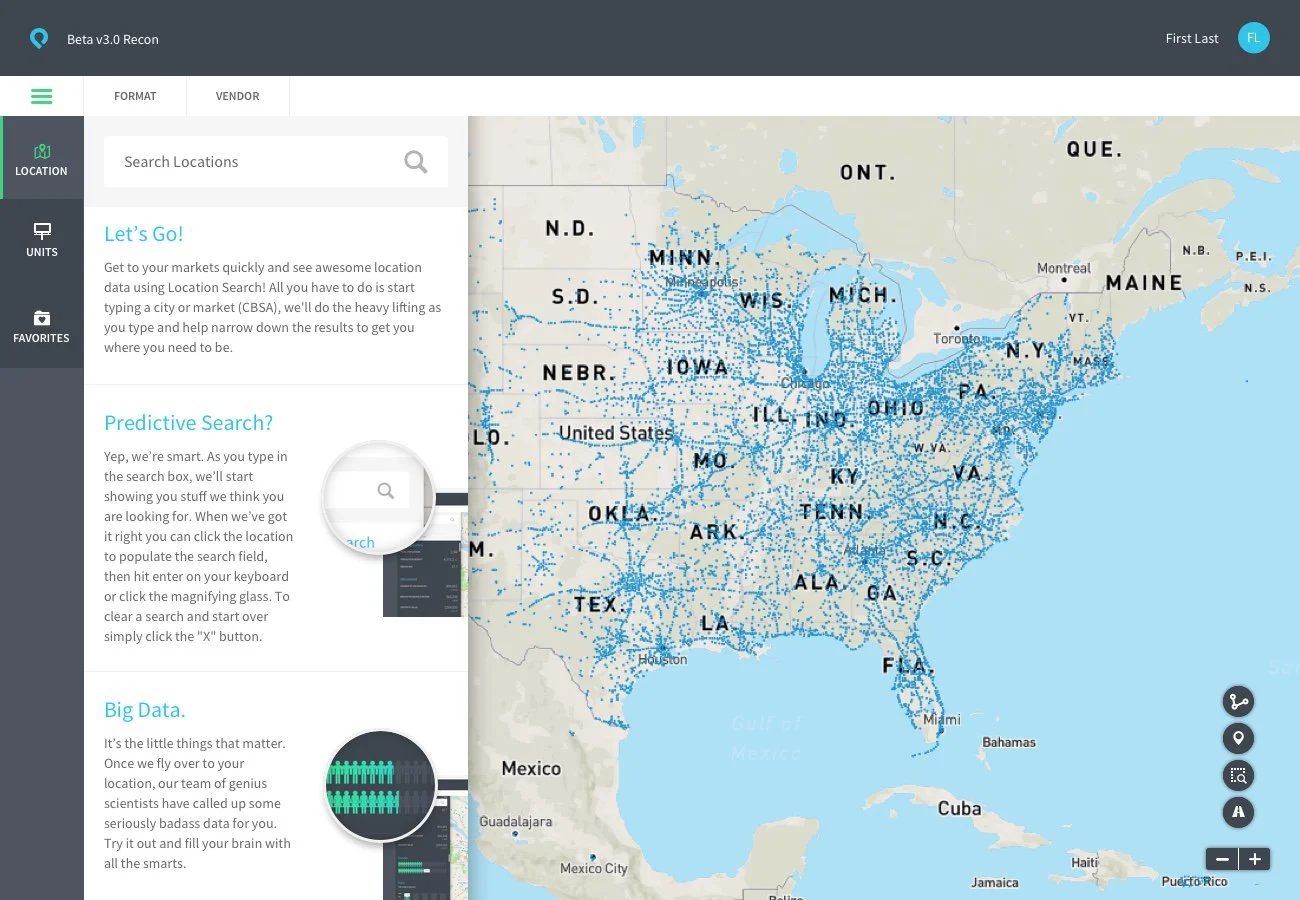
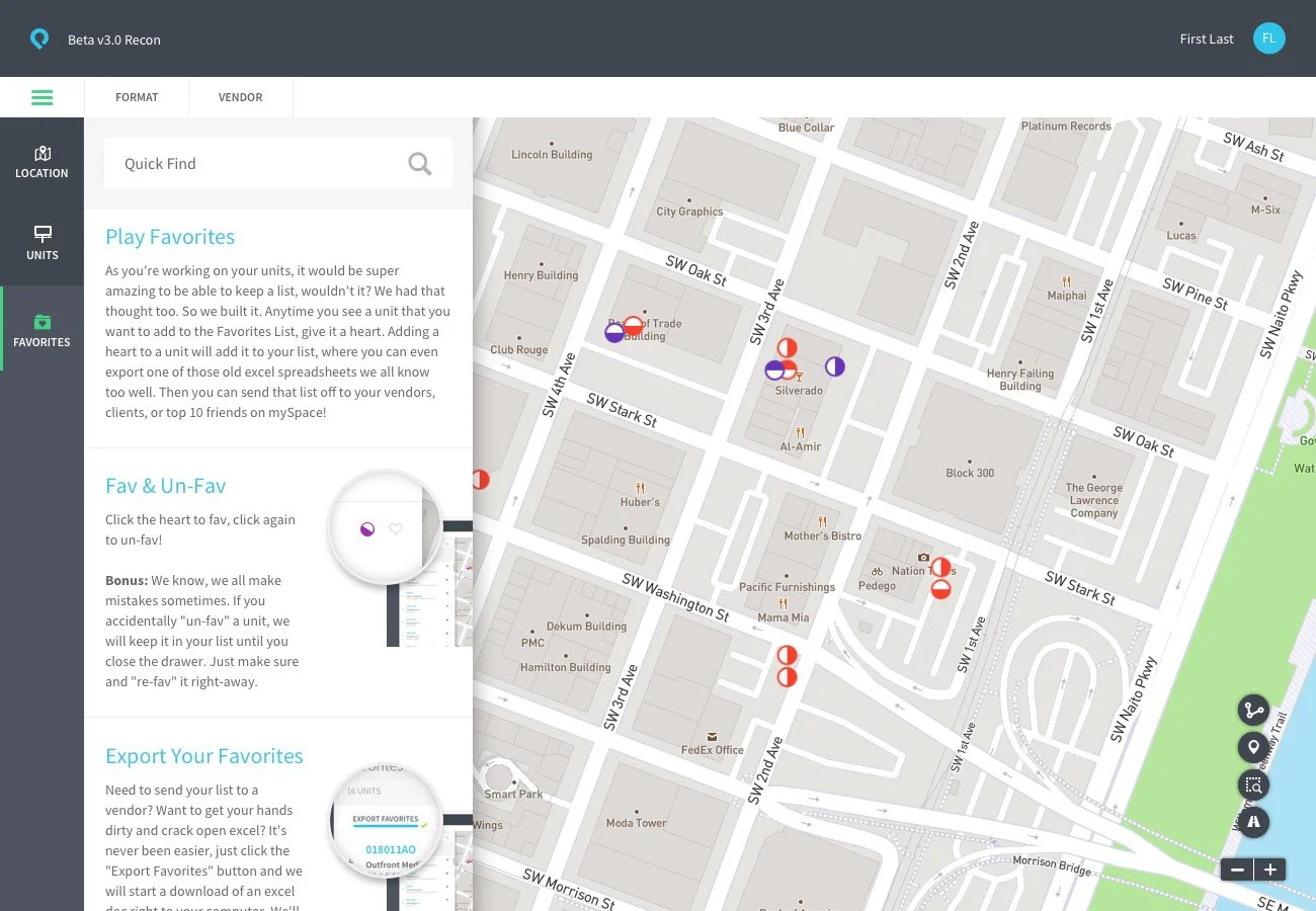
Color palette, iconography for billboard and kiosk types, the overall visual language of the map, all built to a level of craft nothing else in OOH software was operating at. I worked with the branding team on the product's mark, typography, and tone of voice, and wrote most of the instructional and system copy myself, aiming for something that felt professional but genuinely human rather than sterile enterprise software.
A lean process built for speed, not documentation
I skipped traditional wireframing and instead built a library of Sketch symbols alongside the team as we worked directly on screens. That let us pivot quickly on layouts, colors, and field sets across a wide range of implementations without starting over each time.
Iterating in step with engineering
Running two weeks behind dev meant constant back-and-forth, revised screens, bug reports, enhancement notes, and detailed UI specs, as the product moved toward release.






Results
Boohma's strongest result is the work itself. The map system, the visual language, the tone of the product down to its copy, all of it reached a level of craft ahead of anything else built for this category. I don't have adoption or performance metrics to point to here, this one's a craft story more than a numbers story, and the screens carry that case better than a stat would.